
Back Office Configuration Changes - Move to New UI
Introduction
Institution Wizard
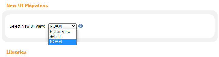
The New UI Migration section has been added to the Institution Wizard to allow you to migrate to the new UI when you are comfortable and to allow users a chance to transition smoothly to its new look and feel. To support this transition, the following options are supported:
-
Display new UI link in classic UI – Displays a link to the new Primo UI from the classic UI to allow users to try the new UI during the migration away from the classic UI.
-
New UI Enabled – Indicates that the new UI is the prominent user interface, and the URLs to deep links and the Services page in the classic UI will be redirected to the new UI.
-
Disable the classic interface – Prevents access to the classic UI. When selected, the system will redirect most URLs used in the classic UI (except for URLs to deep links and the Services page) to the home page of the new UI.
-
Select New UI View – When the New UI Enabled option is selected, select the view used for the new Primo UI if it is different from the view used for the classic UI. This allows the system to use the new view configuration while deep links and Services Page URLs contain the view used to configure the classic UI.
Views Wizard
| Configuration Option | New UI? | Comments |
|---|---|---|
|
General View Attributes:
|
||
|
Default user institution
|
Yes
|
|
|
Is template/Inherits
|
Yes
|
|
|
Enable My Library Card
|
Yes
|
|
|
Invoke automatic search when tabs are switched
|
Yes
|
The automatic search is between scopes.
|
|
Enable the “Personalize Your Results” service
|
Yes
|
|
|
Enable Citation Trail
|
Yes
|
|
|
Default Institution
|
Yes
|
|
|
Session timeout URL
|
No
|
In the new UI, the home page always displays after a timeout.
|
|
Side bar (Tweak my results) position (New UI only)
|
Yes |
Allows you to configure which side the facets appear in the new UI.
|
|
Layout Set (Classic UI only)
|
No
|
Included with the customization package.
|
|
CSS and Mobile CSS (Classic UI only)
|
No
|
Included with the customization package.
|
|
Mobile CSS (Classic UI only)
|
No |
|
|
Default interface language
|
Yes
|
|
|
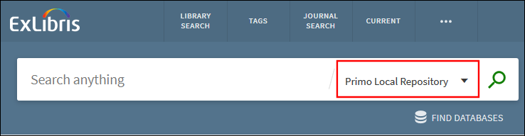
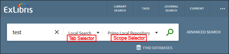
Search Scopes List:
|
||
|
Search scopes
|
Yes
|
The scopes appear as follows in the new UI:
|
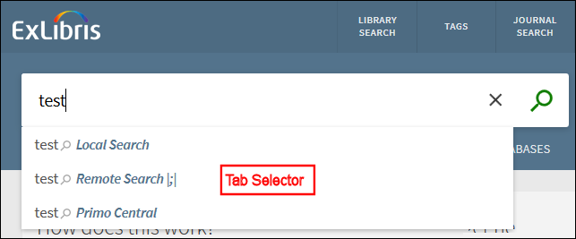
| Tabs List: | ||
|
Tabs list
|
Partially
|
The tabs appear as follows in the new UI:
|
|
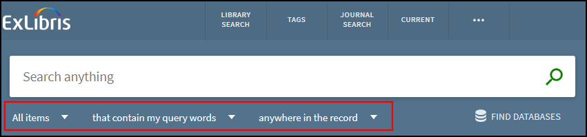
Basic Search Tile:
|
||
|
Enable pre-filters in new UI |
Used for new UI only. |
When selected, the pre-filter parameters (Media type, Search operators, and Search Target Fields) will also display in the new UI.
|
|
Media type
|
Yes
|
Same as Advanced Search configuration, but the new UI requires you to select the Enable pre-filters in new UI option.
|
|
Search operators
|
Yes
|
Same as Advanced Search configuration, but the new UI requires you to select the Enable pre-filters in new UI option. |
|
Search Target Fields
|
Yes
|
Same as Advanced Search configuration, but the new UI requires you to select the Enable pre-filters in new UI option.
|
|
Advanced Search Tile:
|
||
|
Search pre-filters
|
Yes
|
|
|
Display "Find Database" Link
|
NA
|
|
|
Main Menu Tile:
|
||
|
Contents of Main Menu Tile
|
Yes
|
Links should display as follow:
|
|
Static HTML Tile:
|
||
|
Contents of HTML Tile
|
No
|
Included with customization package. For more information, see New UI Customization - Best Practices.
|
|
Full Results Tile:
|
||
|
Field to display in the full results
|
Yes
|
|
|
Links to display in full results
|
Yes
|
|
|
Send To Tile:
|
||
|
SMS
|
Yes
|
SMS is planned for a later release.
|
|
Brief Results Tile:
|
||
|
E-Shelf
|
No
|
Always appears, but it can be removed in the CSS.
|
|
Define Sign-in message (in new UI)
|
Yes (new parameter on the Brief Results tile)
|
Indicates whether to display the sign-in message on the Brief Results page. The following options are valid:
|
|
Define link from title
|
No
|
Clicking the title always opens the Full Display.
The availability statement is a link to full text, Get It, or OvL. (See Availability Links in Brief Results.)
|
|
Define FRBR (Primo Local) display
|
Yes
|
|
|
Order of Tabs
|
Yes
|
The tabs are now referred to as services and appears as sections in the Full Display only.
Because the GetIt1 and locations are combined under the Get It section in the new UI, the order setting for Locations will be ignored.
Links that display in the Details tab of the classic UI will now appear under the Links section in the Full Display of the new UI.
|
|
Brief record display
|
Yes
|
|
|
Sort Fields of the brief results
|
Yes
|
|
|
Snippet Display Options
|
Yes
|
|
|
Institution Boost
|
Yes
|
|
|
Networks:
(facebook)
|
No
|
Not planned for the new UI, yet.
|
|
Number of records
|
No
|
The new interface includes both infinite load (which allows users to load 10 additional results to the page at a time) and pagination. We will continue to track usage and performance to determine whether changes should be made to the number of results that are loaded at a time.
|
|
Refine My Results (facets) Tile:
|
||
|
Display "Show only" facets on the top of the brief results list
|
No
|
|
|
Display "Show only" facets on top of "Refine My Results"
|
Yes
|
There is an option to disable it and add ‘Top level’ facet in the facets list. In this way the customer can configure the number of values to display and sort option.
|
|
Display "RSS", "Save Search" and "Add page to e-Shelf" on top of the facets options
|
Yes
|
Add page to e-shelf will not be added since there are no pages in the new UI.
|
|
Facets to display
|
Yes
|
The tabs are also taken into account by checking the tab to which the scope is linked.
|
|
Locations Tile:
|
||
|
Real Time Availability
|
Yes
|
|
|
Sort locations by user institution
|
Yes
|
|
|
Include only locations belonging to the institution of the view
|
Yes
|
|
|
Display Item list filters
|
Yes
|
|
Mapping Tables
| Table | Description |
|---|---|
|
Actions List (modified)
|
For information on the new Up-front Actions field, see Actions.
|
|
Bulk Definition (modified)
|
For My Library Card, the OVP loans paging parameter is ignored since the constant bulk size is 10. |
|
GetIT! Link 1 Configuration (modified)
|
For information on the new Availability/Service field, see Availability Statement.
|
|
My Account Menu Configuration - OvP (modified)
|
Defines the existence of the My Library Card tabs, but does not control the order of the tabs. The new Overview tab always appears and cannot be hidden. You must use CSS to configure the order.
|
|
Items Brief Display (new)
|
See Get IT 1 Services.
|
|
User Login Links (new)
|
See Sign-In Page.
|
|
PushTo Adaptors (no change) |
Unlike the classic UI, the new UI does not support customer-defined PushTo adaptors. |
Code Tables
| Table | Description |
|---|---|
|
GetIT! Tab1 (modified)
|
Added labels (such as the name displayed for the GetIT1 services) for the View It and Get It sections on the Full Display page in the new UI. Each of the new labels are prefixed with nui. For example, the following delivery codes display the View Online heading in the Full Display:
|
|
GetIT! Tab2 (modified)
|
Added the following codes to support the Click here for more options message that displays in the More section on the Full Display page in the new UI. Each of the new labels are prefixed with nui. For example:
default.nui.getit_full.tab2_notexistcheck
|
|
Get it service labels (new)
|
This table defines labels for various subsections, messages, and back links in the Get It section on the Full Display page in the new UI. Each of the new codes are prefixed with nui. For example, the following code displays the Locations header:
default.nui.locations.header
|
|
User Login (modified)
|
See Sign-In Page.
|
| Advanced Index Fields Labels (New) | Defines the search field drop-down values in the Advanced Search Box. |
|
Library card Labels (new)
|
See Brief Display of an Item. |
|
Suggestions labels (new)
|
Defines the labels associated with the Suggestions area of the Full Display. |
|
Favorites Labels (new)
|
Defines the labels used on the My Favorites page. |
|
Tags Tile (modified)
|
Defines the labels used on the Tags page. |
Brief Results Page
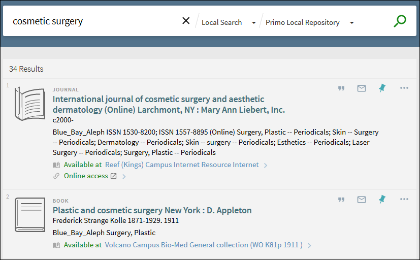
Availability Statement
-
An external page:
-
Alma directs to the item's full text.
-
SFX directs to the item's full text.
-
Primo directs to link to resource if there is a single link for the record. Otherwise, the link displays the record's full display to allow users to select a link.
-
Primo directs to OPAC via link.
-
Other scenarios configured in the new column as Out in GetIT! Link 1 Configuration mapping table. See Get It Service for more details.
-
-
The Full Display page on which attention is focused on the relevant GetIt1 service:
-
Get it (Alma) – Full display focusing on Get It service with Alma Get It mashup.
-
Get it (Aleph/Voyager) – Full display focusing on Get it service with Request & Locations.
-
View it (Alma) – Full display focusing on View It service with Alma View It mashup.
-
View Online – full display focusing on View Online service.
-
Other links scenarios configured in the new column as Full in GetIT! Link 1 Configuration mapping table. See GetIT 1 Services for more details.
-

Actions
 in the new UI. The following figure highlights the up-front actions.
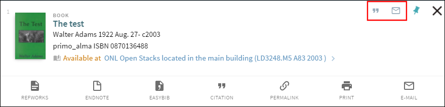
-
Settings for local send-to actions and Delicious will be ignored. In the November release, the customization package will be used to configure the local actions.
-
The SMS action will be added in a later release.
Full Display Page
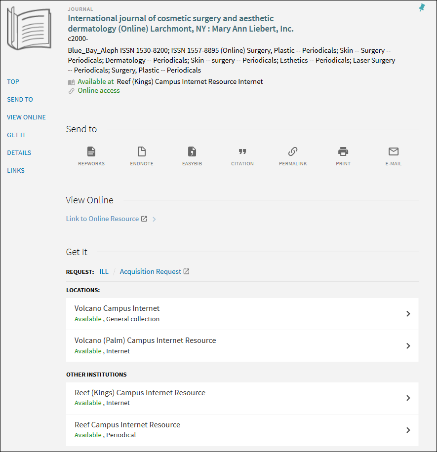
GetIT 1 Services
-
The Availability/Service links field has been added to the GetIT! Link 1 Configuration mapping table to define how the system handles the Getit1 links (including View It and View Online). For more details, see GetIT Links.
-
The Items Brief Display mapping table has been added to configure the details that appear in brief display of an item on the Full Display page. There is an option to define up to three parameters per field and the delimiter that displays between them.
-
The Get it service labels code table has been added to configure the labels for this service on the Full Display page. All other labels are taken from existing code tables.
View Online Service
-
Link-to-resource link – the text is taken from the $$D value of the linktorsrc field in the PNX (which is the same as the classic UI).
-
For all the other cases or when there is no $$D value in the linktorsrc field – the text is taken from the new codes in the Tab 1 Label Code code table. The codes starts with default.nui.getit_full.* text. The relevant code is calculated based on the existing GetIT! Tab 1 Text Configuration mapping table with the combination of Delivery Category Code, Availability Status Code, and Data Source Code).
Links Service
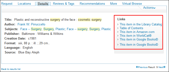
More Service
Main Menu Links
| Link | Description |
|---|---|
|
Library search
|
Displays and opens the new UI home page in the current window.
|
|
Tags
|
Opens the new Tags page in the current tab/window.
|
|
A-Z
|
Opens in a new tab/window.
For Alma, it opens the Journal Search page in a new tab/window.
|
|
Citation linker
|
The Fetch Item page opens in a new tab/window.
|
|
Help
|
|
|
Collections
|
Displays and opens in a new tab/window.
|
My Library Card
Brief Display of an Item
-
Loans Brief Display
-
Requests Brief Display
-
Fines Brief Display
Full Display of an Item
-
<type of request> Request Detailed Display
-
Loans Detailed Display
-
Fines Detailed Display
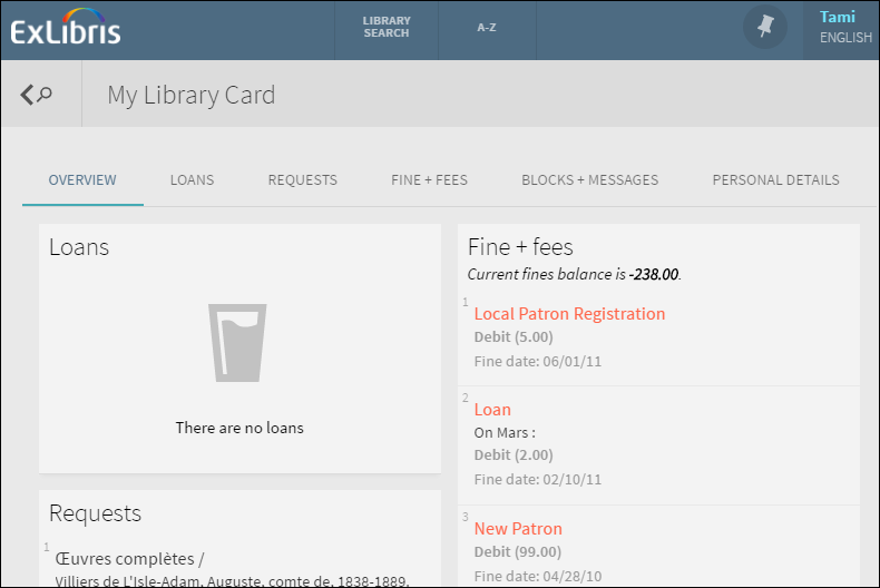
Personal Details
-
Registration - Expiry date and patron group display under the Personal details heading.
-
Address - Includes the following address-related fields:
-
address_1 - address_5
-
city
-
state
-
zip
-
address_valid_from
-
address_valid_to
-
-
Contact - Includes the following contact information:
-
telephone_1 - telephone_4
-
sms_number
-
my_email
-
-
Actions -
-
mail_attachment (Aleph only)
-
sms_authorized
-
Library notices flags (Alma only) – This section displays which library notices are sent to the user. If a notice is enabled in Alma, the user will be able to modify its setting in My Library Card. For details on how to configure library notice flags in Alma, see Configuring Library Notices Opt-In. The display of these flags in My Library Card is not configurable with the Personal Settings Fields mapping table.
-
Alert Notifications
-
Next to a specific tab at the top of My Library Card
-
Next to an item in a borrowing activity tab (such as the Loans or Requests tabs)
-
Loan due or overdue
 – This notification indicates that a borrowed item is almost due or overdue. For additional configuration information, see Loan Alert Configuration.
 -
Hold ready
 – This notification appears when a requested item is ready for pickup.
 -
Blocks or messages
 – This notification may indicate that a particular activity has been blocked or that the library has sent a message.
 -
Fines and fees
 – This notification indicates that the user has incurred a fine or a fee.
Loan Alert Configuration
Display Reasons for Nonrenewable Loans
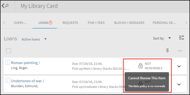
With the new UI, a Not Renewable indicator will appear next to items that cannot be renewed on the Loans tab in My Library Card. For Alma environments only, the system will display up to two reasons (such as a loan policy or block) as to why the item is not renewable when users hover their cursors over a Not Renewable icon.
Alma uses the following criteria to determine whether a loan is not renewable and passes the Not Renewable reasons to Primo for display in My Library Card:
-
The following patron blocks are checked first to see if all loans are blocked for renewal. Alma will return the first two reasons found and will not perform any further checks.
-
Patron is expired.
-
Check if patron overdue recall limits were exceeded.
-
Fetch patron's active blocks.
-
Check if patron overdue limits were exceeded.
-
Check if a patron's cash limits were exceeded.
-
-
The following loan-specific checks are performed next. Alma will return the first two reasons found for that loan.
-
Validate that the item is renewable.
-
Check if the user has a patron role for this library or the whole institution.
-
Validate that the current date is before the maximum renewal period expires.
-
Check that the item does have any holds.
-
Configuration Options
No additional configuration is necessary to enable this functionality. If you want to customize the display labels or provide translations, configure the following codes in the Library Card Labels code table:
-
default.nui.loans.notRenewable: Not Renewable
-
default.nui.loans.cannotRenewThisItem: Cannot Renew This Item
Services Page
-
Links menu
-
Search section
-
Details service – All of the open URL data displays in the brief display, see below.
-
Brief display – Consists of the following elements, which are not configurable:
-
Thumbnail appears on the left side.
-
Resource type above the title does not display.
-
First line – title
-
Second line – creator, creation date
-
Third line - identifier
-
Fourth line - is part of
-
http://<Primo_domain>/primo-explore/openurl?institution=<Primo_institution_code>&vid=<Primo_view_code>
-
In the Primo Back Office, access the Institution Wizard (Primo Home > Ongoing Configuration Wizards > Institution Wizard).
-
From the list of institutions, edit your institution.
-
In the New UI Migration section, specify the view that you will be using for the new Primo UI. If you switched previously to the new UI, this field is disabled .
 Institution Wizard - New UI Migration SectionIf you are receiving bX recommendations in the classic UI (which is indicated by the bX Token field), you must populate the Alma Services Page URL field to allow users to display the full record for titles clicked in the Related Reading section of the new UI.
 -
Save and deploy your changes to the Front End.
Sign-In Page
-
User Login Links mapping table – Allows you to define up to four links that display on the Primo Sign-In page. If only a single link is defined, the link will appear without clicking Need help.
-
User Login code table – Defines the labels for the links and the description for the Primo Sign-In page.
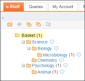
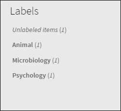
E-Shelf Migration to My Favorites
-
Folder/subfolder names are converted to label names only if a folder/subfolder has items. All items directly under that folder/subfolder are assigned to that label name. If an item belongs to a subfolder, it will not be assigned to its higher-level folders as well.
-
Items stored directly under the Basket folder in the e-Shelf will not be assigned a label, but users can still list them by selecting the Unlabeled items filter in the new UI.
No Results Page
The No Results Page has been added to provide feedback to users that have entered search queries that yield no results. This can occur for many reasons, such as when the user's query contained a misspelling or too many keywords. To help end users find what they are looking for, the No Results Page will include up to five suggestions to help them to improve the search query. For more information, see Feedback Messages.
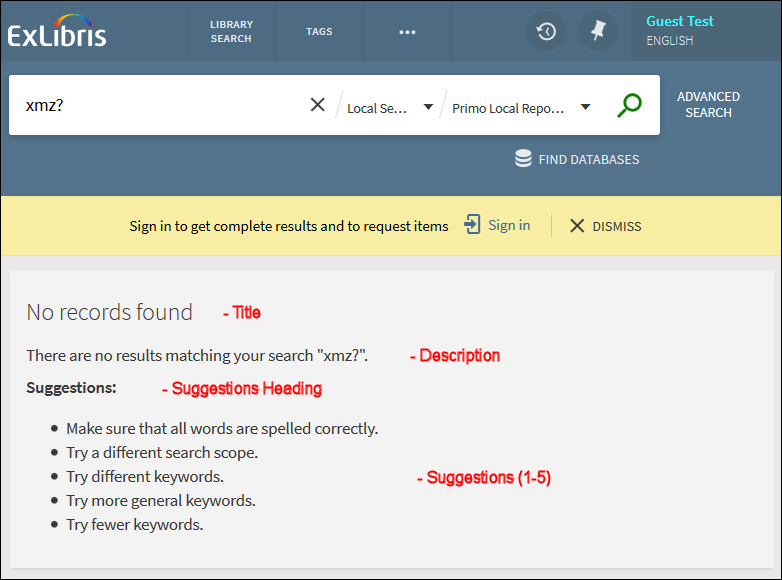
The Error Messages code table (Primo Home > Advanced Configuration > All Code Tables > Front End) allows you customize and translate the labels and suggestions that appear on the No Results Page, which consists of the following areas:
-
Title – The No records found label appears in all cases in which no records were found.
default.nui.noresults.title – No records found
-
Description – Depending on the reason in which no results were returned, the system may display a different description. The following description is general and displays when the user has not exceeded any query limits and no results were found:
default.nui.noresults.description – There are no results matching your search "{{term}}".
The {{term}} placeholder allows Primo to fill in the search terms that were associated with this particular search. This placeholder was designed specifically for this code and cannot be used with any code. For more information, see Placeholders in Code Tables.
-
Suggestions Heading – Depending on the reason in which no results were returned, the system will display one of the following headings:
-
General suggestions:
default.nui.noresults.suggestions – Suggestions:
-
Search limit suggestions (see Search Limits).
default.nui.search.error.noresults.suggestions.header – MAY WE SUGGEST:
-
-
Suggestions – Depending on the reason in which no results were returned, the system will display up to five suggestions. The following suggestions are general and display when the user has not exceeded any query limits and no results were found:
-
default.nui.noresults.suggestions1 – Make sure that all words are spelled correctly.
-
default.nui.noresults.suggestions2 – Try a different search scope.
-
default.nui.noresults.suggestions3 – Try different keywords.
-
default.nui.noresults.suggestions4 – Try more general keywords.
-
default.nui.noresults.suggestions5 – Try fewer keywords.
-