
Summon: Create a Search Box or Search Widget
- Product: Summon
How do I add a Summon search box or search widget to a web page?
You can create Summon search boxes and widgets that can be placed on any web page, such as research guides, course-management pages, collaborative research portals, and more. This document describes how to create these tools. For additional information, see Search Boxes on the Ex Libris Developer Network.
Adding Search Boxes and Widgets
Before you start adding Summon search boxes and widgets, decide whether you want to create a search box or a widget, and determine if you want the tool to search your entire Summon service or be targeted (scoped) with filter and facet options. For more details, see Search Boxes and Search Widgets.
Then access the widget builder via either option below:
-
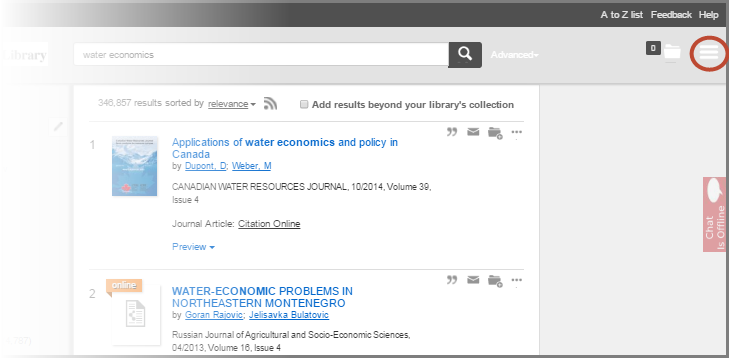
Via the Widget Builder link within the menu on the top right of the screen:
-
Via the URL for your library's Widget Builder. Go to the following URL, replacing "MyDomain" with your library name:
http://MyDomain.summon.serialssolutions.com/widgets
You will see the Summon Search Widgets page specific to your library:
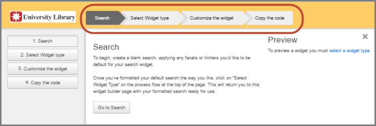
Use the links at the top of the page (on the left side as well) to navigate through the 4 steps to create a search box or widget:
-
Search: In this step you select any facets or filters that you want to apply.
-
Select widget type: In this step you choose either to build a search box or a search widget.
-
Customize the widget: In this step you can apply various changes to the look and feel.
-
Copy the code: In this step you copy the HTML code and paste it into any web page.
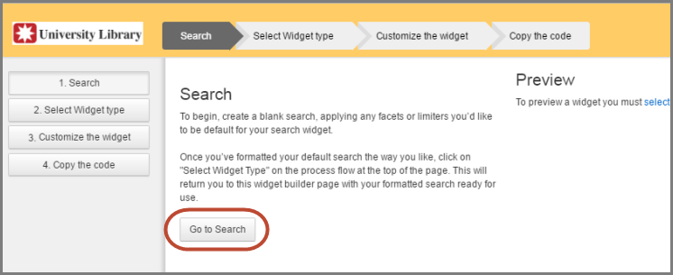
Step 1. Search
The first step is to apply any desired facets or filters. Click the below Go to Search button and a blank search within your Summon instance will display. Apply any facets or filters that you want to include by default, and then move to the second step by clicking Select Widget Type at the top of the page.
Step 2. Select Widget Type
Choose to create either a search box or a widget. The right side of page provides a live Preview environment of the box or widget that you are building. After selecting a widget type, move to the third step by clicking Customize the widget at the top of the page.
Select widget type Box to create a search box:
|
Select widget type Search to create a widget:
|
Step 3. Customize the Widget
The customization options will depend on whether you are building a search box or search widget.
If you are Building a Search Box
Choose to use the default settings or customize them. The search box Preview pane on the right side will dynamically update to reflect your changes.
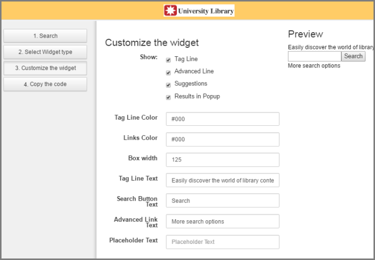
The above customization options include:
-
Show:
-
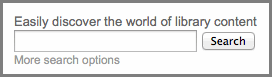
Tag Line: This text appears above the search box and should help your patron identify the parameters of the scoped search. The default text is "Easily discover the world of library content." To hide the tag line, de-select the checkbox.
-
Advanced Line: This text field links users to your library's Advanced Search page. The default text is "More Search Options". To hide the line, de-select the checkbox.
-
Suggestions: With the checkbox selected, the Autocomplete feature is enabled and provides search suggestions and spelling corrections as the search is being entered.
-
Results in Popup: Uncheck this box if you prefer Summon to open in the user's existing browser window. Default behavior is to open in a new browser window.
-
-
Tag Line Color: By default the Tag Line will display in the user's default browser color for text. To change the color, either enter the hexadecimal color code or click in the box and use the color picker.
-
Links Color: By default the More search options link will display in the user's default browser color for links. To change the color, either enter the hexadecimal color code or click in the box and use the color picker.
-
Box width: The default width is 125 pixels. To change the size, enter the number of pixels. For example enter "200" for a width of 200 pixels.
-
Tag Line Text: This text appears above the search box and should help your patron identify the parameters of the scoped search. The default text is "Easily discover the world of library content." This field can be turned off by deselecting the Show Tag Line checkbox.
-
Search Button Text: This is the text that appears in the button to the right of the search box. The default text is "Search." Enter the word you would like to appear on the button, such as "Find" or "Go." This is a required field.
-
Advanced Link Text: This text links users to your library's Advanced Search page. The default text is "More Search Options." This field can be turned off by deselecting the Show Advanced Line checkbox.
-
Placeholder Text: This text displays inside the search box. By default this field is blank.
When you are satisfied with your selections, go to the last step by clicking Copy the code at the top of the page or the left side of the page.
If you are Building a Search Widget
Choose to use the default settings or customize them. The search widget Preview pane on the right side will dynamically update to reflect your changes.
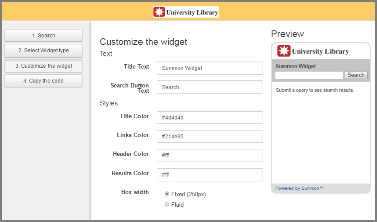
The above customization options include:
-
Title Text: This text appears above the search widget and should help your patron identify the parameters of the scoped search. The default text is "Summon Widget." This is a required field.
-
Search Button Text: This is the text that appears in the button to the right of the search widget. The default text is "Search." This is a required field.
-
Title Color: By default the color of the Title Text is the user's default browser color for text. To change the color, either enter the hexadecimal color code or click in the box and use the color picker.
-
Links Color: By default the color of links in search results is the user's default browser color for links. To change the color, either enter the hexadecimal color code or click in the box and use the color picker.
-
Header Color: This is the color behind your library logo. This is a required field.
-
Results Color: This is the color behind the search results. If the field is empty, the user's default browser color will be used.
-
Box Width: The two choices are either Fixed (250 pixels), which is the same size as the widget in the Preview pane, or Fluid, which changes width depending on the space available on the web page where the widget will appear.
When you are satisfied with your selections, go to the last step by clicking Copy the code at the top of the page or the left side of the page.
Step 4. Copy the Code
This page contains the HTML code that you will use on any web page to display your search box or widget:
-
Copy the code from the window.
-
Place the code into any web page.
-
Save the web age and test it.
If your web page is in a secured HTTPS environment: Note that if you have a JavaScript file in the Summon 2.0 External Script section of the Settings page in the Summon Administration Console and the JavaScript file applies to Summon interface customizations, the file will also need to be served up over HTTPS. Assuming that the domain (from which the script is served up) supports HTTPS along with HTTP, it is likely that you can remove the protocol from the JavaScript file name listed in the Summon admin console, and that will meet the need for a secured connection over HTTPS. In other words, instead of entering the JavaScript file into the Summon administration console as http://<javascript file name>, enter it as //<javascript file name>.
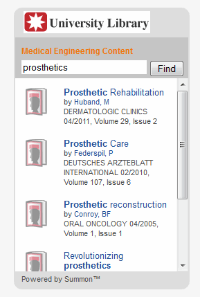
Your patrons can start using the new scoped search box immediately.
- Date Created: 12-Feb-2014
- Last Edited Date: 14-Jun-2021
- Old Article Number: 9963