Upcoming Behavior and Design Changes in Leganto 2024
Upcoming UI Changes
The following UI changes are coming in 2024. We will update with specific months once we have finalized the development plans.
Email us at Leganto_Customers_Feedback@exlibrisgroup.com with any feedback or questions.
| Experience | Software | Expected Release |
|---|---|---|
| Separate All Lists and My Lists Search | Leganto | TBD |
| Move X to Close Right Pane | Leganto | No longer planned |
Separate All Lists and My Lists Search
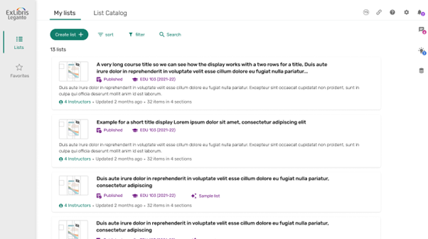
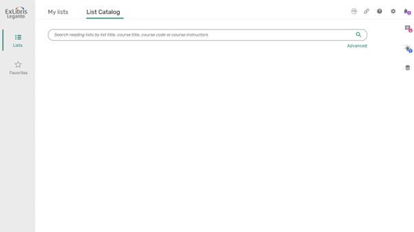
We received feedback that it is difficult to toggle between My lists and All lists. We will change the drop-down menu to two separate tabs to help users see that there are multiple options for searching. It also allows to display all “My lists” by default but reset the results when switching to All lists.
Mock-up:


Move X to Close Right Pane
We received feedback that the X to close is too small and requires too much mouse movement to access. We had planned to move the X to the left side of the right pane to make it easier to see and use, but after developing it we discovered that moving the X from the top right caused new usability issues as users generally expect to find a close button in the top-right of the screen. Therefore, we no longer plan to make this change. In the meantime, we have made all the icons larger, added additional padding to the right of the X, and added a hotkey (ESC) to close the right pane. We will also make the X a bit thicker and include the hotkey information in the out of the box label.

