Leganto
- Last updated
- Save as PDF

Overview
Leganto product integration enables users to enjoy the full user experience of Leganto built into their mobile app and web portal. The simple-to-deploy integration, configured within the App Manager, delivers a mobile-specific styling and structure and provides users with a seamless engagement of their library services through the app.
For more information, watch Leganto Integration (6:00 min).
About Ex Libris Leganto
Leganto, the Ex Libris resource list management system, makes it easy to create, access, and manage course resource lists. Instructors can build, maintain, and share resource lists that include all material types, librarians can provide resources more efficiently and scale up to support more courses, and students can access all course materials in one place and from any device.
Leganto tightly integrates with Ex Libris Alma® as well as learning management systems, library discovery services, mobile apps, citation tools, and other campus systems.
User Experience
The following section describes information relating to the user experience for the Leganto product integration.
User Activities
Users can use any Leganto functionality from the app. For example, students can view their reading lists, view which resources are used for the course, access online resources, find the location of physical resources, etc.
Authentication
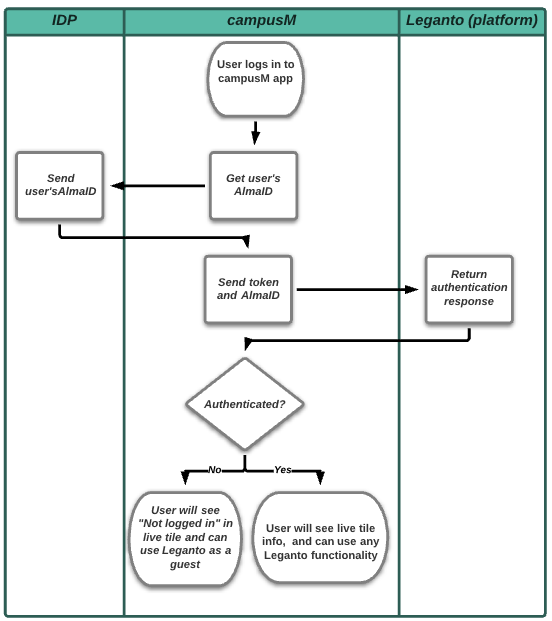
The following is the authentication flow:
- The user logs in to the app.
- The app calls IDP to get the AlmaID attribute (the user identifier in Alma).
- IDP returns the AlmaID.
- The app sends the AlmaID and Authorization Token to Leganto. (The token is configured on both sides – Alma and campusM, see Prerequisites).
- Leganto verifies the token and the AlmaID using the Alma login flow.
- Leganto sends the app the authentication confirmation.
Offline Support
Not supported.
Screenshots
The following is an overview of the Leganto product integration user interface for a reference when configuring it.
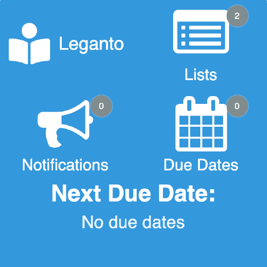
| Leganto UI integrated into campusM | Leganto UI integrated into campusM | Example live tile of 2 x 2 dimensions |
 |
 |
 |
Live Tile Configuration Rules
The Leganto live tile is designed to work with the following sizes. The tile will attempt to display as many elements as possible regardless of the dimensions set, but we cannot guarantee the intended experience if you do not adhere to the following dimensions. The tile dimensions are set in the App Builder, while the widgets per row (and other details) are set in the Configuration page for this product integration.
- 1 wide x 1 high
- This is a special case. The tile only displays one widget (the highest prioritized, enabled widget).
- 2 wide x 1 high
- We recommend using 1 - 2 widget rows and using 1 - 3 widgets per row.
- 2 wide x 2 high
- We recommend using 2 - 3 widget rows and using 1 - 3 widgets per row.
- 3 wide x 1 high
- We recommend using 1 - 2 widget rows and using 2 - 4 widgets per row.
- 3 wide x 2 high
- We recommend using 2 - 3 widget rows and using 2 - 4 widgets per row.
We also recommend keeping the header text and widget labels for the live tile short.
Technical Overview
The following section describes technical information for the Leganto product integration.
Prerequisites
The following are the prerequisites for the Leganto product integration:
- IDP must return the AlmaID attribute. The Alma ID attribute is a unique ID controlled by the customer that is defined per student/staff member in Alma. For CMAuth, this attribute can have any name in the IDP attribute response (from SAML/OAUth/LDAP) but needs to be mapped in Additional Mapping in the CMAuth Integration Profile. Otherwise, the AlmaID attribute must be returned in the LDAP attribute response. Due to this new mapping in the authentication token, users need to log out and log in again to the app. This is the same AlmaID configured for the Primo VE product integration.
- Handshake between Alma and campusM: to enable secure access to Primo VE, an authorization token must be configured in Alma (Configuration > Discovery > Customer Settings > app_authorization_token). The same code must be configured in the app (App Manager > Product Integrations > Add Product Integration > Primo VE > Authorization Code). This is the same authorization token configured in Alma for Primo VE product integration.
If you do not have Primo VE, contact Ex Libris Support (by opening a Salesforce case) to update this parameter for you.
Technical Flow Diagram
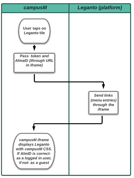
The following is the technical flow diagram for the Leganto product integration:
The user logs in to the app and the Leganto tile is available.

The user selects the Leganto tile.

Product Integration Configuration
To configure the Leganto product integration, select Product Integrations > Add Product Integration and select Leganto.
The following table describes the configuration options available on this page.
| Field | Description | Mandatory | Data Type | Default | Example |
|---|---|---|---|---|---|
| Manage Integration | |||||
| Enable Product Integration | Select to enable product integration on the user's app. | No | Checkbox | ||
| Product Integration Description | A description of the product integration for internal use. | Yes | String | Leganto | |
| Screen Title | The title that displays in the top header of the service. | No | String | Leganto | |
| General | |||||
| Base URL | The base URL of your Alma instance. | Yes | String | https://alma-eu02.campusm.exlibrisgroup.com | |
| Institution Code | The Leganto institution code. | Yes | String | 01CM_INST | |
| Authorization Code | Must be the same authorization token as in Alma, in the following format: "^((?=[^\\s])[\\w\\W\\d]){8,}$" For more information, see Prerequisites section. |
q58151J4bD | |||
| General Error Message | General error message if the page fails to load. | No | String | Please try again later. | |
| Landing Page | Select whether you want Leganto to open with All Lists or My Lists. | No | Radio buttons:
|
All Lists | |
| Live Tile | |||||
| Enabled | Select to enable Live Tile | No | Checkbox | Yes | |
| Badge Color | Select a color for the badge | No | Color Code | #FFFFFF | |
| Show Live Tile Header Text | Select to display the header on the live tile. If cleared, the text does not appear in the header. If both the header text and the header logo are disabled, the header does not appear. | No | Checkbox | No | |
| Show Live Tile Header Icon | Select to display the logo on the live tile. If disabled, the logo does not appear in the header. If both the logo and the header text are disabled, the header does not appear. | No | Checkbox | No | |
| Header Width | This sets the width of the header on the live tile. The header can take up a width of 1 or 2 widget slots. | No | Dropdown | 1 | |
| Customise Live Tile Header Padding | If enabled, enables you to customize the blank space around the header block. All values have a minimum of 0. | No | Checkbox | No | |
| The First Widget(s) Should Display on the Same Row As the Header | If disabled, the first widget row will start below the header. | No | Checkbox | Yes | |
| Widgets Per Row | This sets the number of widgets to display per row. There is a minimum of 1 and a maximum of 5. | No | Integer | 2 | |
| Show Lists | If disabled, the widget will not appear on the live tile. | No | Checkbox | Yes | |
| Show Notifications | If disabled, the widget will not appear on the live tile. | No | Checkbox | Yes | |
| Show Due Dates | If disabled, the widget will not appear on the live tile. | No | Checkbox | Yes | |
| Show Next Due Date Row | If disabled, the widget will not appear on the live tile. | No | Checkbox | Yes | |
| Include Due Dates in the Future Num of Days | Set the number of days to look for upcoming items that will be due. | No | Integer | 7 | |
| Always Display Widget Count | If enabled, all widgets will display the count even if the count is 0. | No | Checkbox | Yes | |
| Priority | This ordered list prioritizes the items that appear on the live tile. The item at the top of the list appears first, while the last item appears last. | No | Ordered List |
|
|
| Use Custom Icons | Select to use custom icons instead of the default live tile icons. | No | Checkbox | No | |
| URL for Icon | Enter the URLs of custom images for the icons of the various widgets. | No | String | ||
| Live Tile Header Text | This sets the text for the live tile header. It is displayed if the Show Live Tile Header Text checkbox is selected. It is recommended you keep this text short. | No | String | Leganto | |
| Text - "Lists" | Displayed underneath the widget, if enabled. | No | String | Lists | |
| Text - "Notifications" | Displayed underneath the widget, if enabled. | No | String | Notifications | |
| Text - "Due Dates" | Displayed underneath the widget, if enabled. | No | String | Due Dates | |
| Text - "Next Due Date:" | Displayed as the label for the Next Due Date section. | No | String | Next Due Date: | |
| Text - "No due dates" | Displayed under the Next Due Date label if there are no upcoming items due | No | String | No due dates | |
| Date Format (long) | You can enter any ISO-standard date format here. For more information on LL, LLL and LLL, see Locale aware formats at Moment.js Documentation. | No | String | LL | |
| Import/ Export Configuration You can configure product integration and then export it to another campusM environment, for example, from sandbox to production or from preview to production. |
|||||
| Export | Create a JSON file with all product integration configurations. | No | |||
| Import | Use this option to load configuration from JSON of an exported product integration. | No | |||

