Branding Guidelines
Ex Libris can create branding assets for your app based on your institution's branding guidelines. If your institution does not have branding guidelines, provide the project team with as much information as possible regarding the branding you are interested in.
In addition to the institution's branding guidelines, a list of tiles (with the tile names) is also needed for the designer.
This guide is intended for graphic designers, App Manager users, and project managers. It outlines the individual Branding Assets which compound the branding process. If you choose to create the branding in-house, you will find all the needed information in this guide.
This guide will also be helpful if you wish to make changes after go live.
All dimensions are in pixels unless specified otherwise. The recommended image format is png.
All-Platform Assets
The assets discussed in this section span the different application platforms. These assets and branding will be applied across iOS, Android and the Responsive Web.
App Name
The app name is the title that appears under the icon on the device’s homepage. This is the name that comes from the branding exercise.
|
Item |
Requirements/Restrictions |
|
App Name |
12 Characters |
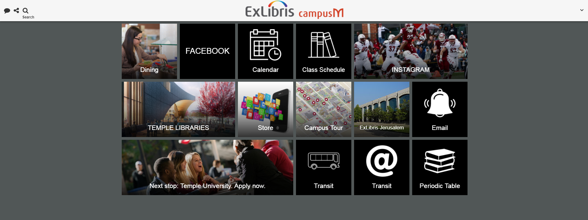
Homepage Tiles/Icons
Below are examples of two apps. The app on the left uses full images as tiles while the one on the right uses icons on top of black colored tiles. The shape of the tile image can be selected in App Manager.


Tile width and height can also be set. Tiles are measured in Tile Units. In these examples, the timetable has a width of 2 Tile Units. Homepage Banners are 3x1 Tile Units. Tile dimensions are in this table:
|
Height/Width (Tile Units) |
1 |
2 |
3 |
4 |
|---|---|---|---|---|
|
1 |
180x180 |
180x375 |
180x570 |
180x765 |
|
2 |
375x180 |
375x375 |
375x570 |
375x765 |
|
3 |
570x180 |
570x375 |
570x570 |
570x765 |
|
4 |
765x180 |
765x375 |
765x570 |
765x765 |
Be aware that some devices do not support four columns. For these devices, the table is resized to 2 or 3 columns instead.
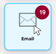
You can also set the hover color to change the tile color behind the icon when tapped or when the mouse hovers over the icon:

Note that when displaying icons on a tile, the Menu Option Text comes from App Manager. If you use a full image, ensure that you have the text as part of the image.
|
Item |
Requirements/Restrictions |
|---|---|
|
Icon on tile |
120x120 Max: 50k |
|
Tile color |
Hex Value |
|
Hover color |
Hex Value |
App Background Color
This is the color of the background, behind the tiles or images on the app.
For example, below are two screenshots of the same app. One with white background and one with black background:

|
Item |
Requirements/Restrictions |
|---|---|
|
Background color |
Hex value |
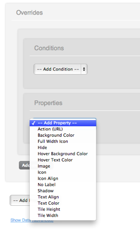
Overrides
Overrides enable you to customize all the above configurations depending on pre-defined conditions. These conditions include, for example, platform and screen size, allowing you to deliver completely different experiences depending on the end user’s device. These conditions are set in App Manager. The conditions and properties are visible in the following screenshots:

Recents Images
Recents images are currently not in use.
|
Item |
Requirements/Restrictions |
|---|---|
|
Recents Images (One per Menu Option) |
120x120 Max: 50k |
Mobile Assets
App Icon
This is the image displayed above the app name on the home screen of the mobile device. This icon is also used in the App Store and in Google Play to represent the app. Different dimensions are required for app submission. Please also note that iOS automatically rounds the corners of all app icons, so you should avoid rounding the corners yourself in case it conflicts with Apple’s rounding algorithm.
Please see here Apple's app icon general and transparency guidelines:
https://developer.apple.com/design/h...ages/app-icon/


|
Item |
Requirements/Restrictions |
|---|---|
|
App Icon |
Format: png 1024 x 1024 pixels please note that all icons should be opaque. |
Android Feature Graphic
The feature graphic is displayed on top of the Google Play Store listing. This link provides additional information on the purpose of a feature graphic, and further links to Google provided design guidelines.
|
Item |
Requirements/Restrictions |
|---|---|
|
Android Feature Graphic |
1024 w x 500 h JPG or 24-bit PNG (no alpha) |
Splash Screen
The Splash Screen is displayed when the app is first opened on iOS devices.
|
Item |
Requirements/Restrictions |
|---|---|
|
iPhone Splash Screen |
640x940 |
|
iPad Splash Screen (Portrait) |
768x1024 |
|
iPad Splash Screen (Landscape) |
1024x768 |

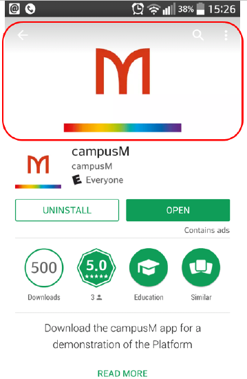
Homepage Header
The homepage header can either be a graphic image or text. We recommend that customers use header images that have transparent backgrounds. In the image below, the orange "campusM" logo is a transparent image.

|
Item |
Requirements/Restrictions |
|---|---|
|
Graphic Header |
Transparent 640x88 Max: 100k |
|
Graphic Header |
Portrait: Transparent 1536x88 Landscape: Transparent 2048x88 Max:100k |
|
Header Text |
32 characters |
Responsive Web Assets
Header Image
This is the image that is used in the colored header bar on the Responsive Web Page for your app. This image should be transparent otherwise the background color may clash with the header bar color.
|
Item |
Requirements/Restrictions |
|---|---|
|
Responsive Web Homepage Banner |
339x73 Max: 15k |
Summary of Required Branding Items
Here is a summary list of all the items above which are required for the branding process. An Excel version checklist is also available for your convenience.
|
Item |
Requirements/Restrictions |
|---|---|
|
App Name
|
12 Characters
|
|
Icon on tile
|
120x120
Max: 50k |
|
Tile Color
|
Hex value
|
|
Hover Colour
|
Hex value
|
|
Background color
|
Hex value
|
| Recents Images (One per Menu Option) | 120x120 Max: 50k |
| Homepage Banners | 570x180 Max: 50k |
| App Icon | Format: png 1024 x 1024 (*no alpha, iTunes Connect) |
| iPhone Splash Screen | 640x940 |
| iPad Splash Screen (Portrait) | 768x1024 |
| iPad Splash Screen (Landscape) | 1024x768 |
| Graphic Header | Transparent 640x88 Max: 100k |
| iOS Header Text | 32 characters |
| Android Feature Graphic | 1024 w x 500 h JPG or 24-bit PNG (no alpha) |
| Responsive Web Homepage Banner | 339x73 Max: 15k |