
Feature Focus – My Calendar
With React Native, we have taken the opportunity to completely redesign the calendar function within campusM, given that this is the most used feature across our customers. Taking design cues from what students are used to, we have created a calendar experience that intuitively presents schedule information across multiple calendar feeds in one place.
Calendar Interface
The calendar interface shows the end-user's scheduled activities for a selected day. The label of each activity includes information about the activity, the feed to which it belongs, and its start and end times. Selecting an activity opens the Activity Details page.
Scheduled activities appear in the calendar color-coded to indicate the feed to which they belong, such as a course timetable or an event product integration. Events from event feeds are included in the calendar only if the end-user either registered for them or tagged them as favorites. Events tagged as favorites are marked with a Heart icon ( ). Favorites for which the end-user did not register appear in the calendar with a lighter background color than events for which they did register.
End-users can easily open the calendar from any location in the app by selecting the Calendar button ( ) in the menu bar at the bottom of the screen.
By default, the Calendar button appears in the menu bar for all customers who have active timetables and/or event product integrations. Customers who do not have any active timetables, but do have event product integrations, or who do not have any event product integrations nor any CAL endpoints, can have the Calendar button removed if they wish. To do so, open a support ticket, and request that the Show events from other sources in calendar feature flag be disabled (in App Settings > Feature statuses).
The following image illustrates many of the calendar interface's features:

- Last Refresh Date & Time – The date and time at which the timetable data was last updated on the device. Tap this message to update the timetable data (see Refreshing the Calendar, below).
- Go to Today Button – Select this button to display the calendar for the current day.
- View Button – Select this button to switch from Day view to Agenda view (see Day and Agenda Views, below).
- Date Display and Selection Region – Shows the currently selected date, either within its week or within its month, depending on the selected view (see #8 below). Select a different date to view its calendar. If the desired date is not currently displayed, drag the date area down/up for the previous/next week (of the selected month) or right/left to display the previous/next month. When the first week of the month is visible, drag down on it to refresh the timetable data (see Refreshing the Calendar, below).
- Date of Displayed Calendar – If a date other than the current date is selected, the blue highlight indicates the currently selected date.
- Current Date – The black highlight indicates the current date.
- Calendar Selector – Customers can deploy multiple calendar feeds to populate end-users' calendar. Each feed is provided with a configurable name and a color. The end-user can view all calendars in a blended view or filter to individual calendar views by selecting the calender name. To view only future events from event product integrations, the end-user can select Upcoming events. Note that days with activities in a currently displayed calendar feed have color-coded dots for each type of activity scheduled on that day.
- View Selector – In week view, drag the selector down to open the month view; in month view, drag the selector up to switch to week view.
- Calendar Event – An event summary is shown in the calendar view. The color identifies the calendar feed containing the event. A Heart icon () indicates that the event was selected by the end-user as a favorite. Selecting an event opens the event's Details screen.
- Favorite Event – Unregistered events that were tagged as favorites by the end-user appear in the calendar with a lighter background.
Agenda and Day Views
End users can choose from two calendar views:
- Agenda view – The schedule for the day is displayed as a list of activities, presented as equal-sized rectangles, each of which represents a single activity, regardless of its duration. Times for which no activities are scheduled do not appear in this view. Scrolling up or down shows previous and future days' schedules. If the first day shown is not the current day, the first day shown is lightly highlighted in the date display above the list of activities.
- Day view – The schedule for the day is displayed as a grid in which each row represents an hour, and the height of each activity indicates its duration. Times for which no activities are scheduled appear in this view as blank rows. Activities that have start times but no specified end times occupy one hour in the calendar display. Long-pressing the activity opens its full label in the Details Drawer at the bottom of the screen (see Day View – Additional Features, below).
|
Calendar in Agenda View
|
Calendar in Day View
|


The default view – the view students see the first time they open the calendar – is Agenda view. Nevertheless, the app saves information about the last view employed by the student, and implements that view until the student switches to the other view.
- To switch from Agenda view to Day view, select
 .
. - To switch from Day view to Agenda view, select
 .
.
Day View – Additional Features
Certain additional calendar-display features are available in Day view, as show in the following illustration:

- Highlighted Activity – Long-pressing an activity highlights it and opens the Details Drawer (#3) at the bottom of the screen.
- Current Time Marker – When the schedule for the current date is displayed, a marker provides a visual indication of the current time.
- Details Drawer – When an activity is highlighted, displays its full label.
Refreshing the Calendar
End-users can employ any of the following methods in order to update the schedules of activities in their calendars:
- Tap the Updated... line at the top of the calendar
- When the first week of the month is visible in the calendar area (above the schedule of the selected day; in Week or Month view) drag down from the row of that week in the calendar area.
- Drag in the schedule area:
- In Day view – When 12:00 AM is visible at the top of the timeline, drag down from the 12:00 AM row.
- In Agenda view – When the first activity of the day is visible, drag down from it.

Activity Details Page
Selecting an activity in the calendar opens the Activity Details page of the activity. Exactly how this page looks varies depending on the type of feed and the configuration of the activity. The following are examples of an Activity Details page for a scheduled class and an Activity Details page for a scheduled event from an event PI.

- Course name
- Lecturer name
- Link to lecturer email
- Button to add the activity to the device's native calendar
- Link to open the campusM Position page of the event
- Map showing the location of the activity; select the map to open the device's map app and show the location of the activity on it
- Link to online event

- Image
- Event Title
- Favorite/Registered badge
- Event tag
- Event Description
- Button to add the activity to the device's native calendar
- Scheduled alerts for the event (see as configured by the end-user in Settings > Notifications > Calendar Reminders; see Calendar Reminders, below)
Day View Tile
The Day View tile shows end-users their next activity of the day, taking the information from the new calendar, so that it includes information from timetables and other event PI feeds. Events for which the end-user registered appear in the Day View tile, but unregistered events that were tagged as favorites do not. Selecting the tile opens the calendar with the activity displayed.
- If you add a Day View tile to your app, and the app already has a Timetable tile, it is recommended to remove the Timetable tile, because it essentially serves the same purpose as the Day View tile.
- Although the Day View tile can be added to the Web app, it is not recommended to do so at this time, because the Web-app does not yet support the React Native calendar, so activities may appear in the Day View tile that do not appear in the calendar.
Day View Tile Showing an Upcoming Activity

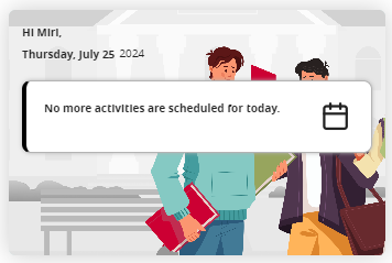
Day View Tile When No Activities Are Upcoming
When the end-user has no remaining activities scheduled for the day, the tile appears with a standard background image and message. Several versions of the background image, employing different color themes to better match each institution's standard color-scheme, are available for selection in the tile's configuration. A default message – “You have no more activities today!” – is defined, but this message can be changed, as required.
|
Day View Tile with No Activities and the Background Image in Its Default Colors
|
Day View Tile with No Activities and the Green Version of the Background Image
|

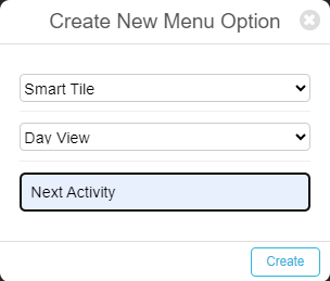
Adding and Configuring a Day View Tile
You can add a Day View tile from the App Manager, in the App Builder. In the Create New Menu Option dialog box, in the first field, select Smart Tile, and in the second field, select Day View. In the third field, enter a title for the tile. For additional information about working with the App Builder, see Creating Services.
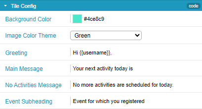
Default values are defined for all of the tile's settings. If you want to customize any of the settings, you can do so in the Tile Config section, as follows:
- Background Color – The background color of the tile when information about an upcoming event is displayed in it
- Add Image Color Theme – The color-scheme of the background image that appears in the tile when there are no upcoming events
- Greeting – The greeting that appears at the top of the tile
- Main Message – The message that appears when information about an upcoming event is displayed in the tile
- No Activities Message – The message that appears when no additional activities are scheduled for the current day
- Event Subheading – A message that appears in the tile when the next activity is an event for which the end-user registered; the message is displayed above the name of the event. (For timetable events, the calendar name is displayed in this location.)
To include the user's name in a message, insert this code: {{username}}.
Calendar Reminders
End-users can set up reminders for all calendar activities (classes, events, etc.). They can determine whether or not to receive reminders for each type of activity, and can set the timing for the reminders they choose to receive. Reminders pop-up on end-users' devices at specified intervals before the activities are scheduled to take place. (They are not included in the Alerts list.) Selecting a reminder opens the app to the homepage.

- Calendar reminders are supported both for customers who use the Attendance module and for those who do not. However, activities that are managed through the Attendance system are not handled by the calendar-reminder feature, because the Attendance system generates notifications for these activities (see campusM Attendance Student Experience).
- Customers who require their reminder notifications to be translated into other languages should open a support ticket and specify what they want to add to their language pack.
Configuration for this feature is part of the app settings, so end-users can configure their notification settings themselves. Notifications for each timetable endpoint can be configured individually, and end-users can choose whether to have notifications at all, and if so, whether to have multiple reminders for each activity, at specified times before they are scheduled to take place. For example, they could choose to have reminders for events 1 hour before they are scheduled to begin, and reminders for exams 5 minutes and 15 minutes before they are scheduled to occur.
Configuring Calendar Reminders
By default, all timetables are set to generate one reminder for each activity, 15 minutes before it begins. End-users modify their reminder settings in their app settings.
- In the app, navigate to Settings > Notifications > Calendar Reminders. The Manage Calendar Reminders page opens, and shows the current settings for each timetable for which reminders can be set up. (In systems in which the Attendance module is deployed, the Attendance timetable is not included here.)
 Reminder Settings Configured for Each Timetable Endpoint in the System
 - To turn reminders off or on for a timetable, tap its switch.
When you turn on reminders in this way, they are automatically set to their default setting – one reminder, 15 minutes before the start time of each activity.
- To modify the settings of the reminders of a timetable, tap the current setting below the name of the timetable (e.g., tap 15 minutes before).The Timetable Alerts drawer opens. To activate or deactivate an option in the list, select . Multiple options can be selected at the same time.
- Drag down from the top of the drawer. The drawer closes, and the modifications are implemented.
Viewing Reminder Settings for an Activity
The reminder settings for each activity are displayed in its Activity Details page (see Activity Details Page, above).
