March 2018
All sandbox apps (also known as customer beta apps or dev apps) will be moved to the latest version on February 19, 2018 as part of campusM's monthly release. Hockey app builds for native apps will be made available during the week of February 19, 2018. This version will be available to deploy to live from March 5, 2018.
New Features
App Builder: Roles in Alphabetical Order 
Coming from Ideas Exchange: In the App Builder, roles now appear sorted as follows: uppercase sorted alphabetically, followed by lowercase sorted alphabetically.

Roles List
App Builder: Tile Style Changes
Previously, as part of the redevelopment of the home screen to enable personalization, certain tile style properties were changed or removed. New tile style properties were added to replace the removed styles, and additional, obsolete styles were removed.
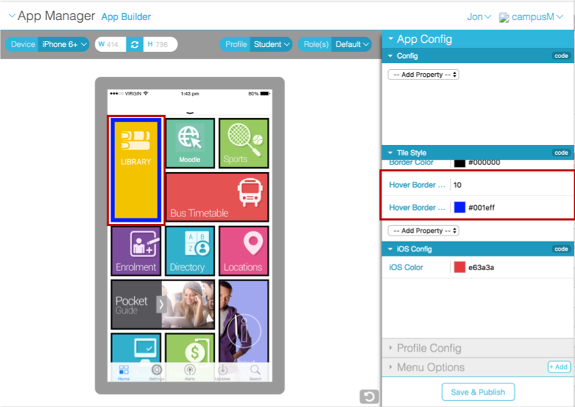
Hover Border Size and Color

Hover Border Size and Color
New Tile Style Properties
| Property | Description |
|---|---|
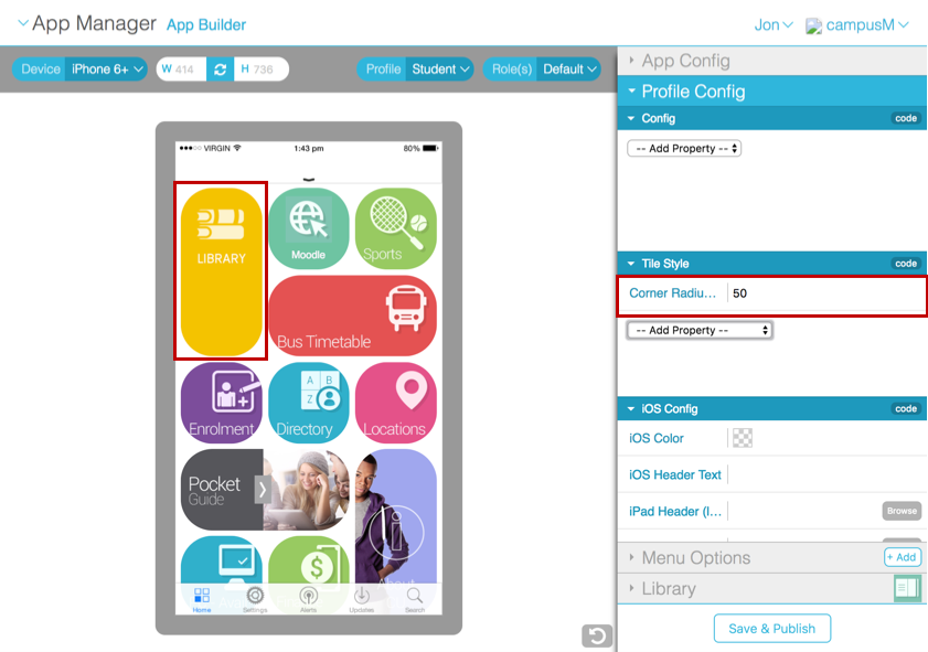
| Corner Radius (Pixels) | Adds a rounded corner to the tiles.
Use this to replicate the previous rounded tile appearance by adding a 5-pixel radius.
|
| Text Overlay |
Provides a gradient fill over the top of the tile image, which enables label text to be rendered more accessibly.
Select Show Overlay to make the overlay visible or Hide Overlay to remove the gradient fill.
Note: Current feature will take effect when Property "Full Width Icon" is set to YES only.
|
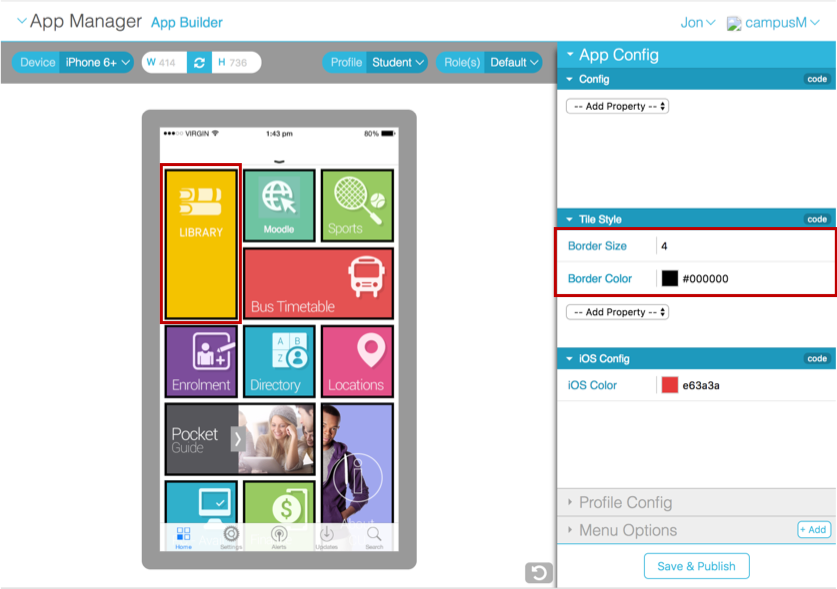
| Border Size | Sets the tile border width, in pixels.
Use this to add the legacy shadow effect by applying a border width of 1 pixel.
|
| Border Color | Sets the tile border color.
Use this to add the legacy shadow effect by applying a border color of #dddddd.
|
| Hover Border Size | Sets the tile hover border width, in pixels. |
| Hover Border Color | Sets the tile hover border color. |
Removed Tile Style Properties
| Property | Description |
|---|---|
| Shadow | Superseded by border size and color. |
| Icon Alignment | Icon images are now centrally aligned. |
| Text Alignment | These properties related to how label text was shown on the tile. These are superseded by Text Overlay (see above), which provides a gradient fill over the top of the tile icon, making the label text visible. |
| Text Box | |
| Text Box Background | |
| Text Box Foreground |
Adjustments have been made to the following App Configuration properties:
- 'Header Image' relabelled to 'Header Image (web)'
- 'Header Background Color' relabelled to “Header Background Color (web)'
- 'Header Foreground Color' relabelled to 'Header Foreground Color (web)'
Adjustments have been made to the 'Image Fit' Tile Style property.
- The default setting for the image fit behavior is 'Contain' and has been removed from the selection dropdown for this property.
Notification: Removed Settings
As part of our program to enhance and simplify the App Manager, the following obsolete parameters for notifications were removed.
- Priority
- Category
- Expiry
Notification: Multiple Recipient Warning
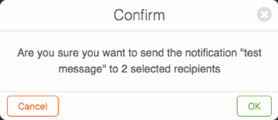
Customers will now see a Confirmation message if they attempt to send a notification to two or more recipients within App Manager. This is to ensure that bulk messages are not sent incorrectly.

Resolved Issues
| Issue | Affected Platform | Salesforce Case Number (s) |
|---|---|---|
| Potential click jacking vulnerability from the Web App and App Manager. |
|
00496468 |
| The Menu Option description overlapped with the check box within the list view as part of Personalization. |
|
N/A |
| Added the ability to add corner radius to tiles within the home screen (see above). |
|
00454610 |
Known Issues
- There is a known issue with applying Borders to Banner tiles and Live Tiles. In this instance, borders are not shown within the web and native apps. This will be resolved in the May 2018 release.
- There is a known issue with applying corner radius on live tiles. In this instance, the corner radius will not be applied within the web and native apps. This will be resolved in the May 2018 release.


