
Best Practice Toolkit: Benchmark Analytics
What is it?
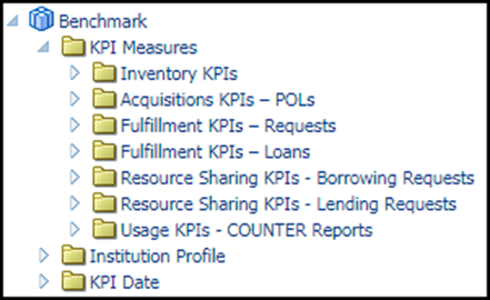
Benchmark Analytics compare your library to similar libraries on:
- Inventory KPIs
- Acquisitions KPIs
- Fulfillment KPIs for Requests and Loans
- Resource Sharing KPIs for borrowing and lending requests
- Usage KPIs through COUNTER reports.
Why?
If you’re not sure where you may or may not need to reevaluate the processes and practices of the library, this is a good place to start.
Some of the questions that can be investigated with these reports include:
- What is the average time of my institution from when an order is sent until the eResource is activated compared to other institutions?
- What is the average time for a physical item hold request to be processed compared to other institutions?
- What is the percent of loans that were returned late compared to other institutions?
Where is it?
You can retrieve the reports in Analytics. The following fields are available in the folder for Benchmark folder under Alma Analytics:
Design Analytics > Catalog > Shared folder> Alma folder> Benchmark folder.
Setting it up:
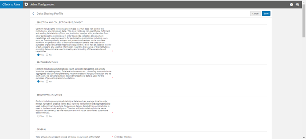
To be able to get benchmark analytics report, you need to configure the data sharing services at Configuration > General > General Configuration> Data Sharing Profile.
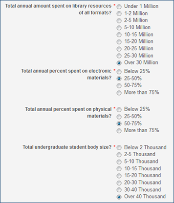
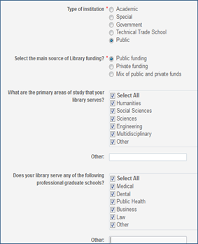
Click Yes to the first 3 questions and answer the below 10 questions for us to match you with libraries similar to your size. Click save on the top right.
What does the report look like?
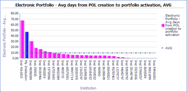
- The dotted line is the average.
- The blue bar is “my institution”.
- The pink bars are all other institutions.
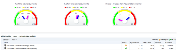
- In the KPI Watchlist folder, it provides a summary of various KPIs which can be seen together.
- The gauges inform the user where his institution (blue dial) stands in comparison to other institutions (pink dial):

- The “Inventory Total” tab allows the institution to compare its inventory to other institutions:
- The dotted line is the average
- The blue bar is “my institution”
- The pink bars are all other institutions