User Experience and Accessibility
Return to Alma Roadmap Highlights Overview

User Experience & Accessibility
Overview
Alma is designed as a modern and intuitive interface. We aim to allow the user to be efficient and to ensure that workflows are as simple as possible. We also take into consideration accessibility, allowing people with disabilities to easily use the software.
in June 2016 Ex Libris started a long-term journey for improving the Alma User Experience. Initially, we aimed to improve the stratification of users in the UI. We focused on visual design, most used workflows, navigation, screen layout, system-wide tools, and messages. Following this first phase, we started a second phase in 2018 focusing on the Metadata Editor, workflow pain points, and system-wide tools. Through 2019 and 2020 we started to introduce new UI concepts, with the intention of implementing them in Alma throughout different areas of the system. We've already started with the New Layout and soon we will implement 'side by side' and the slide-out panel.
At Ex Libris, we make every effort to ensure that Alma can be used by everyone. Alma is continually designed and developed to meet Level A and AA of the W3C Web Content Accessibility Guidelines (WCAG 2.1) and Section 508 of the US Rehabilitation Act for features and functions. See Alma Accessibility Statement
For more details on current rollout plans see Usability Improvements.
| 2016 - 2018 - new UI | 2019 - 2020 - new concepts | 2021 and beyond - apply concepts across the system |
 |
 |
 |
|
|
|
Alma new UI concepts
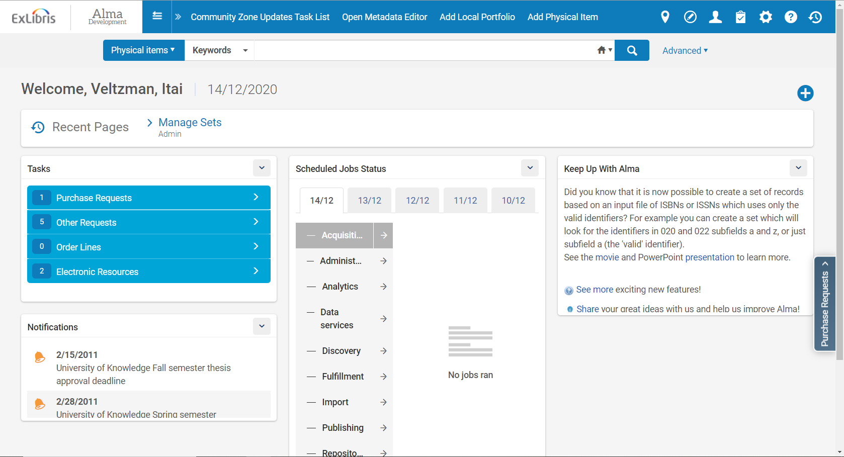
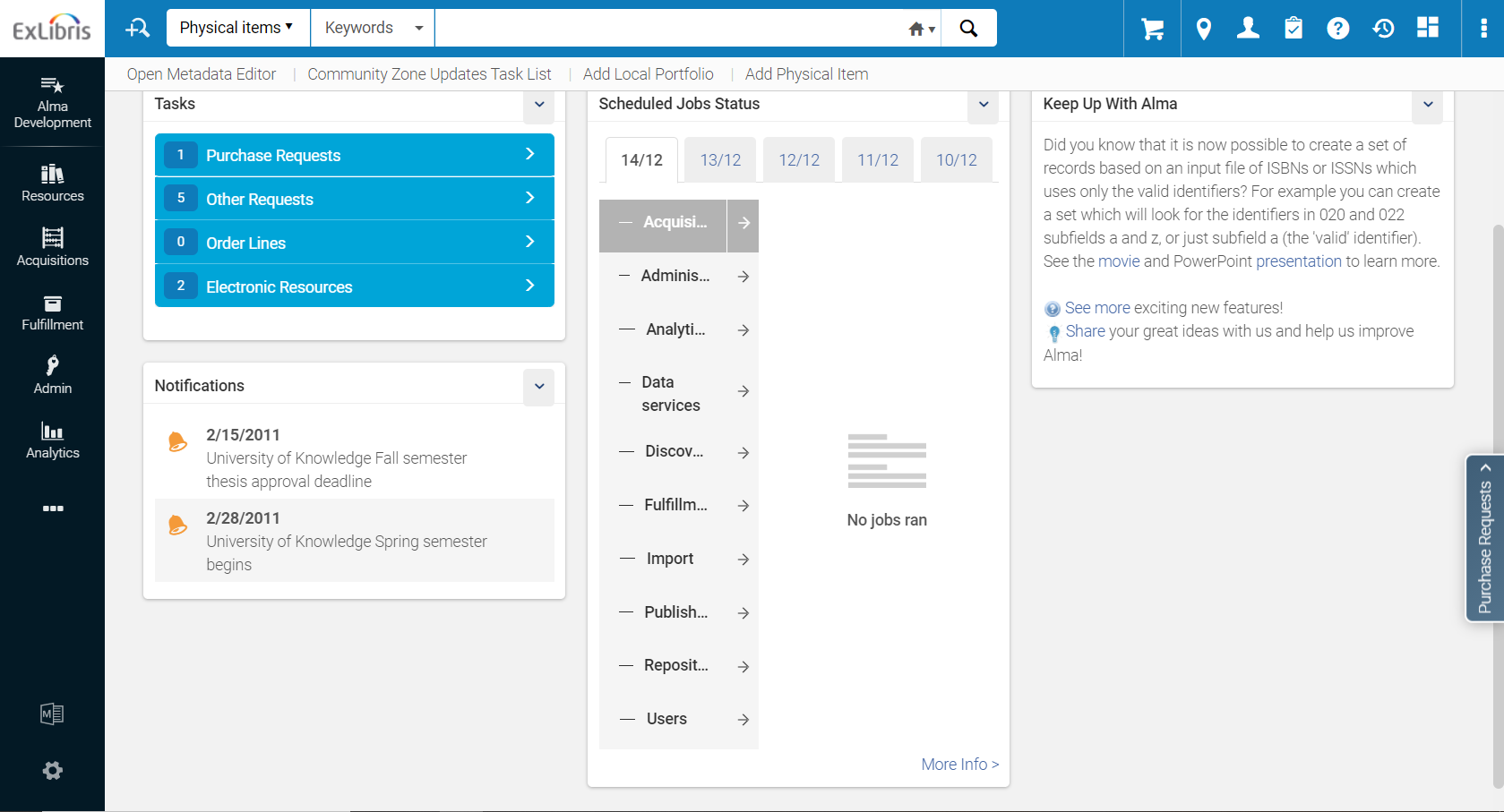
New Layout
What we learned about Alma navigation from our user study:
- the menu should be more scalable,
- vertical space is very expensive,
- there are too many elements at the top of the screen.
- users have to scroll a lot.
As result, we decided to change the menu navigation to be on the side. This provides the user with a focused work area, optimized use of space, scalability, less scrolling, and a menu that is easier to navigate. The new layout is compounded of a new vertical customizable menu and a header with search always on top, as well as the summary section on the side, aimed to optimize the use of space. The new layout gives the user more options to customize their menus and facilitates improved user workflows.
Side by Side
From the user study we learned about list management:
-
Too many clicks involved in repetitive work
-
It is hard to find mistakes in a list
-
It takes the user a long time to make small changes
-
Space usage is not optimal
Slide-out panel
As part of our user study, we learned that one of the important things that users look for is to keep their work in context while reviewing a list. The slide-out panel presents a full editing form for a specific entity, without the need to switch to a new page and thus lose context. When the user finishes the editing, the changes are saved, and the user is returned to the list and to the record that was in focus.
Disclaimer: the following mockup is the conceptual design of the slide-out panel. It illustrates the possible usage of the UI concept and might change when implemented for a specific form.
Cards
The card is a complementary concept to the side by side option. It will provide an optimized quick view and edit. The card will provide both a specific view for each role and entity and will also allow for performing quick inline editing.
Disclaimer: the following mockup is the conceptual design of the card. It illustrates the possible usage of the UI concept and might change when it will be implemented.
Roadmap
| 2021 H2 | 2022 H1 | 2022 H2-2023 |
2021 H2
Accessibility - WCAG 2.1 level AA
| What’s New | Highlights | Impact |
|---|---|---|
| All elements of Alma will comply with WCGA 2.1 level AA |
|
Users with disabilities will be able to better interact with Alma |
Safari Certification
| What’s New | Highlights | Impact |
|---|---|---|
| The user will be able to use the Safari browser |
|
Users will be able to use a larger variety of major browsers according to their preference |
2022 H1
Accessibility - high contrast color scheme
| What’s New | Highlights | Impact |
|---|---|---|
| The user will be able to use a special high contrast color scheme | The user will be able to utilize a special high contrast color scheme that complies with WCGA 2.1 level AA standard | Users with sight disabilities will be able to see elements more clearly |
Deep Linking
URM-121591: Deep linking capability for Alma
| What’s New | Highlights | Impact |
|---|---|---|
| The user will be able to use a generated link to access a specific record while logged in |
|
A quicker workflow involving external steps |
2022 H2 - 2023
Improved Configuration – Enhanced UX and wizard
| What’s New | Highlights | Impact |
|---|---|---|
| Improved access to configurations based on user workflows with easier editing and settings |
|
Users will be able to configure the system more quickly and intuitively |