
Primo VE Customization - Best Practices
Introduction
-
Analyzed search logs
-
Conducted surveys of librarians during workshops
-
Interviewed users at different academic levels and from various countries and disciplines
Additional Resources
-
Learn how to use js directives: https://github.com/ExLibrisGroup/primo-explore-package/tree/master/VIEW_CODE/js
-
All source code used for existing customer widgets: https://github.com/search?utf8=%E2%9C%93&q=primo-explore
-
All feature packages that customers have created: https://www.npmjs.com/search?q=primo-explore&page=2&ranking=optimal
Inspecting Web Elements with Your Browser
Most Web browsers provide developer tools that enable you to inspect the currently-loaded HTML and find specific elements on a page. In most browsers, you can either click F12 or right-click the page and then select the Inspect Element option.
In order to customize Primo VE, you should be familiar with the following: CSS, HTML, JavaScript, and AngularJS. Depending on your experience with each of these languages and frameworks, you can perform more complex customizations.
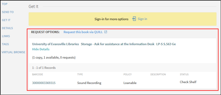
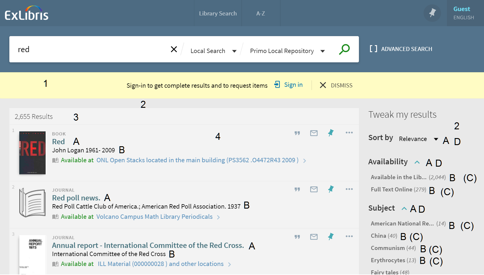
The following procedure shows how to use the browser's inspect tool to locate the code table used to define a label in Primo VE.
-
On the page that you want to inspect, press F12.
-
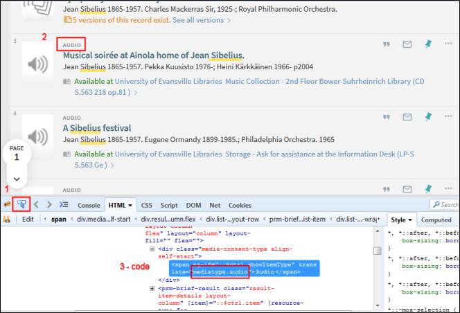
Select the inspect item button (#1) and then select the label (#2) that you want to modify. Each component highlights as you move the cursor over the item.
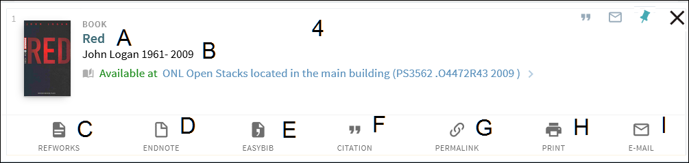
 Inspection Brief Results Page
 -
In the HTML tab, you should see the label and its corresponding code (#3). If you do not see a translate parameter, you can instead search for the label’s description on the All Code Tables page.
-
On the All Code Tables page (Configuration Menu > Discovery > Display Configuration > Labels), either search for the code or description (the actual display label).
The following figure shows an example of a search for a code:
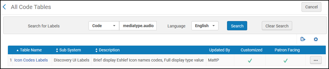 Code Search Example
The following figure shows an example of a search for a label:
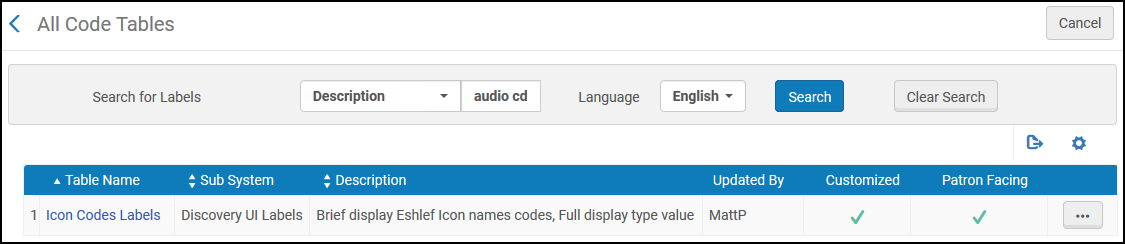 Label Search Example
Using the UI Customization Package Manager
The Customization Package Manager enables you to upload and manage customization packages, which enables you to brand and further customize Primo VE. If no packages are loaded, the system uses the out-of-the-box configurations.
Primo VE Administration Certification: User Interface Customization (7 min)
-
Database files (.db) are not permitted in your customization package. If the following error occurs while uploading your ZIP file, remove all .db files:
Validation error: File type db is not allowed in the zip file -
Set Windows to display hidden files if you cannot see any .db files in your customization package folder.
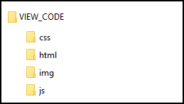
To ensure that a customization package integrates properly with Primo VE, ensure that its ZIP file is structured as follows:
-
<View_Code> – The top folder of your customization package. Ensure that you change the name of the top folder to your institution's view code, which must be in the following format: <institution_code>-<view_code>.
-
css – This subfolder contains the custom1.css file, which includes your CSS rules. These rules override corresponding rules in the default CSS.
-
img – This subfolder contains all customized images for Primo VE. To ensure that the correct image appears in Primo VE, ensure that you use the same file name as the original.
-
js – This subfolder contains the custom.js file, which includes your scripts.
-
html – This subfolder contains the following subfolders, which store all customized HTML files for Primo VE:
-
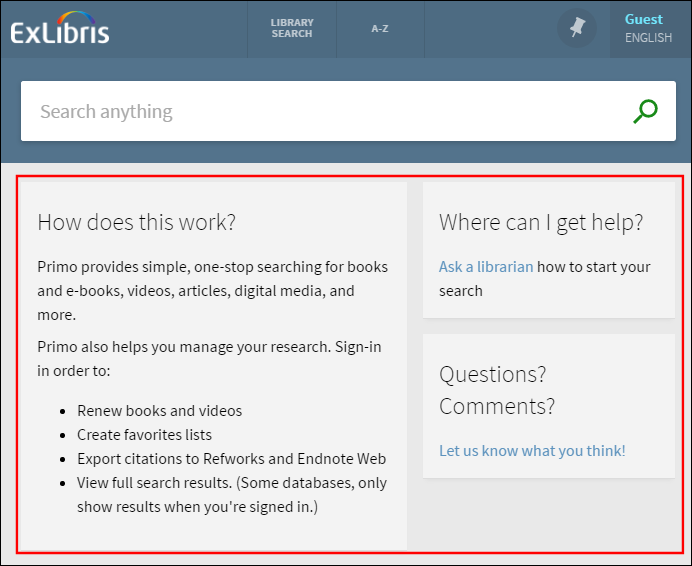
homepage – The homepage_en.html file enables you to customize the area of the page below the search box on the Primo VE Home page. To support other languages, you can create and upload new HTML files with the relevant language code. For example, homepage_fr.html. For more information, see Home Page.
 Primo VE Home Page
-
The system does not use content inside <script> tags.
-
Since this code is nested inside the main HTML code, wrap this code with a <div> tag (insets of the <html> tag).
-
-
email – The email_<2-character_language_code>.html template files (such as email_en.html) enable you to configure the layout and format of the emails (per supported UI languages) that are sent when users perform the Send To Email action. Note that the email folder is not created for you. For more information, see Customizing the Email Template.
-
help – The help_en.html file enables you to create a help page for your view. To support other languages, you can create and upload new HTML help files with the relevant language code. For example, help_fr.html. For more information, see Creating a Custom Help Page. Since a help page is not provided out of the box, you need to add the help directory to your customization package.
-
You can create a customization package from either the View Configuration page or Primo Studio, but you need to use the View Configuration page to deploy the customization package for both methods. For more information, see the following sections:
Accessing Primo Studio
Primo Studio enables you to interactively customize some aspects of your view and create a customization package for deployment with the View Configuration page in Primo VE. For more information, see Primo Studio for Primo VE.
-
Edit your view on the View Configuration page (Configuration Menu > Discovery > Display Configuration > Configure Views).
-
Select the Manage Customization Package tab.
-
Select Go to Primo Studio in the Create a Customization Package section.
Creating a Customization Package
-
On the Views List page (Configuration Menu > Discovery > Display Configuration > Configure Views), edit your view.
-
Select the Manage Customization Package tab.
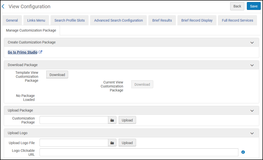 Manage Customization Package Tab
 -
Select Download to download the customization package. If this is the first time, download the template package. Otherwise, download the current package to ensure that you are using the latest version.
-
Unzip the file.
-
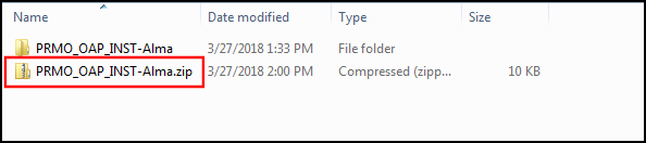
Ensure that the top folder of your package's zip file is the <View_Code> folder, which must have the following format: <institution_code>-<view_code>. For example, PRMO_OAP_INST-Alma.
-
As needed, customize the configuration files and folders associated with the home page, images, and CSS. You must retain the file structure and names of files that you are overriding. Refer to the following sections for details on how to brand and make simple changes to your view:
-
Zip the view code folder.
 Zipped View Code Folder
For Windows users, we recommend using a compression tool such as 7zip or Winrar instead of Windows Send to > Compress folder to avoid upload errors.
For Mac users, use the following procedure to zip and remove any hidden .DS_Store files:
-
Open the Terminal application under Applications > Utilities.
-
Move to the parent directory of the folder that you want to compress. For example:
cd /Users/<user name>/<parent folder> -
Enter the following command to compress the file:
zip –r <target file>.zip <My_View> -x "*.DS_Store"
-
-
Specify the name of the zipped package and click Upload.
-
Select Save to deploy the changes.
-
Refresh your view in the Web browser and test your changes prior to uploading the changes to the production server.
Adding a Clickable Logo
The Manage Customization Package tab on the View Configuration page (Configuration Menu > Discovery > Display Configuration > Configure Views) enables you to upload a new logo and define a link that opens a page when users click the logo. The following image formats are supported: PNG and SVG.
IE11 may not fully support the display of SVG images.
-
Edit your view on the View Configuration page (Configuration Menu > Discovery > Display Configuration > Configure Views).
-
Select the Manage Customization Package tab.
-
In the Upload Logo section, perform the following steps:
-
Select an image to upload in the Upload Logo File field.
The system places the following restrictions on the logo file:-
The file format of the image must be .png or .svg.
-
The height of the image cannot exceed 100 pixels.
-
The width of the image cannot exceed 300 pixels.
-
The size of the image cannot exceed 30 KB.
-
-
Select Upload.
If you want to remove the clickable logo, select Remove Logo.
-
If you want the image to be clickable, specify the redirection URL in the Logo Clickable URL field.
-
-
Select Save to save changes to the customization package.
Customizing the Email Template
Primo VE enables you to customize the format of emails sent to users after selecting the Send To Email action in Primo VE. You can customize the format with or without Primo Studio. With either method, you must upload the customized email templates with the View Configuration page. In addition, you can create separate email templates for each supported language in the UI.
-
The email template for Primo VE supports a maximum of 50 records. If a user sends more than 50 records, the system reverts to the classic email template, which was used in previous releases.
-
For security reasons, all links are removed from your email template.
The following figure shows the sample output of the out-of-the-box Email template for Primo VE.
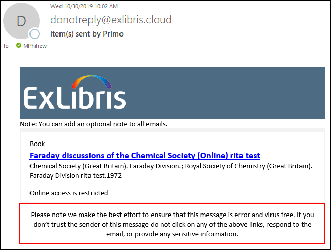
The Email template is in HTML format and includes the following sections:
-
Logo – Displays the same logo that is loaded with the Customization Package Manager (Configuration Menu > Discovery > Display Configuration > Configure Views). For more details, see Adding a Clickable Logo.
-
Institution note – Displays the text configured with the following code in the Send Email and SMS code table: nui.email.institutionNote. By default, this field has no value and does not display if left empty.
-
List of records – For each record, the email displays the record's brief display and availability statement.
-
Disclaimer – Displays the text configured with the following code in the Send Email and SMS code table: nui.email.disclaimer.
Configuration Options
The email_<2-character_language_code>.html template files (such as email_en.html) enable you to configure the layout and format of the emails (per supported UI languages) that are sent when users perform the Send To Email action in Primo VE. For more details and examples of how to customize the email templates, see the following page on GitHub:
Note that the default email template file is called email_en_US.html on GitHub.
-
If you decide to customize the out-of-the-box email template and your view supports additional languages, you must create and upload a separate template file for each language (including the default email_en.html file).
-
The alignment of the email's text is based on the email client settings.
After you have created or modified any email template files, edit your view (Configuration Menu > Discovery > Display Configuration > Configure Views), select the Manage Customization Package tab, and then use one of the following methods to upload the email template files to the UI:
-
Store the custom email template files under the html/email directory in your view's customization package and upload the entire customization package.
-
If you are not using a customization package, you can use the Upload Templates section to upload your email template files or choose to use the classic email template. By default, your view uses the new email template.
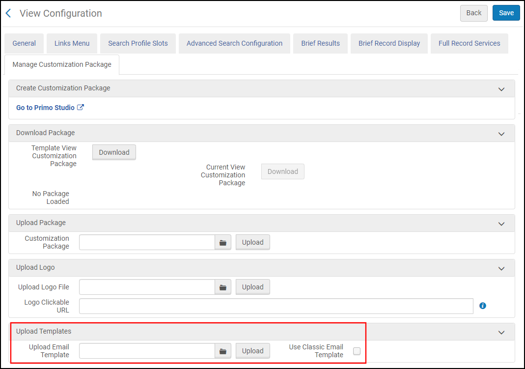 View Configuration Page - New Upload Templates Section
If you want to delete an email template file, remove the email template file under the html directory in the view's customization package and upload the modified package to the UI. If you want to revert to the out-the-box email template, remove all email templates under the html directory in the view's customization package and upload the modified package to the UI.
Customizing SVG Icons
Unlike other image files (such as PNG, GIF, and JPG), the SVG (Scalable Vector Graphics) format is an editable XML-based file that represents a detailed set of coordinates that tells your browser how to draw an image. Primo VE enables you to replace SVG images through the customization of the custom-ui.svg file, which is not provided by default and is stored under the /img directory of your customization package. This file contains an SVG container (wrapper) that may include one or more SVG elements, where each SVG element is a separate image that has its own SVG ID.
For example:
<?xml version="1.0" encoding="UTF-8" ?>
<svg xmlns=http://www.w3.org/2000/svg xmlns:xlink=http://www.w3.org/1999/xlink width="24" height="5000" viewBox="0 0 24 5000">
.
.
</svg>
You can replace existing icons by assigning the SVG IDs used to represent specific icons in Primo VE to the SVG elements that you add to the customization file's container.
-
In the browser, inspect the icon that you want to replace and get its SVG ID, which is used later in this procedure.
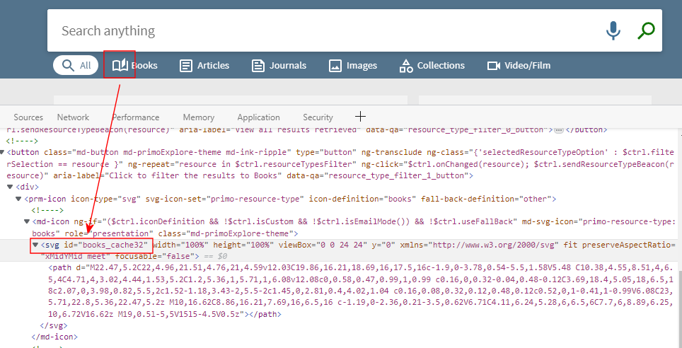 Inspect Icon in Browser
Do not include the _cache32 suffix in the SVG ID, only use books.
-
Edit the SVG file for your new icon and copy its SVG definition for later use in this procedure.
For example, the following SVG definition draws a heart image:
<svg xmlns=http://www.w3.org/2000/svg xmlns:xlink=http://www.w3.org/1999/xlink x="0px" y="0px"
viewBox="0 0 50 50" style="enable-background:new 0 0 50 50;" xml:space="preserve">
<path style="fill:#D75A4A;" d="M24.85,10.126c2.018-4.783,6.628-8.125,11.99-8.125c7.223,0,12.425,6.179,13.079,13.543
c0,0,0.353,1.828-0.424,5.119c-1.058,4.482-3.545,8.464-6.898,11.503L24.85,48L7.402,32.165c-3.353-3.038-5.84-7.021-6.898-11.503
c-0.777-3.291-0.424-5.119-0.424-5.119C0.734,8.179,5.936,2,13.159,2C18.522,2,22.832,5.343,24.85,10.126z"/>
</svg> -
In the Manage Customization Package tab on the View Configuration page (Configuration > Discovery > Display Configuration > Configure Views), download your view's customization package. If it does not exist, download the template and use it to create your view's customization package.
-
Under the /img folder, create or edit the custom-ui.svg file (if it already exists) and paste the SVG definition you copied in step 2 into the file's SVG container, remembering to include the SVG ID of the icon that you inspected in step 1.
In the following example, the heart icon replaces the Books icon in the Resource Types Filter Bar:
<?xml version="1.0" encoding="UTF-8" ?>
<svg xmlns=http://www.w3.org/2000/svg xmlns:xlink=http://www.w3.org/1999/xlink width="24" height="5000" viewBox="0 0 24 5000">
<svg id="books" xmlns=http://www.w3.org/2000/svg xmlns:xlink=http://www.w3.org/1999/xlink x="0px" y="0px"
viewBox="0 0 50 50" style="enable-background:new 0 0 50 50;" xml:space="preserve">
<path style="fill:#D75A4A;" d="M24.85,10.126c2.018-4.783,6.628-8.125,11.99-8.125c7.223,0,12.425,6.179,13.079,13.543
c0,0,0.353,1.828-0.424,5.119c-1.058,4.482-3.545,8.464-6.898,11.503L24.85,48L7.402,32.165c-3.353-3.038-5.84-7.021-6.898-11.503
c-0.777-3.291-0.424-5.119-0.424-5.119C0.734,8.179,5.936,2,13.159,2C18.522,2,22.832,5.343,24.85,10.126z"/>
</svg></svg>
Replacement SVG Definition for Books Icon -
Save the custom-ui.svg file.
-
Compress, upload, and save the customization package.
Image File Customization
-
library-logo.png – Contains the library logo.
-
favicon.ico – Contains the favicon.
-
icon_<resource_type_code>.png – Contains the image for the specified resource type <resource_type_code>—for example, icon_audio.png. These icons are used only for the resource type icons that appear as default thumbnails if there is no cover image. For information on how to customize SVG icons associated with the Resource Type Filter Bar, see Customizing SVG Icons.
From your Home page (homepage_en.html), you can use the HTML img tag to load any image stored in the /img directory. For example:
<img src="/discovery/custom/01INST-MyView/img/circdesk.png" alt="Circulation desk image">
Customizing the Shortcut Icon for IOS/Android Devices
In addition, you can change the shortcut icon that displays on the Primo VE home page for IOS and Android devices.
To change the shortcut icon:
-
Create a 150x150 pixel image for the Primo VE shortcut and give it the following name: home-screen-icon.png.
-
Edit your customization package and place the new shortcut image file under the img folder.
-
Zip and upload your customization package.
CSS Components and Customizations
Home Page
-
.prm-primary-bg.prm-hue1, prm-search-bar.prm-hue1, prm-spinner.prm-hue1.overlay-cover.light-on-dark:after, prm-topbar .top-nav-bar{}
-
.prm-primary-bg, prm-search-bar, prm-spinner.overlay-cover.light-on-dark:after{}
-
view_code/html/homepage_en.html
If you want to display a drop-down list for a specific search scope initially, include the search_scope parameter as follows in Primo VE's URL:
Brief Results Page
-
.alert-bar{}
-
md-content, md-content.md-primoExplore-theme{}
-
.section-title {}
-
.section-content .md-chips .md-chip strong{}
-
.md-autocomplete-suggestions .suggestion-scope, .text-italic{}
-
.link-alt-color, .section-title prm-icon {}
-
-
prm-search-result-list .results-title {}
 Brief Result Item Components
 -
prm-brief-result-container .list-item-primary-content {}
-
prm-brief-result .item-title{}
-
prm-brief-result .item-detail{}
-
.item-expanded .secondary-content-holder .md-tab:nth-child(2), .item-expanded .secondary-content-holder md-tab-item:nth-child(2){}
-
.item-expanded .secondary-content-holder .md-tab:nth-child(3), .item-expanded .secondary-content-holder md-tab-item:nth-child(3) {}
-
.item-expanded .secondary-content-holder .md-tab:nth-child(4), .item-expanded .secondary-content-holder md-tab-item:nth-child(4) {}
-
.item-expanded .secondary-content-holder .md-tab:nth-child(5), .item-expanded .secondary-content-holder md-tab-item:nth-child(5) {}
-
.item-expanded .secondary-content-holder .md-tab:nth-child(6), .item-expanded .secondary-content-holder md-tab-item:nth-child(6) {}
-
.item-expanded .secondary-content-holder .md-tab:nth-child(7), .item-expanded .secondary-content-holder md-tab-item:nth-child(7) {}
-
.item-expanded .secondary-content-holder .md-tab:nth-child(8), .item-expanded .secondary-content-holder md-tab-item:nth-child(8) {}
-
Hiding the Sign-In Link
Changing the Color of the Versions Link
-
Open the Discovery UI Labels code table (Configuration Menu > Discovery > Display Configuration > Labels).
-
Edit the Results Tile Labels code table.
-
Change the description of the nui.frbrversion.found.link code to include your color settings. For example:<font color="green">See all versions</font>
Full Display Page

-
prm-full-view prm-brief-result-container{}
Upper Menu
-
view_code/img/library-logo.png
-
.layout-align-end-center { }
-
prm-topbar .md-button:not(.md-icon-button) {}
Hiding the Language Menu
Disabling Automatic Capitalization of Main Menu Links
Library Search Bar
-
prm-search-bar {}
-
/* the text color in the search box */prm-search-bar input::-webkit-input-placeholder { }prm-search-bar input:-moz-placeholder { /* Firefox 18- */}prm-search-bar input::-moz-placeholder { /* Firefox 19+ */}prm-search-bar input:-ms-input-placeholder {}
-
prm-search-bar md-autocomplete-wrap input {}
-
prm-search-bar .simple-search-wrapper .search-actions .md-button {}
-
prm-search-bar .search-switch-buttons .md-button {}
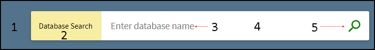
Database and Journal Search Bars
-
prm-atoz-search-bar {}
-
prm-atoz-search-bar div.search-scope.layout-align-center-start.layout-column
-
/* the text color in the search box */prm-atoz-search-bar input::-webkit-input-placeholder { }prm-atoz-search-bar input:-moz-placeholder { /* Firefox 18- */}prm-atoz-search-bar input::-moz-placeholder { /* Firefox 19+ */}prm-atoz-search-bar input:-ms-input-placeholder {}
-
prm-atoz-search-bar md-autocomplete-wrap input {}
-
prm-atoz-search-bar .simple-search-wrapper .search-actions .md-button {}
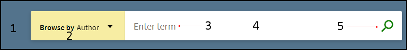
Browse Search Bar
-
prm-browse-search-bar {}
-
prm-browse-search-bar div.search-scope.layout-align-center-start.layout-column
-
/* the text color in the search box */prm-browse-search-bar input::-webkit-input-placeholder { }prm-browse-search-bar input:-moz-placeholder { /* Firefox 18- */}prm-browse-search-bar input::-moz-placeholder { /* Firefox 19+ */}prm-browse-search-bar input:-ms-input-placeholder {}
-
prm-browse-search-bar md-autocomplete-wrap input {}
-
prm-browse-search-bar .simple-search-wrapper .search-actions .md-button {}
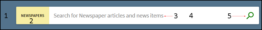
Newspapers Search Bar
-
prm-newspapers-search-bar{}
-
prm-newspapers-search-bar div.search-scope.layout-align-center-start.layout-column
-
/* the text color in the search box */prm-newspapers-search-bar input::-webkit-input-placeholder { }prm-newspapers-search-bar input:-moz-placeholder { /* Firefox 18- */}prm-newspapers-search-bar input::-moz-placeholder { /* Firefox 19+ */}prm-newspapers-search-bar input:-ms-input-placeholder {}
-
prm-newspapers-search-bar md-autocomplete-wrap input {}
-
prm-newspapers-search-bar .simple-search-wrapper .search-actions .md-button {}
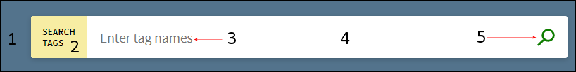
Tags Search Bar
-
prm-tags-search-bar{}
-
prm-tags-search-bar div.search-scope.layout-align-center-start.layout-column
-
/* the text color in the search box */prm-tags-search-bar input::-webkit-input-placeholder { }prm-tags-search-bar input:-moz-placeholder { /* Firefox 18- */}prm-tags-search-bar input::-moz-placeholder { /* Firefox 19+ */}prm-tags-search-bar input:-ms-input-placeholder {}
-
prm-tags-search-bar md-autocomplete-wrap input {}
-
prm-tags-search-bar .simple-search-wrapper .search-actions .md-button {}
Moving the Facets to the Left Side
Creating a Search Box with Deep Links to Primo VE
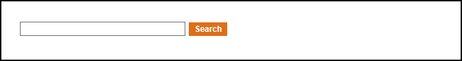
-
Create an HTML file and include the following lines, ensuring that you fill in the host name and customizable parameters, such as view code and tab (search profile):<html><head><meta http-equiv="Content-Type" content="text/html; charset=UTF-8"><!-- Script that converts the query string into valid parameter --><script type="text/javascript">function searchPrimo() {document.getElementById("primoQuery").value = "any,contains," + document.getElementById("primoQueryTemp").value;document.forms["searchForm"].submit();}</script></head><body><!-- Fill in Highlighted Parameters --><form id="simple" name="searchForm" method="get" target="_self" action="https://<host_name>/discovery/search" enctype="application/x-www-form-urlencoded; charset=utf-8" onsubmit="searchPrimo()"><input type="hidden" name="vid" value="<view_code>"><input type="hidden" name="tab" value="<search_profile_slot_code>"><input type="hidden" name="search_scope" value="<search_profile_code>"><input type="hidden" name="lang" value="<2_char_lang_code>"><!-- Fixed parameters --><input type="hidden" name="query" id="primoQuery"><input type="text" id="primoQueryTemp" value="" size="35"><!-- Search Button --><input id="go" title="Search" onclick="searchPrimo()" type="button" value="Search" alt="Search" style="height: 22px; font-size: 12px; font-weight: bold; background: #DE6E17; color: #ffffff; border: 1px solid;"></form></body></html>
Example search query:
https://my-inst.primo.exlibrisgroup.com/discovery/search?query=any,contains,herring&tab=Everything&search_scope=MyInst_and_CI&vid=PRIMO_OAP_INST:MyInst&lang=en
If you are displaying multiple search boxes on a page, you must define separate functions and forms for each search box, ensuring that the red names and IDs are unique for each search box.
-
To test the search box, open the HTML file in a browser and perform a search. If you saved the HTML file on a Web server, use the following URL to access the search box:http://<web_server>/<path>/<filename.html>
Creating a Twitter Feed
This procedure creates a link on the home page, which opens your Twitter feed in a new tab.
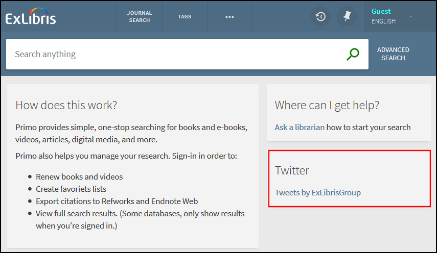
-
Create an HTML link based on your Twitter feed. For details, see https://publish.twitter.com/.
-
Edit the homepage_en.html file and embed the HTML link created in the previous step.
For example:
<div flex-xs flex="40" layout="column">
<md-card class="default-card">
<md-card-title>
<md-card-title-text>
<span class="md-headline">Twitter</span>
</md-card-title-text>
</md-card-title>
<md-card-content><a class="twitter-timeline" href="https://twitter.com/ExLibrisGroup?ref_src=twsrc%5Etfw">Tweets by ExLibrisGroup</a> <script async src="https://platform.twitter.com/widgets.js" charset="utf-8"></script>
</md-card-content>
</md-card>
</div> -
Compress, upload, and deploy your updated customization package. For more information, see Using the UI Customization Package Manager.
Creating a Custom Help Page
Creating and Uploading the Help File
-
Download your view's customization package (see Modifying a View-Level Package).
-
For each language supported, create an HTML help file (using the naming convention mentioned above).
-
Save the help files under the html/help directory of your view's customization package. You may need to create the help directory first.
-
Compress your view's package and upload it to the server (see Modifying a View-Level Package).
Adding the Help Link to the UI
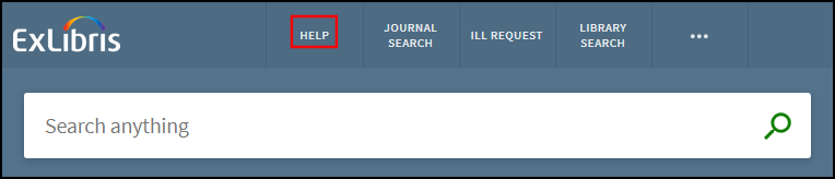
-
On the View Configuration page (Configuration Menu > Discovery > Display Configuration > Configure Views), edit your view.
-
Select the Links Menu tab.
-
Select Customize > Add Link to open the Edit Link Menu page.
-
Specify the following fields:
-
Code – Enter primo_help.
-
URL – Enter static-file/help.
-
Label – Enter the display label for the help link (such as Help). Select the Translate icon
 to define a language-specific label.
 -
Description – Specify the text that displays when a users hover the cursor over the link. Select the Translate icon to define a language-specific description.
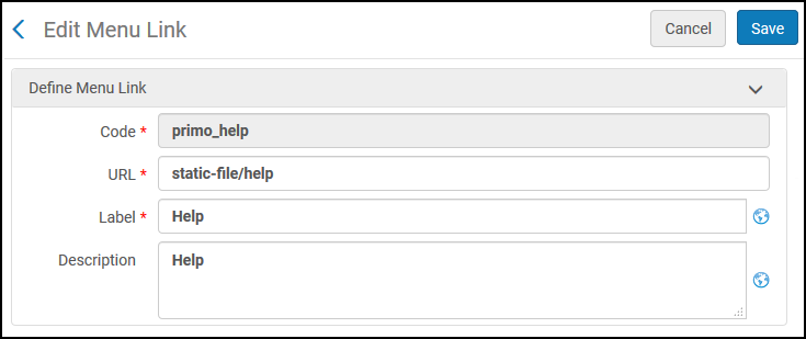 Edit Link Menu Page
 -
-
Select Save.
Disabling Short Permalinks in Primo VE
By default, the Send To action Permalink, which appears on both the Brief and Full Display pages, creates a shortened URL that includes the institution code, record ID, and a key:
When the shortened URL is entered in a browser, Primo converts the URL to its full URL and displays the record's full details.
-
Short format –
https://inst.primo.exlibrisgroup.com/permalink/11INST_INST/12345/alma991004075889705106
-
Long format –
https://inst.primo.exlibrisgroup.com/discovery/fulldisplay?docid=alma991004075889705106&context=L&vid=11INST_INST:inst&search_scope=MyInstitution&tab=LibraryCatalog&lang=en
This enhancement is enabled by default. If you want to revert to the long format, add the following lines to the CSS file in your customization package:
.__xs prm-permalink .layout-column>.long-permalink, prm-permalink .layout-column>.long-permalink {
display: inherit;
}
.__xs prm-permalink .layout-column>.short-permalink, prm-permalink .layout-column>.short-permalink {
display: none;
}
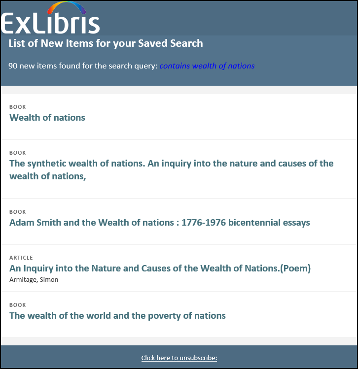
Improved Format of Saved Search Alert Emails
URM-112191This enhancement provides an improved format of emails sent to users for Saved Search alerts. This format is configured with the Saved Searches Letter template on the Letter Configuration page (Configuration Menu > General > Letters > Letters Configuration). For information on how to configure email letters, see Configuring Alma Letters. The alerts are scheduled with the Saved Searches Alert job (Admin > Manage Jobs and Sets > Monitor Jobs > Discovery).
-
Displays the same logo that is loaded with the Customization Package Manager (Configuration Menu > Discovery > Display Configuration > Configure Views). For more details, see Adding a Clickable Logo.
-
The email displays a maximum of 25 items.
Configuration Options
The following table lists the changes to the Send Email and SMS Labels code table to support the display labels used for alert emails.
| Code | Old Description | New Description |
|---|---|---|
|
alert.from |
prima@exlibris.co.il |
No change. |
|
alert.subject |
New search results: {0} |
No change. |
|
alert.conditional.heading |
Note that {0} items are included in this email. |
Note that {0} items are included in this email: |
|
alert.heading |
There are new items in your saved search: |
No change. |
|
alert.headingNoResults |
There are no new items in your saved search. |
No change. |
|
alert.all.items.link |
All new records can be found via the following link: |
No longer in use. |
|
(new) alert.title |
List of New Items for your Saved Search. |
|
|
(new) alert.custom.subtitle |
|
Note that {0} items are included in this email. |
|
(new) alert.unsubscrib |
Click here to unsubscribe. |
|
|
(new) alert.headingNew |
{0} new items found for the search query: {search query} |
|
|
alert.disable |
To stop receiving emails with new records for this query, disable this alert by using the link below: |
No change. |
Customizing the RefWorks Link in the Primo User Area Menu
When the RefWorks code is enabled in the Brief Record Display tab on the View Configuration page, the RefWorks link is enabled by default in the Primo User Area Menu.
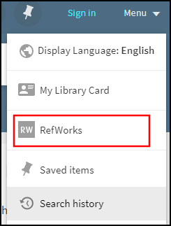
You can perform the following configurations to customize it:
-
Update the eshelf.menu.refworks code in the User Tile Labels code table to modify the link's display label.
-
Hide the link in the Primo User Area menu by setting the following class selectors in your custom CSS file:
.my-refworks-ctm {
display: none;
}
.my-refworks-separator-ctm {
display: none;
}
Configuring the Page Title in Primo VE
For accessibility, the page titles include the title of the specific page in Primo VE and additional information specific to the page's results. For example:
The following table lists the expected title and configuration information for each page:
| Page | Title Format and Code Table Information |
|---|---|
|
Library Search |
Title Format (before search): main.title
Title Format (after search): main.title – <search term>
Header/Footer Tiles code table – main.title: Ex Libris Discovery
|
|
Full Display of Record |
Title Format (after selecting record): {{recordTitle}} - {{institutionName}}
|
|
My Favorites > Saved Records |
Title Format: main.title - nui.favorites.header - nui.favorites.records.tabheader
Header/Footer Tiles code table – main.title: Ex Libris Discovery
Favorites Labels code table –
|
|
My Favorites > Search History |
Title Format: main.title - nui.favorites.header - nui.favorites.records.tabheader
Header/Footer Tiles code table – main.title: Ex Libris Discovery
Favorites Labels code table –
|
|
My Favorites > Saved Searches |
Title Format: main.title - nui.favorites.header - nui.favorites.records.tabheader
Header/Footer Tiles code table – main.title: Ex Libris Discovery
Favorites Labels code table –
|
|
Journal Search |
Title Format (before search): nui.mainmenu.label.journalsearch
Title Format (after search): nui.mainmenu.label.journalsearch – <search term>
View Labels code table – nui.mainmenu.label.journalsearch: Journal Search
|
|
Browse Search |
Title Format (before search): nui.mainmenu.label.browse
Title Format (after search): nui.mainmenu.label.browse – <search term>
View Labels code table – nui.mainmenu.label.browse: Browse
|
|
Tags |
Title Format (before search): nui.mainmenu.label.tags
Title Format (after search): nui.mainmenu.label.tags – <search term>
Tags Tile code table – nui.mainmenu.label.tags: TAGS
|
|
Fetch Items (Citation Linker) |
Title Format: nui.mainmenu.label.citationlinker
View Labels code table – nui.mainmenu.label.citationlinker: Fetch Item
|
|
Database Search |
Title Format (before search): nui.mainmenu.label.databasesearch
Title Format (after search): nui.mainmenu.label.databasesearch – <search term>
View Labels code table – nui.mainmenu.label.databasesearch: Database Search
|
|
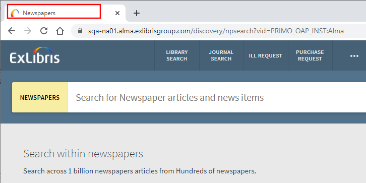
Newspaper Search |
Title Format (before search): nui.mainmenu.label.newspapers_search
Title Format (after search): nui.mainmenu.label.newspapers_search – <search term>
View Labels code table – nui.mainmenu.label.newspapers_search: Newspapers
|
|
Citation Path |
Title Format (after clicking a Cited or Cited by icon): nui.citation_trail.link.header - <search term>
Results Tile code table – nui.citation_trail.link.header: Your current citation path
|
|
My Library Card > Overview |
Title Format: main.title - menu.myaccount.my_library_card - nui.overview.header
Header/Footer Tiles code table – main.title: Ex Libris Discovery
User Space Menu code table – menu.myaccount.my_library_card: My Library Card
Library Card Labels code table – nui.overview.header: Overview
|
|
My Library Card > Loans |
Title Format: main.title - menu.myaccount.my_library_card - nui.loans.header
Header/Footer Tiles code table – main.title: Ex Libris Discovery
User Space Menu code table – menu.myaccount.my_library_card: My Library Card
Library Card Labels code table – nui.loans.header: Loans
|
|
My Library Card > Requests |
Title Format: main.title - menu.myaccount.my_library_card - nui.requests.header
Header/Footer Tiles code table – main.title: Ex Libris Discovery
User Space Menu code table – menu.myaccount.my_library_card: My Library Card
Library Card Labels code table – nui.requests.header: Requests
|
|
My Library Card > Fines & Fees |
Title Format: main.title - menu.myaccount.my_library_card - nui.fines.header
Header/Footer Tiles code table – main.title: Ex Libris Discovery
User Space Menu code table – menu.myaccount.my_library_card: My Library Card
Library Card Labels code table – nui.fines.header: Fine + fees
|
|
My Library Card > Blocks & Messages |
Title Format: main.title - menu.myaccount.my_library_card - nui.blocks.header
Header/Footer Tiles code table – main.title: Ex Libris Discovery
User Space Menu code table – menu.myaccount.my_library_card: My Library Card
Library Card Labels code table – nui.blocks.header: Blocks + messages
|
|
My Library Card > Personal Details |
Title Format: main.title - menu.myaccount.my_library_card - nui.details.header
Header/Footer Tiles code table – main.title: Ex Libris Discovery
User Space Menu code table – menu.myaccount.my_library_card: My Library Card
Library Card Labels code table – nui.details.header: Personal details
|