
Creating a New Report
- You can create an itemized set directly from an Analytics report. This is particularly useful if you want to globally update a set of records by first retrieving these records in Analytics. For more information, see Creating Itemized Sets.
- All date dimensions include dates up to and including 30 years back and 20 years forward. So, for example, if today is March 17, 2021:
- The earliest loan date that would appear is March 17, 1991.
- The latest due date that would appear is March 17, 2041.
For videos describing Analytics reports and dashboards, see Reports and Dashboards and Analytics Reports.
You can create new reports to provide you with information on library activities. The simplest way to create a report is based on one subject area. You can combine data from more than one subject area to create an advanced report; this is a more complex process that requires understanding of the data dependencies.
To ensure accurate results in your report, it is recommended to use at least one measure field from the fact of the subject area as a column or filter.
The reasons for this is that the fact table is the main section of the subject area, and it contains the main data for the subject area. Dimensions may have data that is not relevant to a particular subject area. Adding the measure field causes the data that is displayed to be only relevant to the fact. In addition, including a measure field ensures that dimension fields that are shared with other subject areas display information from the correct subject area.
If the measure is not required in the report's output, you can hide the measure in the results pane.
The following results may appear in your reports:
- Empty field – no data is available
- None – same as an empty field. It is displayed by analytics when creating reports based on a match between two entities on the same field, and that field has no data. None is used as a match-point in the reports.
- EMPTY – same as an empty field, an anomaly that may occur when migrating
- Unknown – there is data for the field in the Alma database, but it cannot be displayed, for example, fields that are based on a code table and the value does not appear in the code table. (This can happen when importing or after deleting a row in the code table.)
Creating a Single Subject Area Report
The simple way to create a report is using one specific subject area. Creating reports using one subject area does not require any deep knowledge of the data structure and relationship of the star scheme.
The following is a basic example of how to create a report. The example is performed in Alma Analytics using an Alma subject area, but the same exact steps apply to any Ex Libris Analytics product (Summon, campusM, Primo, and so forth).
To create a report:
- Select Create > Analysis. The Select Subject Area menu appears. For the list of subject areas, see Alma Analytics Subject Areas, campusM Analytics Subject Areas, or Primo Subject Areas.
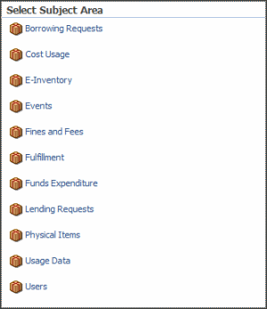 Select Subject Area Menu (Alma)
 - Select a subject area, for example Funds Expenditure, to open the Analysis Editor.
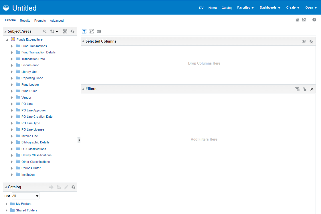 Analysis EditorThe columns of the selected subject area appear as folder icons in the left pane.
 - Expand a column, for example Library Unit, and double-click a dimension, for example Library Name, to add it to the Selected Columns pane.
- You can add an additional column, for example Vendors > Vendor Name.
- You can add an additional column, for example Fund Transactions > Transaction Amount.
The selected columns appear as follows.
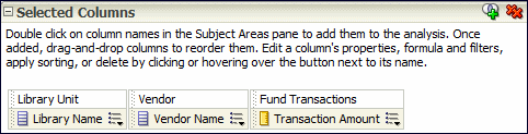 Select ColumnsYou can drag and drop columns to reorder them.
 - You can apply filters to limit the amount of data displayed in the report. Filters are applied before the report is aggregated. Filters affect the report and the resulting values for measures. Filters can be applied directly to attribute columns and measure columns.
- Select the More Options icon
 next to the column whose data you want to filter and then select Filter. (Alternatively, select the Filter icon
  and then select the appropriate column from the drop-down list.) The New filter dialog Box appears.
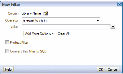 New Filter
 - Select an operator and enter a value. Only items matching the filter will appear in the report.
- Select OK to save the filter. The filter appears in the Filter pane of the report.
- The My Folders > Subject Area Contents folder is an out-of-the-box folder that contains ready to use filters for reports. Do not use this folder for storing reports.
- When filtering by start and end date, dates are inclusive.
- Select the More Options icon
- To sort a column: Select the More Options icon next to the column whose data you want to sort, select Sort, and select a sort option.
- Select the Results tab to see the report results.
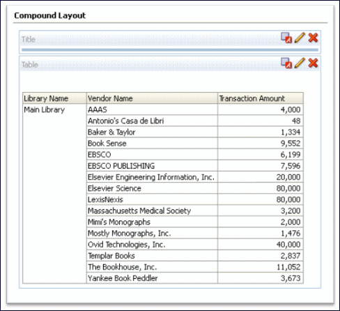 Compound Layout
 - To save a report: Select the Save icon
 (top right). Note that the name of the report should not contain the following characters: ampersands (&), commas (,) , semicolons (;), colons (:), hashtags (#), pluses (+), or slashes (/).
You can save the report under Shared Folders/<your institution>. If it is a private report, you can save the report in the My Folders area. (Do not place reports in the Subject Area Contents folder, since this folder is meant to contain filters.) After you save a report, the title appears at the top of the report. To change the title, from the Results tab, select the Edit icon
(top right). Note that the name of the report should not contain the following characters: ampersands (&), commas (,) , semicolons (;), colons (:), hashtags (#), pluses (+), or slashes (/).
You can save the report under Shared Folders/<your institution>. If it is a private report, you can save the report in the My Folders area. (Do not place reports in the Subject Area Contents folder, since this folder is meant to contain filters.) After you save a report, the title appears at the top of the report. To change the title, from the Results tab, select the Edit icon in the Views pane and enter a new title in the Title field.
Adding a Column Total to a Report
To display the total of a column:
- Select the Edit icon of the report. The Table Editor appears:
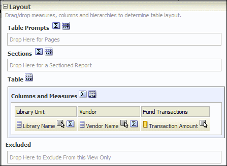 Table Editor
 - Select the Totals icon
 next to Columns and Measures and then select After. The green check mark indicates that a grand total has been added to the analysis.
 - Select Done to apply the change. The report now appears with a grand total:
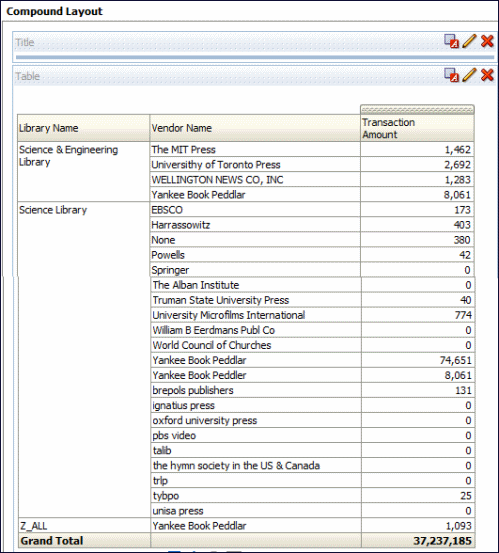 Grand Total
Formatting a Report
To format a report:
- From the Results tab of a report, select the Edit icon
 . The following appears, for example:
 Formatting a Report
 - From the top toolbar, select the Table View Properties icon
 . The table properties dialog box appears:
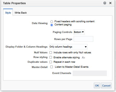 Table Properties
 - From the Style tab, select Enable alternate styling.
- Select Repeat in each row so that the table appears with each full row in a separate color.
- Select the Set alternate format icon
 . The following appears:
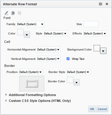 Edit Format
 - Select the formatting options you want. For example, select the yellow for the background color.
- Select OK. If you selected yellow for the background color, for example, the table is now formatted with alternating yellow rows:
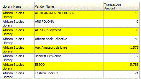 Yellow Rows
Adding a Graph to a Report
You can add a graph, such as a pie chart, to the report.
To add a graph to the report:
- From the Results tab, select the New View icon
 and then select Graph > Pie. A pie chart is added to the report:
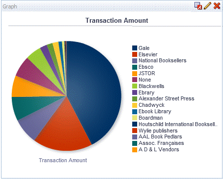 Pie Chart
 - Select the Remove View from Compound Layout icon
 for both Title and Table views. Both views are removed so that only the graph appears.
The Title and Table views are still available for use from the Views pane.
for both Title and Table views. Both views are removed so that only the graph appears.
The Title and Table views are still available for use from the Views pane.
Formatting a Report Graph
You can format a graph. The formatting options available are different depending on the type of graph you are formatting. In this example, we format a pie graph.
To format a graph:
- From the Results tab, select the Edit View icon . The Graph Editor appears.
 Graph Editor
 - Select the Edit Graph Properties icon
 from the top toolbar. The Graph Properties dialog box appears.
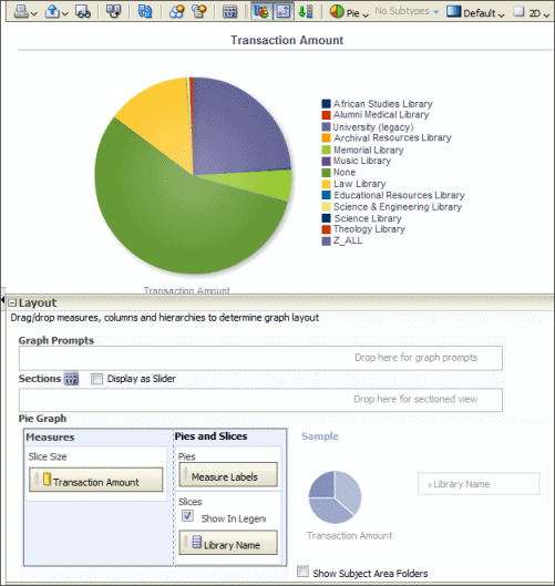
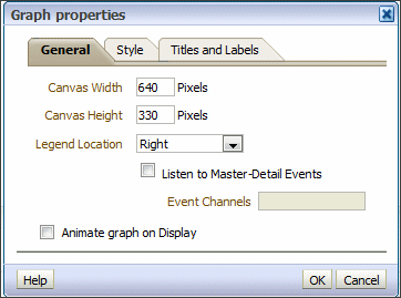 GraphYou can change various graph properties from the General, Style, and Titles, and Labels tabs. For example:
 - From the General tab, select Left for Legend Location.
- From the Style tab:
- From the Legend section, select gray as the background color and blue as the border color
- From the Canvas Colors and Borders section, select turquoise and the background color and blue as the background color.
- Clear the Gradient check box.
- From the Titles and Labels tab:
- Clear the Use measure name as graph title check box and enter a title such as Transaction Amount Pie Chart.
- From the Labels section, select the Format Title icon
 next to legend, select Arial from the Family drop-down list, enter 10 in the Size field, and select red as the color.
- Select OK. The graph now appears as follows:
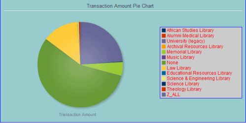 Customized Pie Chart
Using Formulas in a Report
You can use formulas in Alma Analytics reports to manipulate data available in Analytics that was not originally formatted in a way that is useful for creating reports. For more information, see Useful Custom Formulas for Alma Analytics.
Creating a Multi-Subject Area Report
This section describes how to create custom reports from two (or more) subject areas.
Each subject area is composed of a fact and descriptive and measurement dimensions. The fact is the first field listed under the subject area. Measurement dimensions are preceded by yellow rectangles and are located under facts. Descriptive dimensions are preceded by gray rectangles.
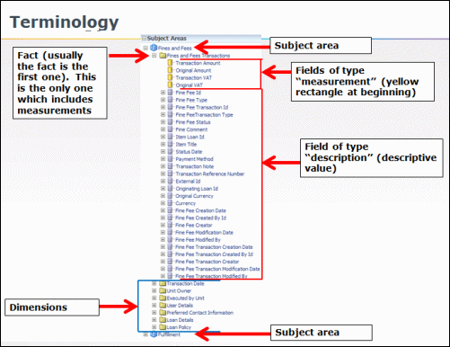
Terminology
In order to be able to create reports from two subject areas, the following conditions must be met:
- There must be at least one common dimension between the two subject areas.
- Descriptive fields must come from the common dimensions.
Measurement fields can come from the facts, although they are not common dimensions.
If you attempt to create a report from two descriptive fields that are not in common between the two subject areas, an error message similar to the following appears.
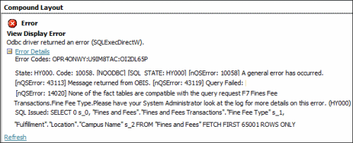
Error Message
In this example, we create a report from the Fulfillment and Fines and Fees subject areas.
To create a report from two subject areas:
- Select New > Analysis > Fines and Fees. The Fines and Fees subject area appears.
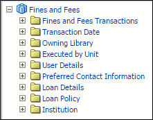 Fines and Fees
 - Select the Add / Remove Subject Areas icon
 and select Fulfillment. Both the Fines and Fees and Fulfillment subject areas appear.
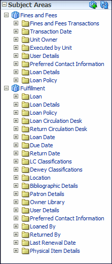 Fines and Fees and Fulfillment
 - The Fines and Fees and Fulfillment subject areas have the Loan Details and Loan Policy dimensions in common. Add to the report any fields from these two dimensions, as well as any measurement dimensions. For example:
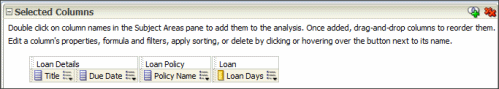 Report Criteria from Two Subject Areas
 - Select the Results tab to display the report:
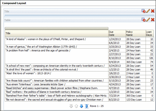 Report of Two Subject Areas
Date functions such as CURRENT_DATE or CURRENT_TIME, which are determined by the system in which the Oracle server is running, are displayed in UTC time, but date fields within subject areas (for example, Loan Date in the Fulfillment subject area or Portfolio Creation Date from the E-Inventory subject area), which are determined by customer data, display the time at your institution.