Workflow Simplification
Ex Libris is undertaking a workflow simplification initiative across different Alma functional areas.
Starting with Fulfillment and Acquisition, where workflow simplification will be achieved by enhanced user experience facilitating a smoother, user-friendly layout and navigation options, to various other workflows identified in the system where simplification could enhance efficiency and ease of work.
The new layout allows to easily switch between the ongoing tasks in your main workflow and any peripheral tasks. including:
- Multi-select facets - Ability to select multiple facets in a single operation will assist staff users to focus on the needed entity more efficiently
- Clearer information hierarchy - A cleared and more prominent information hierarchy of the search results will enable staff users reviewing the the search results list to find what they need faster and with less navigation needs (less clicking).
- "Side -By-Side" presentation - Viewing/Editing the record's information without the need to specifically enter a new screen in order to edit a record enables users to complete their tasks faster with less navigational needs.
- "Slide-Out" panel for extra information - When viewing/editing a record and navigating to a different (related) entity, a "slide-out" panel will overlay the screen providing the user with a single page application experience and a clear sense of orientation.
- Labeling mechanism - Enabling staff users to add personalized labels to records will allow to mark and group records in order to assist users accomplish their tasks in various ways such as easily locating records they worked on, creating sets for global updates and more.
Circulation Desk Redesign
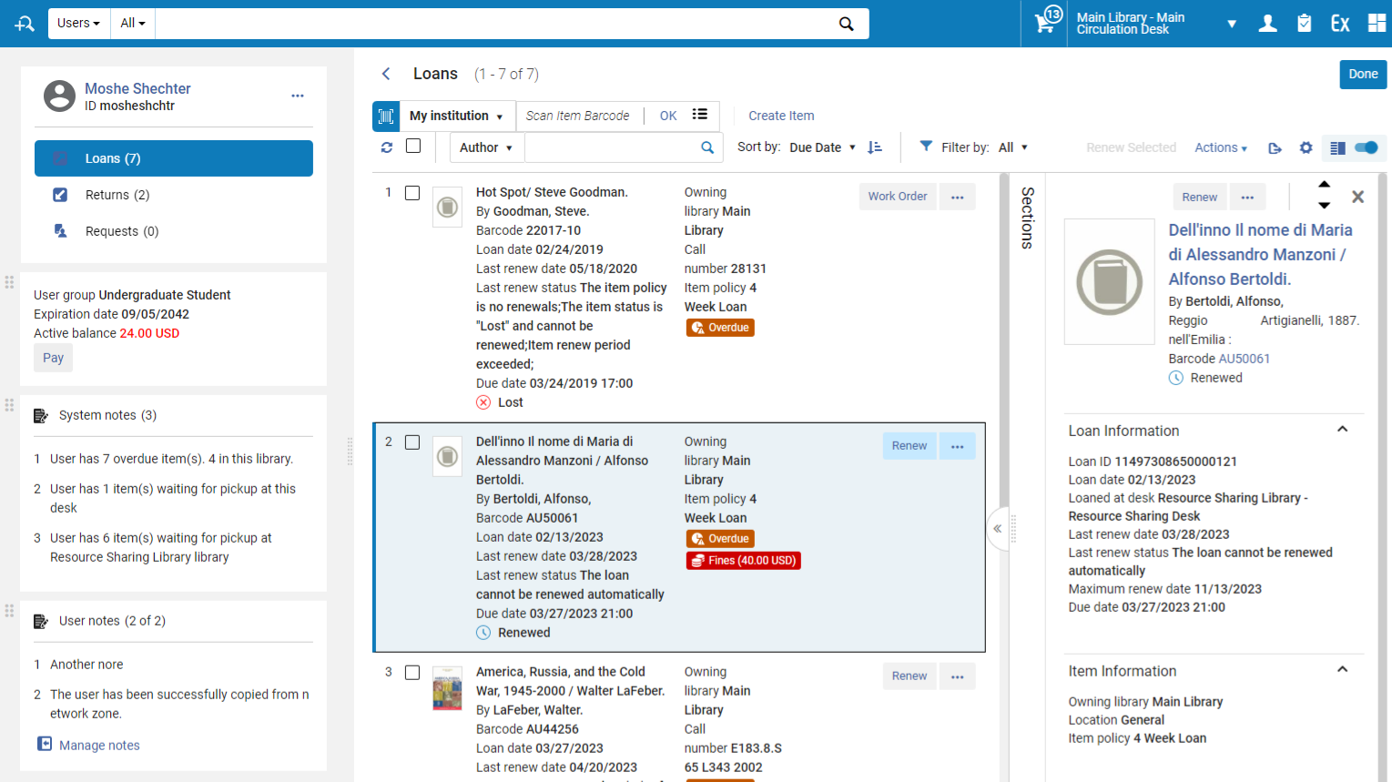
The Manage Patron Services UI will be completely redesigned in order to leverage new layout capabilities to support a more streamlined workflow at the circulation desk. This is planned to be developed as part of the 2024 roadmap plans for Fulfillment
The redesign has been done with a number of concepts in mind:
- Right pane with expanded information, allowing to easily access additional loan information.
- Labels highlighting important information about the listed loans, such as loans being overdue, lost or highlighting fees associated with a loan
- Quicker and easier access to user information for view and update
- Separation of system notes and user notes, allowing better highlighting of patron related information
- Easy to use interface for viewing list of fees and for fully or partially paying/waiving fees
What are the benefits of this feature?
The new circulation desk design will improve the efficiency of the circulation desk staff's work. Being a customer facing service, it is extremely important for the staff that provide end user services to be able to quickly access information and tools needed to service the patrons that have come up to the desk. The new design and the technology it utilizes will make the work at the desk quick and more efficient, reducing the work load of the library staff and perhaps even more importantly, reducing the time it takes for an end user to receive the required service at the desk.
When to use this feature?
The new design will serve all circulation desk operators, and the personalization options will enable different libraries to customize the UI to best refelct their own preferences..
New PO Line Management Workflow
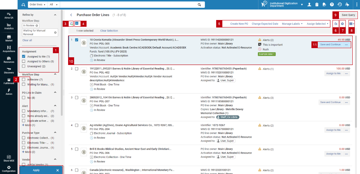
The new PO line management workflow is designed to save users extra navigation within the POL management screen and ease the task assignment using a side by side presentation and by that save 50% of mouse clicking for most workflows. For full information see the New Unified PO Line Task List page and the 2023 roadmap highlight.
The general elements which characterize the side by side view are:
- Compact left side record view presents users with key information regarding the PO lines they would like to work on. Clicking on a specific PO line from the left panel presents detailed information regarding the PO line on the right panel.
- The right side panel presents detailed information regarding the selected PO line, the right panel is separated by sections as described below.
- Any information changes on a PO line conducted from the right panel are saved immediately and automatically once the user enters the new/modified information to the PO line. The Saved indicator is set to present users with a confirmation that their changes are saved. This indicator is displayed upon any modification of information from the right panel.
- Right panel actions are set to enable users with all the available actions that are available in the "original" PO line editing screen.
- Navigation arrows enable users to navigate to the next/previous PO line presented in the left panel.
- "X" icon closes the right panel and returns the user to the "record-view" presentation.
The logic of the new workflow is based on existing principals and data models so working with the new workflow should be intuitive for the Acquisitions operator/manager.
What are the benefits of this feature?
When you use this feature, you gain the following advantages:
- Increase efficiency by working on multiple PO lines within a single screen and prevent the need to navigate back and forth between the POL search result and the editing area of a specific POL
- Unified task list will allow users to search PO line associated with a task list and immediately edit it, preventing the need to "Go to task list" in order to work on the PO line
- Quick navigation between multiple PO lines (for example when looking at a list of POLs associated with an invoice)
- Multi select facet capabilities
- Save 50% of mouse clicking for most workflows
When to use this feature?
The new POL management workflow impacts all POLs in all their statuses. You will see this new workflow when you simply search for a POL or when you desire to review a full list of POLs by entering the relevant menu link (In review, waiting for manual packaging, Claim, etc.).
Resource Sharing Task Lists
The Resource Sharing task lists (borrower and lender) has been redesigned and implemented with new layout capabilities. This greatly improves the efficiency of resource sharing request handling on both the borrower and the lender side for all types of requests.
The redesign is done with a number of concepts in mind:
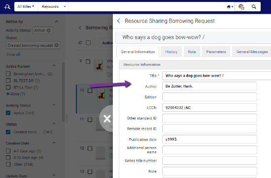
- Right pane work area that allows inline editing of the in focus request without requiring to navigate to a separate edit form and lose the context of the request list that is being processed.
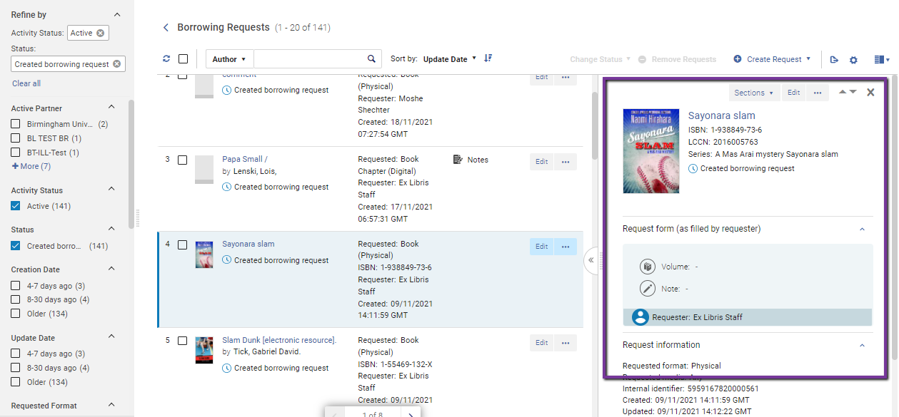
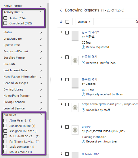
- Multiple facet selection supports a more flexible tool for creating your work set, by including requests that meet multiple criteria of the same facet in one work set.

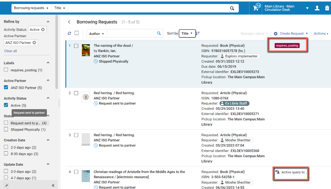
- Inline handling of note and patron queries in a right pane. This makes these important information elements more noticeable when reviewing the request list as well as makes it easier to add and edit notes to the processed requests.
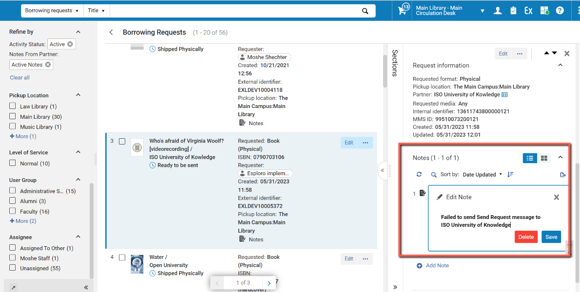
- Easier search across requests in multiple activity statuses and across assignee responsibilities by handling the request status and assignee information as facets that support multiple selection rather than by filters.
- Sliding panel enables full work on requests without losing the requests list context.
- Self assigned labels that enable tagging requests for all processing purposes, as well as highlighted special request conditions such as a query to patron and notes.
What are the benefits of this feature?
The new task lists' design improves the efficiency of resource sharing staff's work. The more efficient work process not only reduce the time and effort it takes for staff to manage requests, it also increases the ability to track the current overall status of the in process requests, and eventually reduces the time it takes for the patrons to receive the resource they have requested.
The new task lists make resource sharing staff better able to manage only the requests that require their manual intervention, and make that manual intervention easier and quicker to process.
When to use this feature?
The new design serves all resource sharing staff. It will be the tool for both the regular daily task list based work as well as for processing specific required requests.
New Title Search - Enhanced Repository Search Results
The Title search UI will be completely redesigned in order to leverage new layout capabilities to support a more streamlined workflow while reviewing Title search results. This is planned to be developed as part of the 2024 Alma roadmap. The Title search redesign will include the Physical, Digital and Electronic title search results as well as general collection search results.
The redesign is done with a number of concepts in mind:
- Multiple facet selection supports a more flexible tool for creating your work set, by including requests that meet multiple criteria of the same facet in one work set.
- Clear indication regarding the Bibliographic record type.
- Clear indication regarding the inventory types associated with the Bibliographic records and information regarding the requests and orders associated with the title.
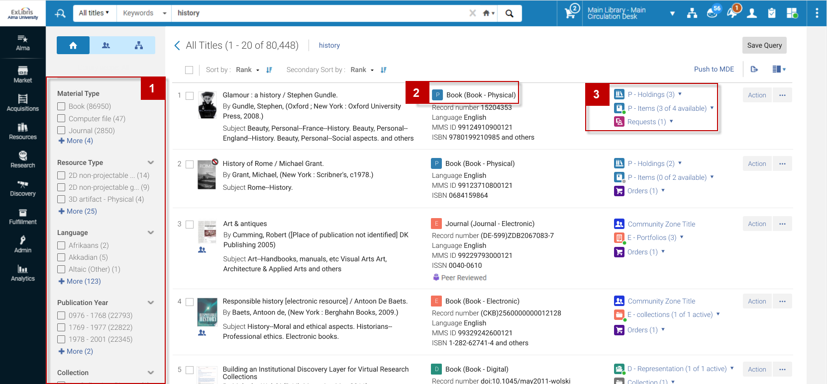
- Right panel which holds full information regarding the entities associated with the title, this information will be presented in the form of sections, which will enable full work on entities relating to the title while remaining within the context of the initial search results
- "Simple" MARC view section will be available to the user up-front without the need to move back and forth between various screens
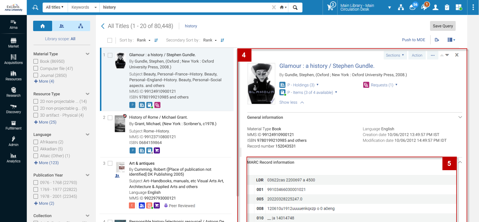
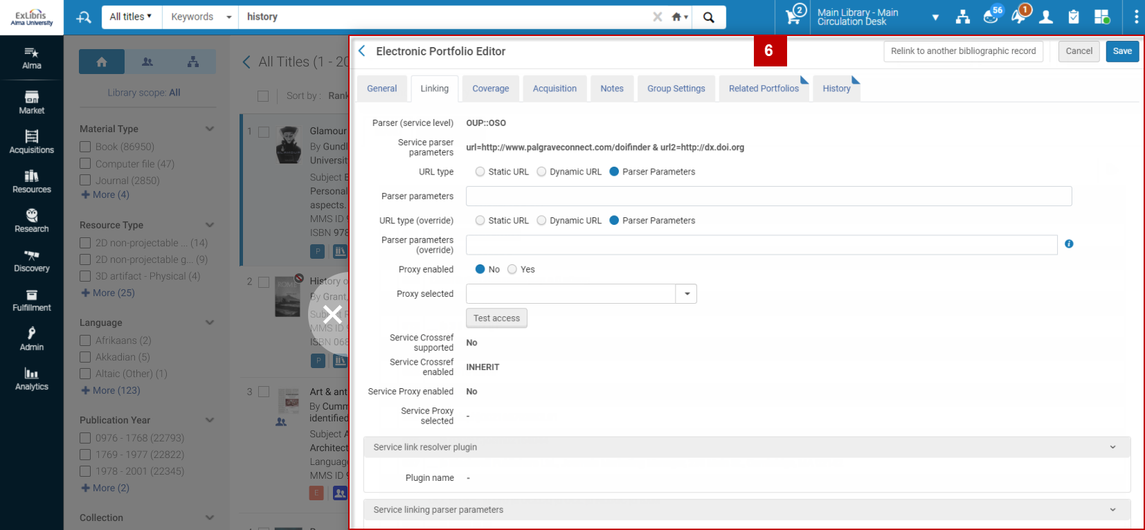
6. Sliding panel will allow initiating workflows while remaining in the context of the search results, this will allow easier understanding of the contexts where the workflow was initiated from as well as easy navigation back to the origin point.
What are the benefits of this feature?
- Increase efficiency by working on multiple Titles within a single screen and prevent the need to navigate back and forth between the Title search result and the various workflows
- Quick navigation between multiple Titles (for example when reviewing similar titles and their MARC records)
- Multi select facet capabilities
- Save mouse clicking for most workflows
When to use this feature?
The new Title search results will impacts all type of Alma users which uses the title search results for their daily workflows, from catalogers to acquisitions staff. Users will see the new design and workflow while using any of the Title searched.
Physical Item Templates
Creating items manually is a very common workflow, and very time-consuming. Item templates will make this more efficient, by allowing operators to pre-populate common item details (e.g. material type, item policy) without having to enter them for each item.
When editing a physical item, it will be possible to save it as a template:

When adding a new item using quick cataloging form or the holdings' items list, it will be possible to select a template from which to populate the item:

The operator would then only need to fill in unique item information, if exists.
See Physical Item Templates on the Alma rodamap.
What are the benefits of this feature?
Item templates will significantly decrease manual work for physical inventory operators, eliminating repeating tasks and leaving librarians to focus on the unique item information.
When to use this feature?
Saving an item as a template would be useful when an item has common data, that will be useful to pre-populate future items. Creating items from template will be useful for common items, containing much of the same data as the template - so that only unique item information will need to be entered manually, if exists.
Form Editing for MARC 21 Bibliographic Records
A form cataloging interface will be added, allowing catalogers quick adding and editing of MARC 21 records efficiently.
The form will display field descriptions, helping catalogers to locate the field and enter the correct information.
See Form Editing for MARC 21 Bibliographic Records on the Alma roadmap.
What are the benefits of this feature?
Some catalogers find MARC 21 fields confusing, and would prefer a simple form for quick data updates.
When to use this feature?
Catalogers who prefer working with a form editor will be able to enter basic information in their preferred interface.
Create multiple items
It will be possible to create multiple similar items for the same holdings in one go.
What are the benefits of this feature?
Creating items manually is a very common workflow, and very time-consuming. Being able to create multiple items when several similar items need to be added will significantly decrease manual work for physical inventory operators, eliminating repeating tasks.
When to use this feature?
When operators need to add multiple similar items to the same holdings record.
Sets - Enhanced UX
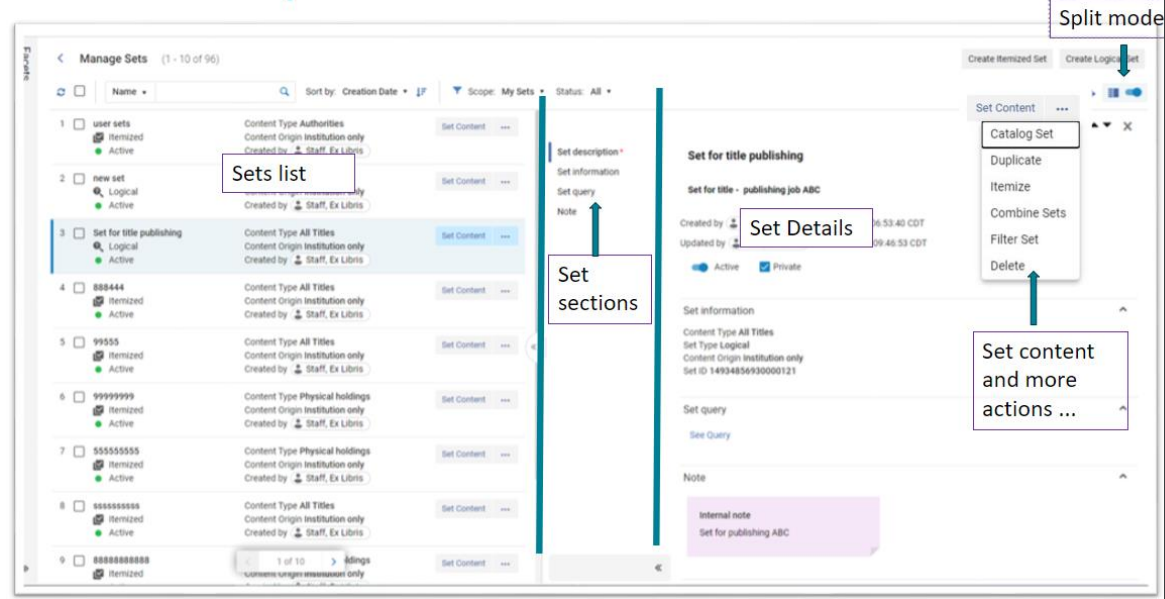
The "Manage Sets" page will be updated to the new Alma layout which will offer immediate advantages and more importantly offer the infrastructure for future features to support enhanced user experiences using sets.
See Manage Sets- New Layout on the Alma roadmap
What are the benefits of this feature?
As part of shifting to a the Alma new layout the Manage sets page will have a side by side view enabling quicker and more informative navigation between sets. In addition, Facets will be added to the search feature for more accurate search features.
When to use this feature?
The majority of areas in Alma offer the ability to save Sets, whether logical or itemized. In any scenario where sets need to be managed the benefits above will be supported in the layout mentioned above.
Menu Simplification
As part of the larger general workflow simplification, theme effort is put to simplify the Alma menu, in order to make it clearer, easier to use and help users be more focused just on what they need. This includes three main enhancements:
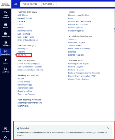
Menu Entities Descriptions
added in May 2023 quarterly release which includes an additional section at the bottom of the Alma Menu that offers a description of each menu entity while hovering over it. This functionality can be switched on or off at the user level.
Smart Menu Search
A smart Menu search offer "fuzzy search" capabilities. This includes spelling mistakes and support for different terminology (starting with English). It will be deployed Gradually for the interface's languages.
See Menu Simplification: Support Similar Terms in More Languages via Search
Menu Customization
During 2024 a new menu customization feature will be introduced to allow institutions and users to easily configure their menu and hide unused entities in order to make their Alma menu more accurate and focused
See Menu Simplification: Customized Menu- on the Alma roadmap
What are the benefits of this feature?
With this feature, users will benefit with a less overwhelming menu which will help them focus on their main workflows with no interruptions. The configuration process will be simple and work on the same principles Alma offers in other customized areas using simple drag and drop. The full menu will still be easily accessed if needed.

