
Adding Page Components
Creative Studio includes an extensive set of components that enable you to build your page in a matter of minutes. You can simply drag-and-drop components into their place on the page using the WYSIWYG display. A single component can include one or more elements.
You can add components to template-based pages or blank pages (pages that begin from the blank template).
Components Overview
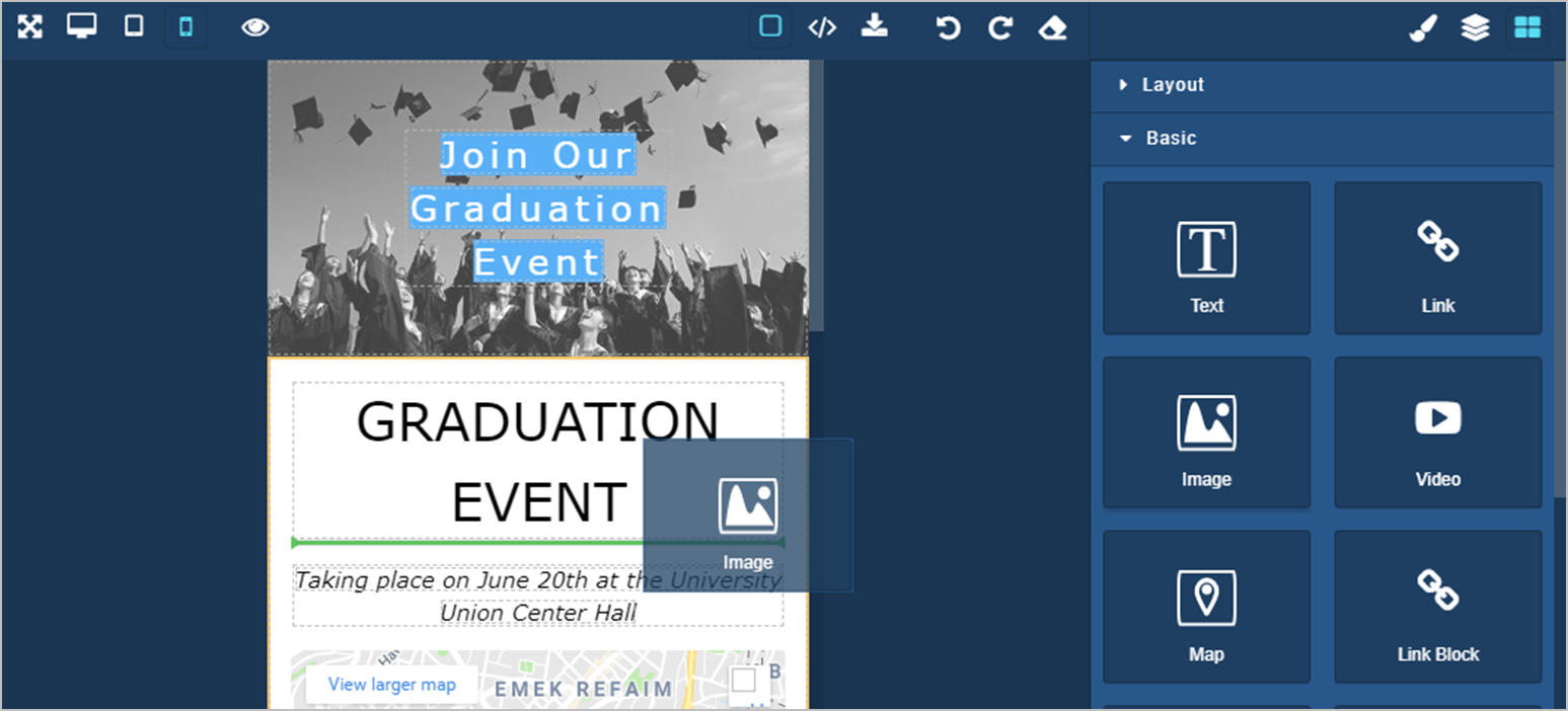
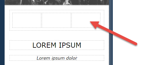
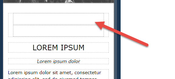
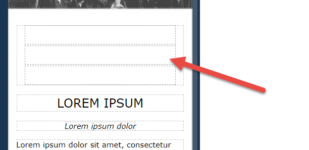
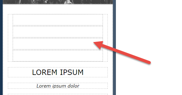
Select the tiles icon from the tools menu.

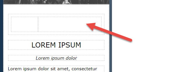
Drag-and-drop them into their relevant position, as shown in the screenshot below.
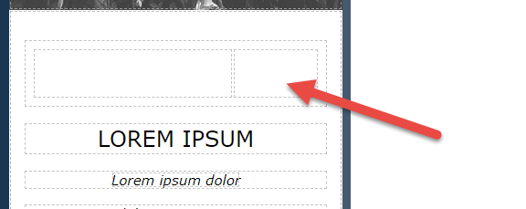
Creative Studio's WYSIWYG display uses nested elements, enabling you to add components and elements into existing ones for a better page layout. For example, you can add a text area and a map into a simple one-column layout.
The green highlighted line indicates the drop position of your component.
If you select any element on the page (and not the contents of the element), an edit menu appears. See Editing and Configuring Page Elements.
Component Types
Components are organized into types:
The types are as follows (select an image icon to see an example):
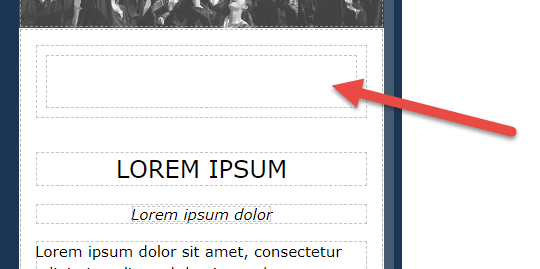
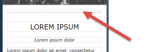
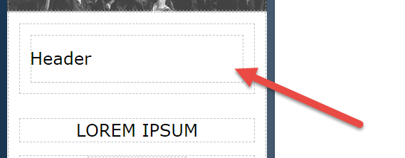
| Layout |
|
Responsive elements used to set the overall page design. These can be used at the start of the page design as they provide the overarching layout for the page. Note that you can start with a simple 3-row layout for example and use Duplicate to extend the page layout as explained here. For all components, you can specify an ID and title. |
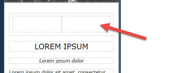
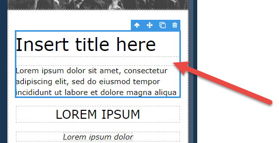
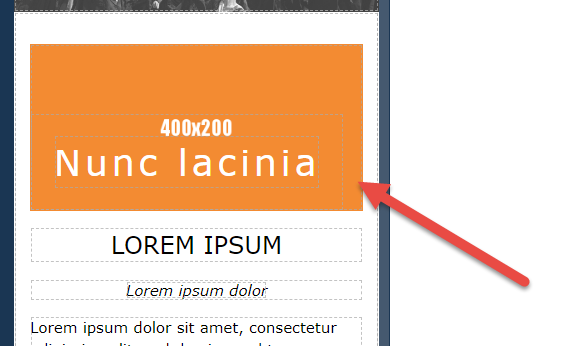
| Basic |
|
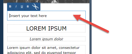
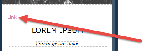
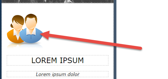
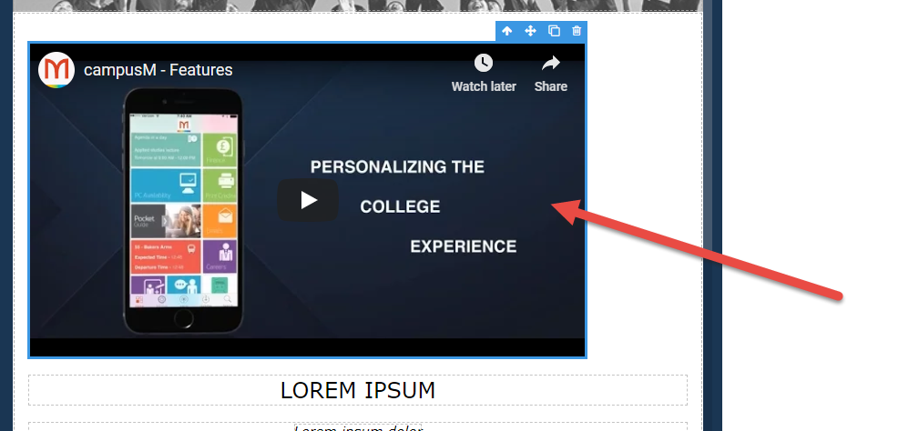
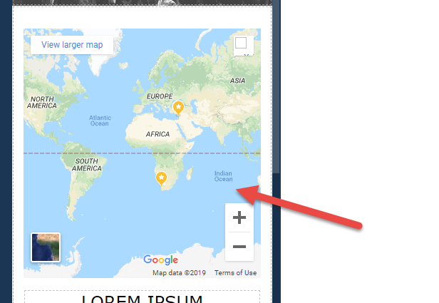
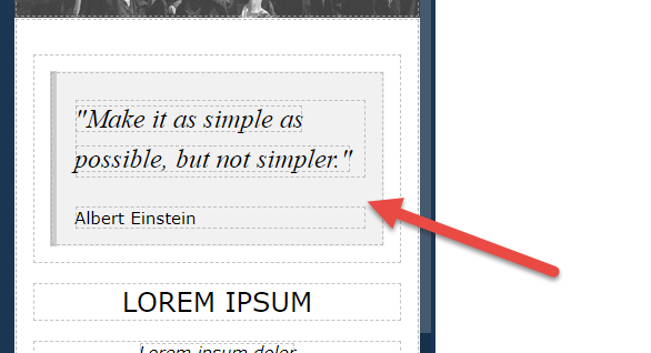
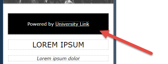
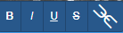
Basic components are commonly used elements, including text, links, images, maps, videos, quotes, dividers, footers, icons, and more. When you are focused on a text box, a formatting menu appears at the top left of the box.
For more information, see Editing and Configuring Page Elements. |
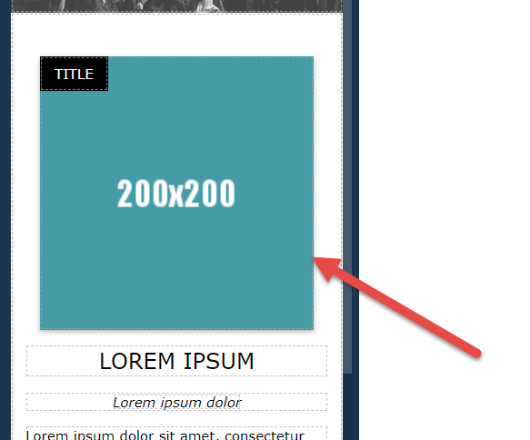
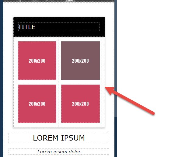
| Images |
|
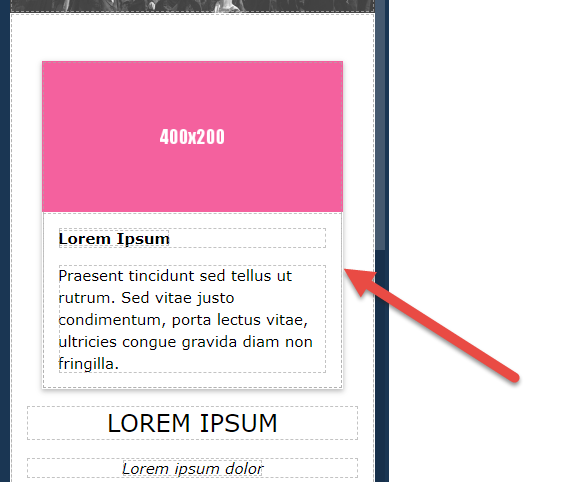
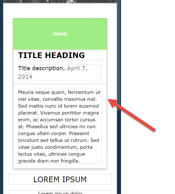
Image components enable you to leverage defined layouts of image and text, for example, a blog card or an image with a caption. In addition, image cards can be found in this section. These components are premade combinations of components from the first two sections (Layout and Basic). For all components, you can specify an ID and title. |
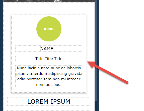
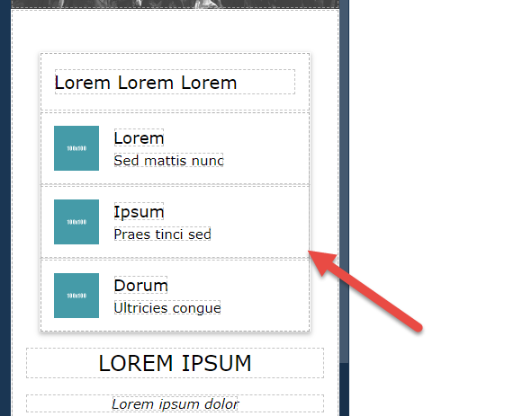
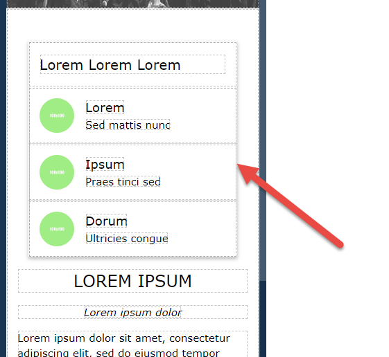
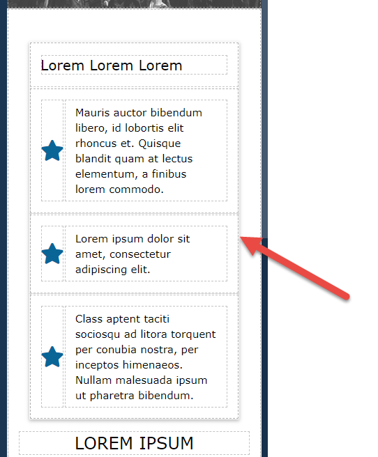
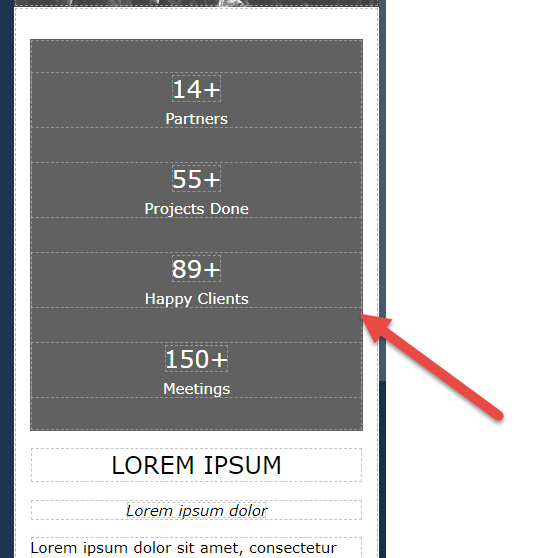
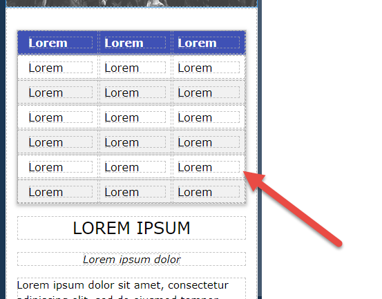
| Lists |
|
List components are prepackaged components for various uses. This section offers several types of lists, including lists with images, lists with icons, and more. These components are premade combinations of components from the first two sections (Layout and Basic). For all components, you can specify an ID and title. |
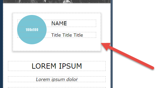
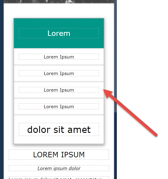
| Sections |
|
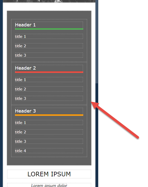
Section components can be used for information pages with multiple topics, enabling you to easily segment the page between the different sections.
These components are premade combinations of components from the first two sections (Layout and Basic). For all components, you can specify an ID and title. |
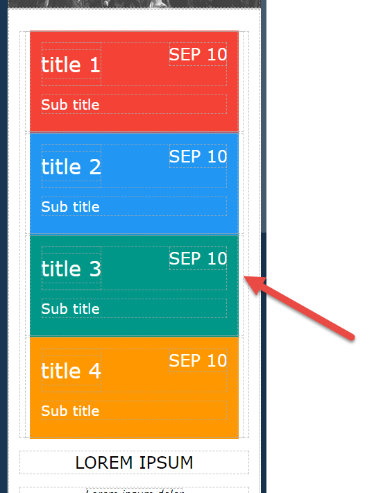
| Events |
|
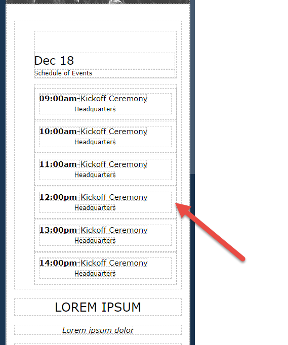
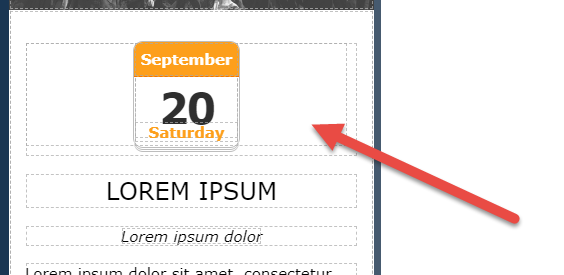
Event components provide a great way to design pages for one or multiple days' events. They provide the required layout including date, times of the day, and more.
These components are premade combinations of components from the first two sections (Layout and Basic). For all components, you can specify an ID and title. |
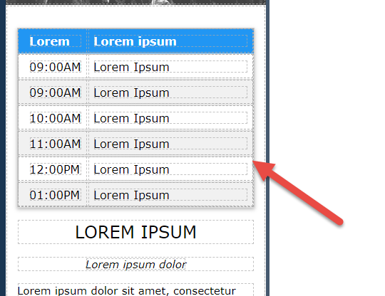
| Tables |
|
Table components provide a designed layout for all purposes.
These components are premade combinations of components from the first two sections (Layout and Basic). For all components, you can specify an ID and title. |
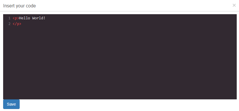
| Advanced |
Custom Code - A freeform element that enables you to enter any HTML code that you like. When you add this element, a pane enters to enter your code.
The result appears on the page.
For this element, an extra icon |
Custom code can be added to a page.
You can specify an ID and title. For some Creative Studio custom code examples, refer to the developer network blog section. |
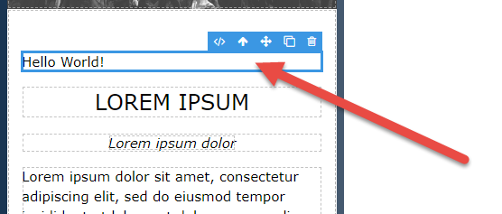
 appears in the element edit menu. Select to open the HTML editing pane. You can also double-click in the element to open the HTML editing pane.