Managing Profiles
For general information about profiles and profile groups, see Customizing End-User Access to Services.
Managing Profile Groups
Profile groups are used to categorize profiles. If multiple profile groups are defined for your institution, when end-users open the app, they must choose a profile group and then choose a profile from within the group. This is done in the Select a Profile page, which opens when the end-user opens the app. Profile groups in this page can be expanded by the end-user in order to select a profile to log into. After logging in, the end-user (if authorized) can switch between profiles in the group they selected in the app Settings.

Profile-Group Selection in the App
The same list of profile groups also appears under Profile group in the profile configuration settings in App Manager. It is there that profiles groups are attached to profile; see Managing Profiles, below.
Profile groups are managed on the Select profile group to change page (App Settings > Enterprise Roles > Profile Groups). This page presents a list of profile groups. You can reorder the entries on this page using the up and down arrows. (For additional information about working with lists, see Working with Lists.)
For each group, configure:
- Description - The name of the profile group, as it will appear in the lists of profile groups in App Manager and in the app.
- Sort order - The position of the profile group in the lists of profile groups.
Managing App Profiles
App profiles are managed on the Select app profile to change page (App Settings > Enterprise Roles > App Profiles). This page presents a list of profiles. You can reorder the entries on this page using the up and down arrows. (For information about working with lists, see Working with Lists.)
For each app profile, configure:
- Description - The name of the profile, as it should appear in various areas of the App Manager and as it should appear to the end-user in the app.
- Profile group - The profile group to which this profile is associated.
- About Content - The About static content that is relevant for this profile. This screen appears in the app when the end-user selects About in the app menu. To configure these screens, see Working with Static Content and the Content Menu.
- iPhone / iPad / Android Intro Content - The iPhone / iPad / Android introductory static content ("splash screen") that is relevant for this profile. This screen appears in the app the first time the end-user logs in to the relevant device, as well as when the end-user selects Show Introduction Again in the app menu. To configure these screens, see Working with Static Content and the Content Menu.
- Language pack - The language pack for this profile. All menu items and header texts (but not static content) appear in the selected language in the app.
Language packs are configured by Ex Libris. To add or modify them, contact Ex Libris customer support.
- Available in iOS / on Android / on web - Whether the profile is enabled for the specific OS.
Available on RIM is not in use.
- iOS Map Type - The default map type for end-users using iOS devices, Apple maps or Google maps. If not selected, Apple maps is the default type. The end-user can select either type on his or her device.
- Sort order - The order that the profiles appear in various dropdown lists in the App Manager, as well as in the app when the end-user selects to switch profiles.
- Receive alerts - If you select Yes, end-users have the option to subscribe to and unsubscribe from notification groups. The Receive alerts menu appears in the app settings, enabling the end-users to select which notifications they want to receive from the institution (see Sending Notifications to End-Users). If you select No, end-users cannot receive notifications when using the app with this profile selected.
- Receive alert msg - Not in use.
-
Personalization enabled - Whether the end-user can rearrange and/or hide services on their device. When enabled, the Arrange option appears in the app menu. Even when personalization is enabled, end-users cannot hide services configured as mandatory (see the Mandatory field in Configuring Services). When Personalization enabled is on for a profile, the Favorites Container menu option is enabled.
- Notification Direction - You can select Left to Right or Right to Left, depending on your language alignment. The default setting is Left to Right.
For more information, see How to Add an App Profile.
Managing Profile Defaults for Services
You can define the default service properties for all services in a profile. When configuring services (see Configuring How Services Appear), any service property not configured for a service inherits its value from the profile.
Before configuring default services for a profile, you may want to configure the app default configurations for services. Any service property not defined for a service or a profile inherits its value from the app default. See Configuring Default Service Properties.
You configure profile defaults for services in the App Builder on the Profile Config tab (App Builder > Profile Config). Most configurations follow the same process as the ones defined for configuring the service; for more information, see Configuring How Services Appear. You can also work directly with the profile's code (see Working with App Code). This section presents configurations not mentioned in the other section.
| Field | Description | Values |
|---|---|---|
| Config | ||
| Portal Style | Configure Portal View to display with or without a sidebar. For more information, see Configuring Portal View. | |
| Background Color | The background color of the app. This color appears between the tiles as the app background. | Select the color icon and select a color or enter a hexadecimal color in the text field to the right of the color icon. |
| Columns (min)
Columns (max) |
Minimum / maximum number of columns in which to display tiles on the device's home screen. | Enter a numerical value. Default minimum is 1. Default maximum is 5000. |
| Header Background Color (web) | Relevant only for the web app.
The background color of the app header.
 Header with Background Color in Web App
|
Select the color icon and select a color or enter a hexadecimal color in the text field to the right of the color icon. |
| Header Foreground Color (web) | Relevant only for the web app.
The text color of the app header.
|
Select the color icon and select a color or enter a hexadecimal color in the text field to the right of the color icon. |
| Header Image (web) | The small image that appears in the app header. | Select Browse to select a file from the Assets Manager; see Uploading Files. |
| Tile Size (max)
Tile Size (min) |
Maximum / minimum tile size, in pixels. A 1 x 1 tile will have a maximum / minimum height and width as defined by these properties. A 1 x 2 tile will have a maximum / minimum height and 2 x width as defined by these properties. | Enter a numerical value, in pixels. Default minimum is 95 pixels. Default maximum is 180 pixels. |
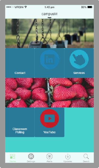
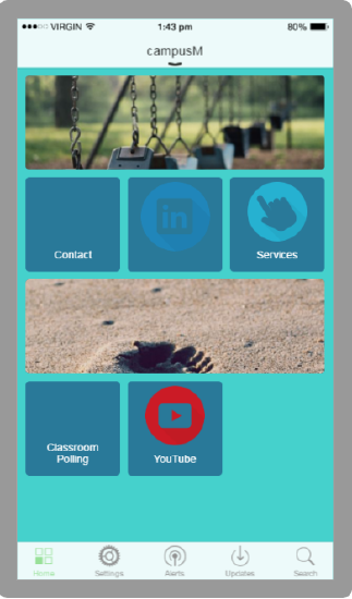
| Tile Spacing | Space between tiles, in pixels. By default, tile spacing is set to 0.
   Tile Spacing of 0, 10, and 20
|
Enter a numerical value, in pixels. |
| Overrides | See Overriding Service Appearance Based on Device Properties. | |
| Tile Style - See Tile Config in Configuring How Services Appear | ||
| iOS Config - Properties specific to an iPhone or iPad. | ||
| iOS Color | The color for the toolbar icons.
iPhone Icons
|
Select the color icon and select a color or enter a hexadecimal color in the text field to the right of the color icon. |
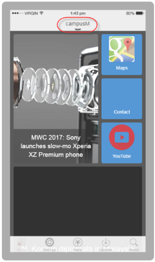
| iOS Header Text | The text on the header bar. By default, the header text is the name of the app.
 iPhone Header
|
Enter the header text in the text field. |
| iPad Header (landscape) | A header image for an iPad in landscape mode. This image is used in place of the header text (above). | Select Browse to select a file from the Assets Manager; see Uploading Files. |
| iPad Header (portrait) | A header image for an iPad in portrait mode. This image is used in place of the header text (above). | Select Browse to select a file from the Assets Manager; see Uploading Files. |
| iPhone Header Image | A header image for an iPhone. This image is used in place of the header text (above). | Select Browse to select a file from the Assets Manager; see Uploading Files. |
| Recents Indicator Image | The default icon that appears in the app's Recents menu for a service; see Configuring How Services Appear.
The icon should be 120x120 pixels and a maximum size of 50k.
|
Select Browse to select a file from the Assets Manager; see Uploading Files. |
| Portal Config — Note: The Portal Config only appears when either the App Config or Profile Config Portal Style is set to With Side Navigation. | ||
| Right Side Gutter % of Screen | The percentage of the page that is a gutter to the right of the main page to simulate a mobile device | |
| Collapsible Sidebar | Enable the left-hand side sidebar to collapse by clicking to provide more screen space for pages. | |
| Text Transform | Select Capitalize to have the first letter capitalized or Uppercase to have all the letters capitalized. | |
| Text Align | Alignment of the text in the sidebar. | |
| Font Size (px) | The size of the font of the text in the sidebar. | |
| Font Weight | The weight of the text in the sidebar. Select None, Bold, or Bolder. | |
| Hover Font Weight | The weight of the text in the sidebar when you hover over it. Select None, Bold, or Bolder. | |
| Text Color | The color of the text in the sidebar. | |
| Item Hover Text Color | The color of the text in the sidebar when you hover over it. | |
| Item Spacing (px) | The spacing between items in the sidebar. | |
| Item Side Padding (px) | The spacing between the side margin and the text in the sidebar. | |
| Top Padding (px) | The spacing between the top margin and the text in the sidebar. | |
| Background Color | The background color of the sidebar. | |
| Item Hover Background Color | The background color of the sidebar when you hover over it. | |
| Sidebar Footer Content | The text to display in the footer of the sidebar. | |

