
Configuring Services
Configuring How Services Appear

| Field | Description | Values |
|---|---|---|
| Menu Option Config | ||
| Title |
Title of the tile when it was created. This is not the title that end users see at the top of the PI's page (the page the tile opens in the app). That title is configured in the PI's settings, under Screen Title (see Adding a Product Integration). However, this is the title that is included in searches. Thus, if end users search for a PI by this Title, they should find it. To prevent confusion, it is recommended that this Title match both the Screen Title of the PI and the label of the tile itself. Note that the titles of nested tiles are not included in searches. |
Cannot be changed. |
| Metadata Tag | Used to group multiple tags displayed in Analytics. | String values. |
| Small Icon | The icon that appears in the mobile search.
The icon should be 120x120 pixels, and have a maximum size of 50k.
|
Select Browse to select a file from the Assets Manager; see Uploading Files. |
| Roles | The app roles associated with this service. | Select the link. The list of app roles appears in an overlay pane. Select or clear the desired roles and then select away from the pane. |
|
Tags |
The tags associated with this service; see Managing My Profile. |
Select the link. The list of tags appears in an overlay pane. Select or clear the desired tags and then select away from the pane. |
| Disabled | Whether the service is disabled on all platforms. By default, a service is enabled on all platforms.
When a service is disabled, it does not appear in the app for any profiles or app roles. Disabling a service is useful when the app is still under development or has temporarily stopped working.
See also Hide.
|
Select to disable. |
| Android Disabled | Whether the service is disabled on Android. By default, a service is enabled on Android. See Disabled, above. The service is disabled on Android if either this setting or Disabled is selected. | Select to disable. |
| iOS Disabled | Whether the service is disabled on iOS. By default, a service is enabled on iOS. See Disabled, above. The service is disabled on iOS if either this setting or Disabled is selected. | Select to disable. |
| Mandatory | Available only if personalization is enabled for the profile.
Whether the service can be hidden by the end-user. By default, a service is not mandatory. Relevant only when Personalization is selected for the profile (see Managing Profiles).
|
Select to make the service mandatory (cannot be hidden by the end-user). |
| Hidden by default | Available only if personalization is enabled for the profile.
Whether the service is initially hidden by default. By default, a service is not hidden by default. Relevant only when Personalization is selected for the profile (see Managing Profiles).
This enables you to create services that each student can add as required.
|
Select to make the service hidden by default (the end-user must select to make the service visible). |
|
Product Integration
|
Available only if the Tile is created as Product Integrations Tile Indicated the Product Integration instance Description that the tile will access when clicked.
|
Select from available Product Integrations instances within the dropdown. Will be preconfigured with the selected Product Integration on creation.
|
| Tile Config - All fields only appear if they are selected from the Add Property menu. | ||
| Action (URL) | Not available for Feeds tile.
A URL to open if the end-user selects the service's tile.
|
Enter a campusM URL or enter part of a URL and select one from the list. See Working with App URLs. |
|
Available only for feed and banner services. Whether navigation arrows are added to the tile. For banner tiles, the controls are located at the top of the tile by default, but they can be placed at the top or the bottom; see User Controls Location, below. Additionally, these controls will only appear on web-app; on mobile, users can swipe left/right to flip through the banner items.
|
Select to add. |
|
|
Available only for feed and banner services. Whether a Play/Pause control is added to the tile. For banner tiles, the control is located at the bottom-right of the tile by default, but is moved to the top if the user controls are placed at the bottom; see User Controls Location, below.
|
Select to add. |
|
| Background Color | The background color of the service's tile. See also Hover Background Color.
Background Color Selector
 Tile with Background Color
This is typically not used when configuring Image (see below) or Full Width Icon (if the icon is opaque), since the background color will no longer be visible when covered by an opaque image.
|
Select the color icon and select a color or enter a hexadecimal color in the text field to the right of the color icon. |
| Banners | See the Configuring Banner Tiles section below. | |
| Border Color | Set the tile border color. Also see Hover Border Color. | Select the color icon and select a color or enter a hexadecimal color in the text field to the right of the color icon. |
| Border Size | Set the tile border width, in pixels. Also see Hover Border Size. | Enter the border size, in pixels |
| Corner Radius | Add a rounded corner to the tiles. | Enter the radius value, in pixels. |
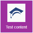
| Description | Description of the tile. This is useful when personalization is enabled; the description appears to end-users who are selecting services to enable/disable. | Enter a text description. |
| Feeds | Available only for feed services.
The feed sources. You can add multiple sources, and items from the various feeds are merged together when presented to the end-user.
|
Select Add Feed and enter the feed description and feed URL to add a feed. If you have configured any default feeds (see Configuring Default RSS Feeds), they appear in a dropdown list as you type. Note that campusM is RSS 2.0 compliant. You can browse and load an icon to indicate the feed's source. If you add an icon, you can choose the position in which it should be placed in the tile – top or bottom, and left, right, or center. If you do not see an example of the live feed in the Device Display Pane, there is a problem with the URL.
|
| Font Size (min)
Font Size (max)
|
The label's minimum and maximum font size. | Select a minimum and maximum font size. |
|
Full-Screen AEK
|
When combined with the right AEK project configuration, this setting causes the AEK tile to expand to fill the whole desktop view. This is only relevant on the web app, when Portal View is not being used.
|
Normal (default) when a proprty is not configured and Full Screen
|
| Full Text Overlay | The shading overlay for labels. Gradient overlay provides a fade from light to dark semi-opaque overlay, which may provide improved visibility.
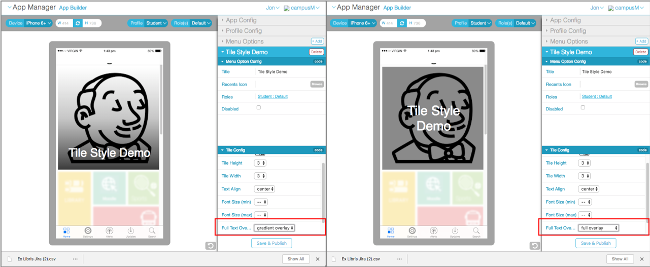 |
Select full overlay or gradient overlay. |
| Full Width Icon | Not available for feed or banner services.
Whether the icon you add to the tile (see Icon, below) is full width or actual width. Actual width is the default.
This is typically used when also selecting No Label (see below).
 Tile Without Full Width Icon
 Tile With Full Width Icon
|
Select Yes for full width. |
| Hide | Whether to hide the service from the app screen. By default, the service is not hidden.
This is different from disabling the service (see above). The service is still available if, for example, another service links to it.
|
Select Yes to hide. |
| Hide Text | Available only for feed services.
Whether to hide the banner title on the feeds tile.
|
Select Yes to hide. |
| Hover Background Color | The background color of the service's tile when the user hovers the pointer over it. This is relevant only for screens in which a mouse pointer is available, such as the web app.
This is typically not used when configuring a background image (see Image, below), since the background color will no longer be visible when covered by the image.
See also Background Color.
|
Select the color icon and select a color or enter a hexadecimal color in the text field to the right of the color icon. |
| Hover Border Color | Set the tile hover border color. Also see Border Color. | Select the color icon and select a color or enter a hexadecimal color in the text field to the right of the color icon. |
| Hover Border Size | Set the tile hover border width, in pixels. Also see Border Size. | Enter the border size, in pixels |
| Hover Text Color | Not available for banner services.
The label color in the service's tile when the user hovers a pointer over it. This is relevant only for screens in which a mouse pointer is available, such as the web app.
See also Text Color.
|
Select the color icon and select a color or enter a hexadecimal color in the text field to the right of the color icon. |
| Icon | Not available for feed or banner services.
The foreground image of the service's tile. Ex Libris works with you to develop a set of icons for your institution.
An icon should be 120x120 pixels, and a maximum size of 50k.
See Full Width Icon.
Not used for services with dynamic tiles (see Changing App Manager Installation Settings).
|
Select Browse to select a file from the Assets Manager; see Uploading Files. |
| Image | Not available for feed or banner services. For integrated services, this is the same as the Image Icon field you set on the Select AEK menu option to change page (see step 7 in Creating Services).
The background image of the service's tile. This is typically not used when configuring Full Width Icon (if the icon is opaque), since the background image will no longer be visible when covered by an opaque image.
A tile occupying a single space is 180x180 pixels. When using an image for a tile that occupies multiple spaces (see Tile Height and Tile Width), each space adds another 180 pixels in the relevant direction as well as any additional pixels taken up by the tile spacing (see Tile Spacing in Managing Profile Defaults for Services).
|
Select Browse to select a file from the Assets Manager; see Uploading Files. |
| Image Fit | How to fit the background image (see Image) that are larger than a tile in the tile. This field is also used for banner services to configure the images in the banners.
The options are:
|
Select no value, contain, stretch, or crop. See the Device Display Pane to preview the results. |
| No Label | Not available for feed or banner services.
Whether to hide or display the service label in the service's tile. The label appears by default.
This is typically used when the image or icon (see Image and Icon) is self-explanatory.
|
Select hide label to hide the label. |
| Overrides | See Overriding Service Configuration Based on Device Properties. | |
| Pause Time | Available only for feed services. | Time, in seconds, to display each feed item. |
| Subtiles | Available for the Tile Container menu option. For more details, see Configuring Tile Containers. | |
| Text Align | The label's alignment in the service's tile. | Select left, right, or center. |
| Text Color | The label color in the service's tile.
See also Hover Text Color.
|
Select the color icon and select a color or enter a hexadecimal color in the text field to the right of the color icon. |
| Text Overlay | Provides a gradient fill over the top of the tile image, which enables label text to be rendered more accessible. | Select Show Overlay to make the overlay visible or Hide Overlay to remove the gradient fill. |
| Tile Height | The number of tile "spaces" used for the service's width. By default, the height is 2 for a feed service, and 1 for any other service. The maximum is 3 for any mobile device; if you select 4, 3 will be used instead for these devices.
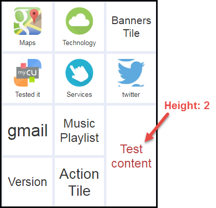 Service With 1 Width x 2 Height
|
Select 1, 2, 3, or 4. |
| Tile Type | Appears for feed or banner services only. | N/A |
| Tile Width | The number of tile "spaces" used for the service's height. By default, the height is 2 for a feed service, 3 for a banner service, and 1 for any other service. | Select 1, 2, 3, or 4. |
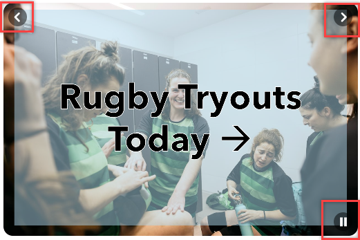
| User Controls Location |
Appears for Banner tiles only. If Add User Controls is selected for a banner tile, select the placement of the controls. When a Play/Pause Control is also included in the banner, it is placed in the opposite location.
Banner User Controls on the Top (Play/Pause Control on the Bottom)
|
Select Top or Bottom. |
| Sidebar Config | ||
| Hide | Hides the Menu Option from the sidebar | Hide Don't Hide |
| Text Transformation | Transforms the way the menu Option Title text displays in the sidebar | None Capitalize Uppercase |
| Text Align | Changes the Menu Option Title text alignment in the sidebar | Left Right Center |
| Font Weight | Changes the font-weight of the Menu Option Title text in the sidebar | Normal Bold Bolder |
| Hover Font Weight | Changes the font-weight of the Menu Option Title text in the sidebar when hovering over the text | Normal Bold Bolder |
| Font Size (px) | Changes the font size of the Menu Option Title text in the sidebar | Pixels |
| Text Color | Changes the text color of the Menu Option Title text in the sidebar | Selection palette or hash code |
| Hover Text Color | Changes the text color of the Menu Option Title text in the sidebar when hovering over the text | Selection palette or hash code |
| Background Color | Changes the background color of the Menu Option in the sidebar | Selection palette or hash code |
| Hover Background Color | Changes the background color of the Menu Option in the sidebar when hovering over the text | Selection palette or hash code |
| Spacing (px) | Changes the spacing above the Menu Option in the sidebar | Pixels |
| Side Padding (px) | Changes the left-hand side padding of the Menu Option Text in the sidebar | Pixels |
| Icon | Add icon to the side of the Menu Option Text in the sidebar | Browse Asset Manager or Image URL |
| Icon Width | Changes the width of the icon as it appears in the sidebar | Pixels |
| Icon Position | Defines the position of the icon in relation to the Menu Option text in the sidebar | Before Text After Text |
| Icon Only | Defines if only the icon should show (hide the Menu Option Text) in the sidebar | False True |
| Right Side Gutter % of Screen | Changes the guttering of full page screens on the right-hand side of the screen | 0%-100% |


Overriding Service Appearance Based on Device Properties
- In the App Builder, in the Tile Config area of the service tab, select Add Property > Overrides. An Overrides pane is added to the Tile Config area. If this pane already exists, expand it.
- Select Add Override to add a new device conditions/override property pair.
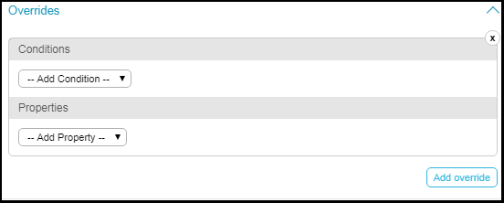 Overrides Pane
 - Select one or more conditions and select one or more values for the conditions or enter a value for the condition. The possible conditions are:
All of the conditions must be true (AND) for the override to take effect. For example, if you select platform iOS and Android, and you select minimum height 100 pixels and minimum width 200 pixels, the override will take effect if the device is iOS or Android and the height is at least 100 pixels and the width is at least 200 pixels: platform = (iOS OR Android) AND height > 100 AND width > 200.
- Platforms - Select one or more: iOS, Android, or Web. The condition applies if the device matches any (OR) of these platforms.
- Device Types - Select one or more: Phone, Desktop, or Tablet. The condition applies if the device matches any (OR) of these types.
- Max/Min Device Area - Enter the maximum or minimum total device area (height x width), in pixels. This setting is not commonly used; the best practice is to specify the max/min device height/width (see the next setting).
- Max/Min Device Height/Width - Enter the maximum or minimum screen height or width, in pixels.
- Select one or more properties to override if the condition matches. For more information, see Configuring Services.
Configuring Banner Tiles
Banner tiles display a rotating carousel of images to users on the home page of the app, which many institutions find to be an incredibly efficient way to communicate with their students. These images, called banner items, can link users to anywhere inside or outside the app when clicked or tapped, and students can swipe left/right on their phones or click through on the web app to navigate between them. Administrators can configure banner items to appear for users with a certain App Role or Tag, or during a preconfigured window of time, and can configure the images to appear in a particular order, or in a randomized order.


Configuring Banners
Banners share many of their configuration options, such as Image fit, width, and height, with normal tiles, as described in the table above. The table below describes configurations that are specific to Banner tiles.
| Name | Description | Default value |
|---|---|---|
|
Banner tile |
||
|
Randomize Order |
When set to true, randomizes the order in which the banner items display to the user each time the home page is loaded. When set to false, the banners display in the order they are configured in App Builder, and may be reordered with the arrow buttons on the top right of each banner item. |
False |
|
Default Image |
This image will be displayed as a “default” banner image if there are no banner items to show to the user (due to roles, tags, or scheduling). If the user can see one or more banner items, the image will not be used. If left empty, when a user cannot see any banner items, the background color of the tile will display. For recommended image ratios and sizes, see this table in our App Branding page. |
|
|
Default ActionURL |
When clicking or tapping on the Default Image, the user will be taken to this URL. If the user can see one or more banner items, the Default ActionURL will not be used. If left empty, tapping/clicking the Default Image does nothing. |
|
|
Add User Controls |
This field controls whether the user can see the “next” and “previous” buttons on the banner tile when using the web app. On mobile, when more than one banner item is displayed, users will see pagination dots to indicate that they can swipe between banner items, regardless of this setting. It is recommended to leave this set to true, as the banner tile will not be accessible to screen-reader users on the web app when user controls are hidden. |
True |
|
Add Play/Pause Control |
This field controls whether the user can see the “pause” and “play” buttons on the banner tile, which allow them to stop and start the rotation of the banner items. It is recommended to leave this set to true, as the banner tile will not be fully accessible when play/pause controls are hidden. |
True
|
|
User Controls Location |
If Add User Controls is true for a banner tile, select the placement of the controls. When a Play/Pause Control is also included in the banner, it is placed in the opposite location. |
Top |
|
Banner Item |
||
|
Image |
The image displayed for the banner item. For recommended image ratios and sizes, see this table in our App Branding page. |
|
|
Action (URL) |
When the user clicks/taps a banner item, they will navigate here. Can link anywhere inside or outside the app. If left empty, clicking/tapping on the banner item does nothing. |
|
|
Display Duration |
Duration of display for each banner item. If empty, defaults to 5 seconds. It is not recommended to display banners for less than 5 seconds, as it is considered inaccessible. |
|
|
Description |
A text description of the banner item. It is recommended to fill in this field, as it is used as Alt-text for the banner item, which is read aloud to screen-reader users, and is used to identify the banner item in Analytics. |
|
|
Scheduled |
When set to true, a banner item will be displayed only during a configured date range. When set to false, the banner item will always be displayed. |
False |
|
Start Time |
The time at which a banner item will start displaying, according to the Administrator's computer's local time. If left empty, the banner will appear until its configured end time. This field has no effect if Scheduled is set to false. |
Today at 00:00 |
|
End Time |
The time at which a banner item will stop displaying, according to the Administrator's computer's local time. If left empty, the banner will appear from its start time and will not stop displaying. This field has no effect if Scheduled is set to false. |
One week from today at 23:59. |
|
Display by Roles/Tags |
When set to true, a banner item will be displayed only to users who have at least one of the configured App Roles or Tags, and will not be displayed to any users if at least one App Role or Tag is not selected. When set to false, the banner item will be displayed to all users. |
False |
|
Roles |
The App Roles a user needs to have to see the banner item. This field has no effect if Display by Roles/Tags is set to false. |
No roles selected |
|
Tags |
The Tags a user needs to have to see the banner item. This field has no effect if Display by Roles/Tags is set to false. |
No tags selected |
Rearranging Services in the App
Tile arrangements affect all device types and orientations, and are saved per profile and not per role/combination of roles/tags. This is because roles are dynamic, and there is no way to predict which roles and/or tags any one user might have at any given moment. Therefore, to make sure that the app looks as best as it can in the different platforms, screen sizes, roles and tag combinations, the default arrangement for any home page is determined at the profile level.
To get the best results, it's recommended to open app builder to the desired profile, select all roles, and arrange. If desirable, remove the roles one by one to see how things change and look for different role/tag combinations.