The App Manager UI
After the initial installation, users use the App Manager to create and manage the institution's app (or all of the institution's apps, if you have multiple apps).
Ex Libris provides you with the URL (App Manager URL) and your initial administrator login credentials for the App Manager. The App Manager can be accessed using any modern browser.
For more information, watch Introduction to campusM (3:41 min).
Logging In and Out of the App Manager UI
To log in to the App Manager:
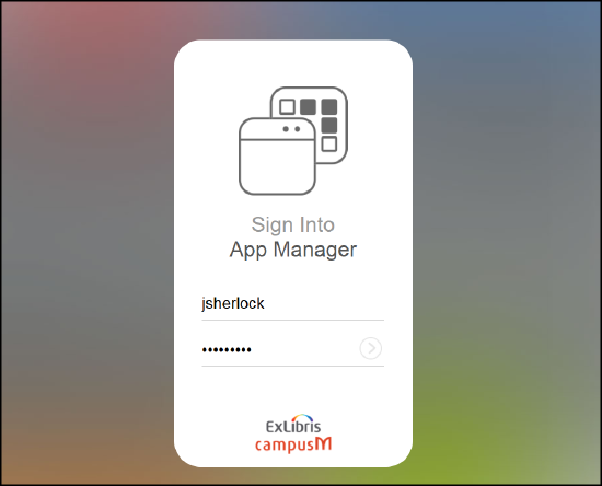
Navigate to the App Manager URL. The App Manager login page appears.

App Manager Login Page
Enter your login credentials and select the arrow or press Enter on your keyboard. After a successful login, the App Manager Home Page appears. If you forget your password and there are no other administrators to change it for you, contact Ex Libris customer support for assistance.

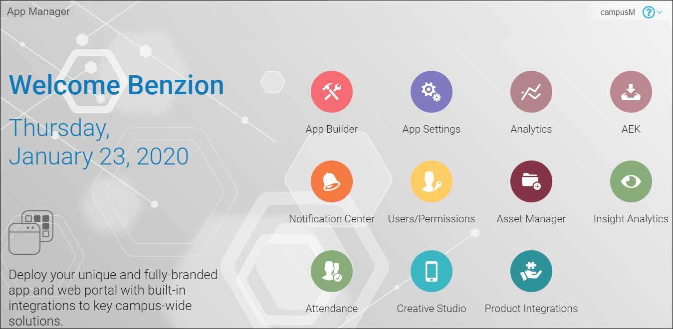
App Manager Home Page
Most of the common elements and procedures of the UI are explained below.
The Home Page contains a number of configuration modules presented as icons (App Builder, App Settings, and so forth), as well as a user menu (which appears when you select your username in the top right corner) and an app environment menu (which appears when you select the app name in the top right corner).
This document presents the navigation steps to open an App Manager page as a highlighted path. For example, to open the Profile Config pane within the App Builder, this document indicates for you to navigate to App Builder > Profile Config. This often (but not always) corresponds to the breadcrumbs trail that appears at the top of the page.
Changing Your Password
To change your password:
Select Change Password in the user menu. The Password Change page appears.

Password Change Page
Enter your old password and new password, verify your new password, and select Change my password. Your password is changed.
Logging Out of the App Manager
To log out of the App Manager, select Log out in the user menu. You are logged out and the Login Page reappears.
If you do not perform any activity for twenty minutes, you are automatically logged out of the App Manager.
Switching App Environments
The App Manager enables you to work only on one app at a time. The app you are working on depends on your app environment.
To switch app environments, select a new one from the app environment menu. To locate a specific app environment in the menu, you can enter part of the app name in the search box at the top of the menu. Your current app environment does not appear in the list.
App Environments List
You cannot switch app environments when a specific record is selected in the App Manager. You must exit the record to switch app environments.
Record Selected in the App Manager
Working with Lists
Some screens contain lists of records.
Email Template Record List
- A count of the total number of records appears at the bottom of the list.
- Search: For some lists, you can enter part of a record name in the search box at the top of the list and select Search to filter the list.
When noted, you can also filter the list by selecting a record type on the right side of the list.
- View/Edit: Select a record in the list to view and/or edit it.
- Add: When available, you can add a new record by selecting Add xxx. In some cases, only certain basic fields are available when adding a record. In these cases, after editing the record, you may want to edit the record to configure any additional fields.
- Save: When adding or editing a record, an asterisk * before a field indicates a mandatory field. Several types of save buttons may be available. Select any one of the buttons to save your changes (note that you cannot enter Ctrl + S to save). After saving your changes, the next page that appears depends on the button that you selected:
- Save – Display the list of records.
- Save and add another – Display the add record page.
- Save and continue editing – Display the edit page for the record.
After saving changes, if the changes affect the app in a visible way, the end-user sees the changes if they log out and in to the app or switch profiles. You can force these changes to appear immediately to the end-user by publishing the app. See Publishing Apps.To exit a record without saving your changes, simply navigate to any other page in the App Manager. - Delete: To delete a single record, select Delete from within the record, and select Yes, I'm sure in the confirmation dialog box. To NOT confirm a deletion, select anywhere in the breadcrumb trail to navigate away from the page.
To delete multiple records, select the records in the list of records, select Delete selected xxx from the Action menu, and select Yes, I'm sure in the confirmation dialog box. Note that this is not possible for some lists of records, for example, profiles.
- View History: Select History within a record to view the change history for that record. The change history includes a timestamp for each change, the ID of the user that made the change, and the action that occurred. It is not possible to roll back changes. The change history is for auditing purposes.
Working with the Text Editor
The text editor appears in several locations. The text editor toolbar contains several icons, some of which appear regardless of the module you are currently using. These icons are described below.
Text Editor Toolbar
| Icon | Function | Description | ||||||||||||||||||||
|---|---|---|---|---|---|---|---|---|---|---|---|---|---|---|---|---|---|---|---|---|---|---|
| Maximize | View fullscreen with the toolbar attached to the main toolbars. You must exit this mode to save the record or modify any other fields. | |||||||||||||||||||||
| View Source | Edit the HTML source of the text. You must exit this mode to save the page. | |||||||||||||||||||||
| Numbered or Bulleted List | Create a numbered or bullet list. | |||||||||||||||||||||
| Link/Unlink | Insert or remove a hyperlink at the cursor. Select Link to display a dialog box to select the link type. The dialog box contains multiple tabs, depending on what you select for Link Type.
On the Link Info tab, select one of the following for Link Type:
|
|||||||||||||||||||||
| Image | Insert an image. You must first upload the image to the Asset Manager; see Uploading Files.
After inserting the link to the image, to edit the image, select the image, and select the Image again.
To delete the image, select the image, and press the Delete key.
When uploading or editing the image, the following options are available:
Select OK to add the image, or select Cancel to return to the text editor without adding the image.
|
|||||||||||||||||||||
| Insert Horizontal Line | Add a horizontal line. | |||||||||||||||||||||
| Insert Special Character | Insert a special character. Select a special character from the pane to insert it into the text area. | |||||||||||||||||||||
| Format Text | Format selected text in bold, italics, or underlined. | |||||||||||||||||||||
| Style Text | Apply style types to the selected text. | |||||||||||||||||||||
| Format Paragraph | Format paragraph. | |||||||||||||||||||||
| Text Color | Apply color to selected text. | |||||||||||||||||||||
| Hide/Display Toolbar | Hide/display the toolbar. The toolbar is redisplayed if you re-access the page. |
Working with the App Builder
The App Builder module (App Builder) is used to configure the look and feel of services, as well as to enable or disable services by app, profile, role, or tag, and to reposition the services in the app. See Configuring Services.
App Builder User Interface
- The Device Display Pane presents a simulation of how the app would appear for a specific device. orientation, profile, and list of app roles. Select the refresh button
 on the lower right corner of this pane to refresh the view. You can drag and drop services in this pane to change the location in the app for the end-user.
 - Use the Device Selection Menu and orientation toggle button to view the app as it would appear on various different devices and orientations. For more information, see Viewing Service Positions by Device Type and Orientation. The height and width (in pixels) of the current display size appear beside the orientation toggle button.
- Use the Profile and Role Selection Menus to view the app as it would appear to end-users who have particular profiles and/or app roles.
- Use the Tag Selection Menu to view the app as it would appear to end-users who have selected particular tags in their My Profiles. For more information, see Managing My Profile.
- Use the Configuration Tabs to configure the look and feel of specific services, as well as the app roles that can view each service. In addition, you can configure the default look and feel for all services for each profile, as well as the default look and feel for all profiles (for the entire app). Any service property not defined for a specific service inherits the property value from the profile default. Any service property not defined for a service or a profile inherits its value from the app default.
- When working on a specific service, an additional configuration tab for that service appears in the Configuration Tabs. The service is highlighted in the Device Display Pane and all other services are blurred.
- After making any changes in the App Builder, select Save & Publish at the bottom of the Configuration Tabs, and again in the confirmation dialog box, to publish your changes. These changes are immediately available to end-users, even if the end-users are already logged into the app. To discard all changes, navigate to some other area of the App Manager. Select Leave in the confirmation dialog box to confirm losing your changes.
For more information, see App Builder Overview. (4:41 min)
Working with Static Content and the Content Menu
The Old Content Menu has been deprecated. See Creative Studio for an alternate method of creating and configuring static content services.
Nested Smart Tiles
With a Nested Smart Tile, users can add multiple buttons within a single tile. This feature allows for a nested menu option appearance, presented in a carousel format.
.png?revision=1)
Nested Smart Tile
By grouping items together, users can minimize the real estate occupied on the homescreen, providing a clutter-free user interface.
How to configure a nested tile:
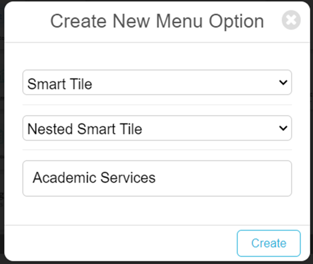
- Add a new menu option to the home screen in app Builder in the usual way and select Smart Tile from the tile type.
- Select Nested Smart Tile from the smart tile type and provide a name. This will be the Title shown on the nested smart tile when deployed.

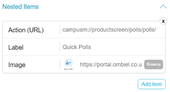
- Configure the menu option through the config panels, adding an Action URL (the action undertaken on selection), the Label and the image to associate with the nested tile.

- You can add a number of these nested items by selecting the Add Item button. After 4 items, the tile will turn into a carousel, allowing end users to browse the content by selecting the left and right arrows on the tile.
- Save and publish.
Options in the UI
See the following sections for information about the top options.
App Builder
App Settings
The options on this page are:
- App Settings
- General Settings – See Configuring App Name and Icons.
- Email Templates – See Configuring App Emails.
- Integration Profiles – See Configuring Integration Profiles.
- Profile Registration Authentication – See Configuring End-User Authentication Types.
- Web App Icons – See Configuring App Name and Icons.
- Biometric Identification – See Configuring Biometric Identification.
- App Directory
- App Directory – See Managing Manually Added End-User Accounts.
- Customer Web Services
- Authentication Access – See Changing App Manager Installation Setting.
- Application Servers – See Changing App Manager Installation Setting.
- Web Service Endpoints – See Configuring Web Service Endpoints.
- Enterprise Roles
- Profile Groups – See Managing Profile Groups.
- App Profiles – See Managing Profiles.
- App Roles – See Managing App Roles.
- Customer Roles – See Configuring Customer Roles.
- Import / Export Roles – See Managing App Roles.
- Refresh Roles – See Roles.
- iOS Splash Pages
- iPhone Splash Pages – See Configuring App Information Screens.
- iPad Splash Pages – See Configuring App Information Screens.
- User Management
- User Roles — See Enabling/Disabling App Roles for End-Users.
- Registered Users — See Managing Users.
- Force Logout — See Force Logout.
- Content
- Content – See Working with Static Content and the Content Menu.
- Resources
- News/Events/Comms
- RSS Categories – See Configuring Default RSS Feeds.
- RSS Feeds – See Configuring Default RSS Feeds.
- Home Page Banners – See Configuring Default Banner Service Images.
- Maps/Locations
- Import / Export Positions
- Campus Maps – See Adding Maps.
- Location Categories – See Adding Map Location Categories.
- Positions – See Adding Map Locations.
- Position Actions – See Adding Actions at Map Locations.
- Publishing
- Publish Content – See Publishing the App.
- Feedback
- Feedback Configuration
- Problem Page Categories – See Configuring Problem Feedback Categories.
- Problem App Categories – See Configuring Problem Feedback Categories.
- Contact Email Addresses – See Configuring Email Addresses to Receive Feedback.
- Feedback – See Viewing Feedback.
- Problems – See Viewing Feedback.
- Ideas – See Viewing Feedback.
- Sharing
- Twitter Settings – See Configuring Twitter Sharing.
- Email Settings – See Configuring Email Sharing.
Analytics
See Analytics.
AEK
The options on this page are:
- Documents/Help
- AEK Documentation – See Application Extension Kit (AEK) and Connect Layer Extension Kit (CLEK).
- App Extension Kit
- AEK Menu Options – See Creating Services.
- AEK Screens – See Creating Services.
- Publishing
- AEK Publishing – See Publishing the App.
Notification Center
The options on this page are:
- Notification Actions
- Send Individual Notification – See Sending Notifications to End-Users.
- Send Group Notification – See Sending Notifications to End-Users.
- Manage Notification Groups – See Configuring Notification Groups.
- Push Service Settings
- Other actions on this page – See Viewing Sent Notifications and Resending Notifications.
User/Permissions
- Users/Permissions
- Users – See Managing Users.
- Groups – See Managing User Groups.
Asset Manager
See Uploading Files.
Insight Analytics
See Monitoring App Usage.
Attendance
Creative Studio
Product Integrations
See Product Integrations.
Help and Support Menu
Click the question mark icon at the top right of any page in the App Manager to display the Help and Support Menu. The following options are available:
- Help for this page – display online help documentation for the page you are viewing. (Only available for select pages).
- Browse Online Help – display App Manager documentation
- Raise a Ticket – open a Salesforce Support Ticket
- Release Schedule – display the monthly release schedule
- The current release notes

