Views Wizard
If you are working with Primo VE and not Primo, see Configuring Discovery Views for Primo VE.
-
A different look-and-feel for different user groups. Every view can have its own logo, header, header links, and more.
-
A different set of tabs and search scopes to be displayed for different user groups.
General View Attributes
Create a View
-
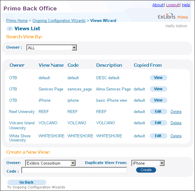
In the Create a New View area on the View List page, select a view to duplicate in the Duplicate View From drop-down list.For installation-level staff users, select the installation name or a specific institution from the Owner drop-down list. The valid values are Installation (if using the default name) or a specific institution. For single-institution installations, your institution is selected for you.
-
Select a view to duplicate in the Duplicate View From drop-down list.
-
In the Code field, enter the view's code. The code can be modified in the View codes table.
-
Click Create.The new view appears in the Views List. You can now edit the view's details by using the instructions in Edit a View.
Edit a View
-
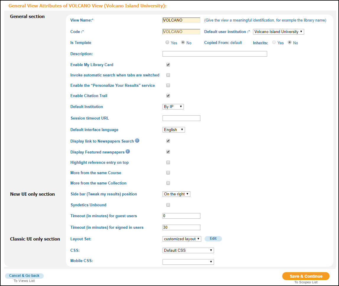
On the Views List page, click Edit next to the view you want to update.The Edit View Attributes page opens.
 Edit View Attributes Page
 -
In the General View Attributes area, edit the attributes for the view (see General View Attributes Details for a list of fields).
General View Attributes Details Section Field name Description General section
View Name1The name of the view.Code1The Primo view ID code.Copied FromThe original view from which this view was copied.Default InstitutionIndicates how the default institution is determined if the user is not signed in. The valid values are:-
By IP – The system will use the institution that is assigned to the IP address from which the user has accessed Primo. If the user is not within an institution’s IP range, the system uses the default institution for the view.
-
By View – The system will use the default institution for the view.The default value is By View.
In a local institution view, it makes sense to base the institution on the view. In a central view that is used by many institutions, it may be better to base the institution on the IP range.
Default interface languageThe default interface language of the interface.Display link to Newspapers Search
When selected, the link to the Newspaper Search page will appear in the following areas:
-
The Main Menu bar. This link opens the Newspapers Search page, which allows users to perform searches within the newspapers collection search index only.
-
The bottom of CDI search results. This link allows users to view newspaper content that matches their search query.
-
A Resource Type facet value in CDI search results. This link allows users to view newspaper content that matches their search query.
The Newspapers Search feature must be enabled first by selecting the Newspapers Search check box in the Institution Wizard.
For more information, see Configuring the Newspaper Search Interface.
Display Featured newspapers
When selected, this check box indicates whether the following will appear on the Newspaper Search page:
-
The Featured Newspapers section displays each time the Newspapers Search page is opened.
-
Featured newspapers appears as a search option in the search box.
The Newspapers Search feature must be enabled first by selecting the Newspapers Search check box in the Institution Wizard.
For more information, see Configuring the Newspaper Search Interface.
DescriptionA description of the view.Enable Citation TrailEnables the Citation and Cited By links in the results for CDI records. It allows users (such as researchers and graduate students) to display the lists of cited and cited by records for CDI records retrieved in the brief results and to follow the trails of each citation. By default, this functionality is enabled.The Results Tile code table allows you to modify the associated labels that display in the Front End.Enable Auto Complete
If Auto Complete has been enabled for your institution, this field appears and allows you to enable this feature for your view. Once enabled, you can disable it per scope if you do not want to provide this functionality for all scopes associated with this view.
For more details, see The Auto Complete Configuration Guide.
Enable My Library CardWhether this view enables My Library Card on the e-Shelf.Enable the “Personalize Your Results” service
Enables the Personalized toggle for searches that include CDI search scopes. Selecting the toggle, enables users to select and apply a higher ranking to CDI articles that fall under their selected disciplines.If you disable the Personalize Your Results feature, it will remain active only for users who previously configured at least one discipline and selected the Personalized toggle in the UI. To disable personalization, those users will have to edit and clear all selected disciplines instead of just clearing the Personalized toggle, which is no longer visible to all users.For more information, see Configuring Personalized Ranking for Primo.Highlight reference entry on top
When this check box is selected, a short topic overview, which is derived from a reference entry in a collection that you have active, displays at the top of the results list. Currently, topic overviews come from the following publishers: Oxford University Press, Credo, Encyclopedia Britannica, Gale Virtual Reference Library, Wikipedia, JapanKnowledge, and Worldbook.
The Reference Entry code table allows you to customize the labels associated with the reference entry.
InheritsWhether this view inherits attributes from the parent view or not.A view that inherits from a parent view cannot be a parent to another view.
Institution*The institution to which this view belongs.Invoke automatic search when tabs are switchedWhether auto-search is enabled when users switch between tabs on a view.This field is checked/enabled by default.Is TemplateWhether this view is a parent view or a child view. Select Yes to make this a parent view. The default value is No.By default, any view that is created from a template becomes a child view.
More from the same Course
Enables the More from the same Course section on the Full Display page. When enabled, users can view other items from the same course and other courses that refer to this record. For more details, see Configuring Course Reserves in Primo.
More from the same Collection
Enables the More from the same Collection section on the Full Display page. When enabled, users can view other items from the same collection and other collections that refer to this record. For more details, see Collection Discovery.
Session Timeout URL(Classic UI only) This field specifies the page to which the user will be redirected after a session times out.To configure the Session Timeout URL to be any file:-
Enter the URL of the file, using the following format:http://<server>:<port>/primo_ library/libweb/static_htmls/<file>
-
Enter the following commands to access the static_htmls directory:fe_webcd static_htmls
-
Place the file in the static_htmls directory.
New UI Only section
Side bar (Tweak my results) position
(New UI only) The position of the Tweak My Results section in the Front End:
-
On the right – Positions the Tweak My Results section on the right side.
-
On the left – Positions the Tweak My Results section on the left side.
Syndetics Unbound
(New UI only) Enables the Syndetics Unbound section on the Full Display page.
For more information, see Setting Up Syndetics Unbound in Primo.
Timeout (in minutes) for guest users
(New UI only) The time in minutes when a session is timed out due to inactivity for guest users. By default, this parameter is set to 0, which indicates that there is no timeout period.
If this parameter is set to a value that is greater than 0 and the session times out, the system will reset all parameters and continue to display the current page.
Regardless of this setting, the maximum duration of a user session is 24 hours.
Timeout (in minutes) for signed in users
(New UI only) The time in minutes when a session is timed out due to inactivity for signed-in users. By default, this parameter is set to 30. A value of 0 indicates that there is no timeout period.
If this parameter is set to a value that is greater than 0 and the session times out, the system will continue to display the current page and upon the user's next action, the system will sign the user out, refresh and display the Primo home page, and prompt the user to sign in.
Regardless of this setting, the maximum duration of a user session is 24 hours.
Classic UI only section
Layout Set(Classic UI only) The Layout Set used with the view. The following options are available:-
Standard – opens facets on the right side.
-
Facets on the Left – opens facets on the left side.
-
Customized layout – allows you to create customized view layouts. Select the Edit button that appears for this option to modify the layouts. For more information on customization, see Custom Layout Editor.
CSS(Classic UI only) The name of the CSS used with the view. This can be Primo's default CSS, iPhone view CSS, or a customized CSS file that you upload. To customize your CSS file, refer to the Primo Technical Guide.Mobile CSS(Classic UI only) The name of the CSS file that automatically adjusts the display for devices that have smaller screens, such as smartphones. The default value is Mobile CSS, which enables the mobile view functionality.If this field is left empty, the system will disable the mobile view functionality.
1This is a mandatory field. -
-
Click Save & Continue to save your changes and display the Search Scope List page.
-
Once you have created or edited your view's header attributes, you can configure the search scopes using instructions in Search Scopes.
Delete a View
-
On the View List page, select the Delete action in the row of the view that you want to delete.
-
Restart your FE. For cloud customers it is necessary to open a Support ticket.
Search Scopes
Add a Search Scope
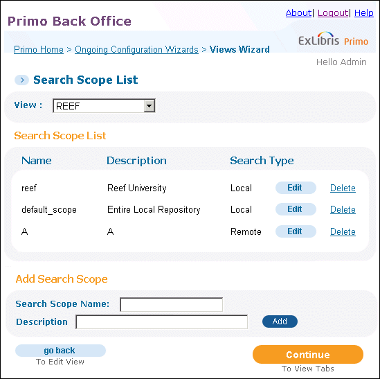
You add an additional search scope to a view in your Primo system. After adding a view, you can edit it to further customize your search scope with more advanced information.

-
In the Add Search Scope section, enter the search scope name in the Search Scope Name field (see Search Scope List Page).
-
In the Description field, enter a description of the search scope.
-
Click Add.The new search scope appears in the Search Scope List. You can now edit the search scope details using the instructions in Edit a Search Scope.
Edit a Search Scope
Editing the search scope enables you to add and remove search scope values created for the local repository and add a single remote quickset for remote searches.
A quickset is a group of remote databases that is defined in MetaLib. Refer to the Primo Interoperability Guide for more information on setting up quicksets in MetaLib.
Generally, a single search scope includes either local search scope values or a quickset, but it is also possible to combine both local and remote scopes in a single scope. The remote search scope values are added to the PNX records during the normalization process.
-
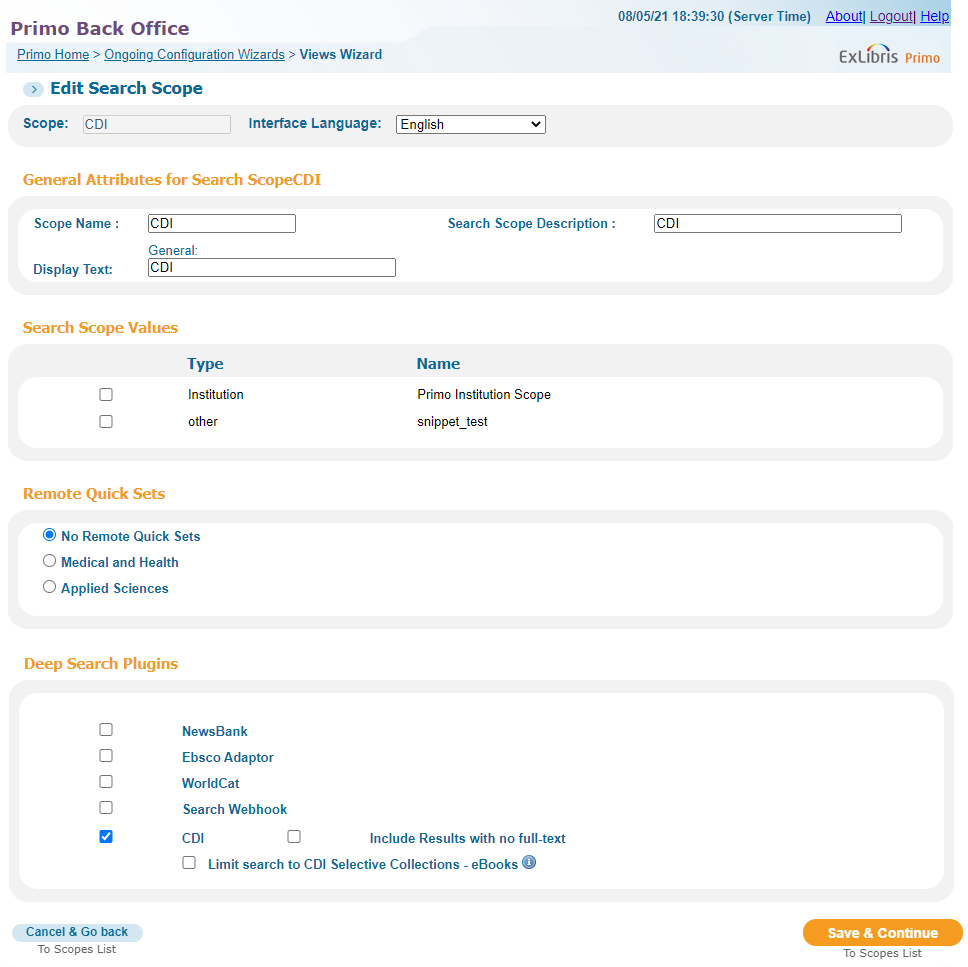
On the Search Scopes List page, click Edit next to the search scope that you want to update.
The Edit Search Scope page opens (see Edit Search Scope Page).
 Edit Search Scope Page
 -
Update the fields shown in the following table to configure the search scope:
General Search Scope Attributes Details Field name Description Scope NameThe name of the view's search scope.Search Scope DescriptionA description of the search scope.Display TextThe name of the search scope as it is displayed in the Front End.Enable Auto Complete
If Auto Complete has been enabled for your view, this field appears and is enabled by default. If you want to disable this feature for a scope, clear this checkbox.
For more details, see The Auto Complete Configuration Guide.
-
In the Search Scope Values area, add or remove the search scope values from the local repository. If no search scopes or quicksets are selected, the scope includes the entire local repository. If a quickset is selected, the scope does not include any search scopes in the local repository.
The values displayed in the Search Scope Values list are defined in the instructions for the Managing Scope Values.
-
In the Remote Quick Sets area, choose a remote MetaLib QuickSet for your search scope by checking the desired quickset. If this section is left blank, there are no remote quicksets for the search scope.
If no scope values or remote quicksets are selected, there are no local or remote search scopes defined and the entire local index is searched.
-
In the Deep Search Plugins area, select additional search plug-ins that you want to include with this view and search scope: WorldCat, EBSCO (see Configuring the EBSCO Plug-In), Primo to Primo, and CDI.
Primo supports only WorldCat Search API 1.0, Currently, there is no plan to support WorldCat Search API 2.0.
If your institution is registered for the CDI service and the CDI plugin is selected, you can also specify the following options:
-
Include Results with no full-text – By default, Primo displays only the CDI records that contain full text, but users may select the Expand My Results option in the Front End to display other CDI records as well. If you want to display all CDI records by default, select this check box.
When selected, the Expand My Results option will not display in the Front End, but users may click the Full Text Online facet to display only the records that contain full text.
-
Limit search to CDI Selective Collections - eBooks – Instead of including all collections from CDI, you have the ability to add specific CDI ebook collections (such as EBSCOhost Ebooks) to your search scopes. When this option is selected, the system will display your active CDI e-book collections so that you can add them to your local search scopes easily.
 CDI Options
For more information about CDI, refer to the documentation in CDI Documentation and Training. For Alma customers, also see Using the Central Discovery Index (CDI) in Alma. For SFX customers, also see the SFX General Users Guide.
To edit another search scope, select the search scope in the Search Scope drop-down list.
-
-
Click To Scopes List to continue to the Search Scopes List page.
To manage search scopes for another view, select the view in the view drop-down list.
-
On the Search Scopes List page, click Save & Continue.
The Tabs Configuration page opens.
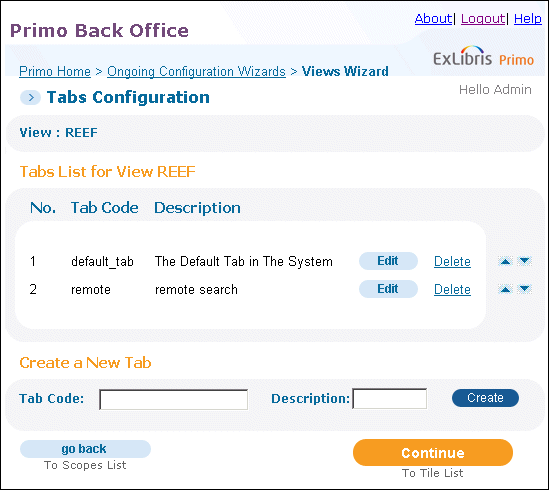 Tabs Configuration Page
You can now create and edit the tab details using the instructions in Tabs.
Tabs
You can define one or more tabs for each view. Tabs allow you to divide the data search within each view into different sections, matching the different search scopes that are defined for the view. A view can include a single search scope or several search scopes that appear in the Front End in a search box drop-down list.

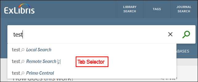
In this section you can create tabs, edit the display name appearing on the tab, and select the search scopes that are to appear in the drop-down list in the Front End search box.
Using tabs in Primo is similar to using links in Google to locate resources of different types such as images and maps.
Because a primary advantage of Primo is to provide a unified search interface for all library resources, Primo is initially configured with a single tab. You are encouraged to carefully consider whether to implement a multi-tab configuration after your switch to production.
Create a Tab
-
In the Create a New Tab area, enter the name of the tab in the Tab Code field.
-
In the Description field, enter a description of the tab.
-
Click Create.The new tab appears in the Tabs List. You can now edit the tab details and define the tab's search scope using the instruction in Edit a Tab.
Edit a Tab
-
On the Tabs Configuration page, click Edit next to the tab you want to edit.The Edit View Attributes page opens.
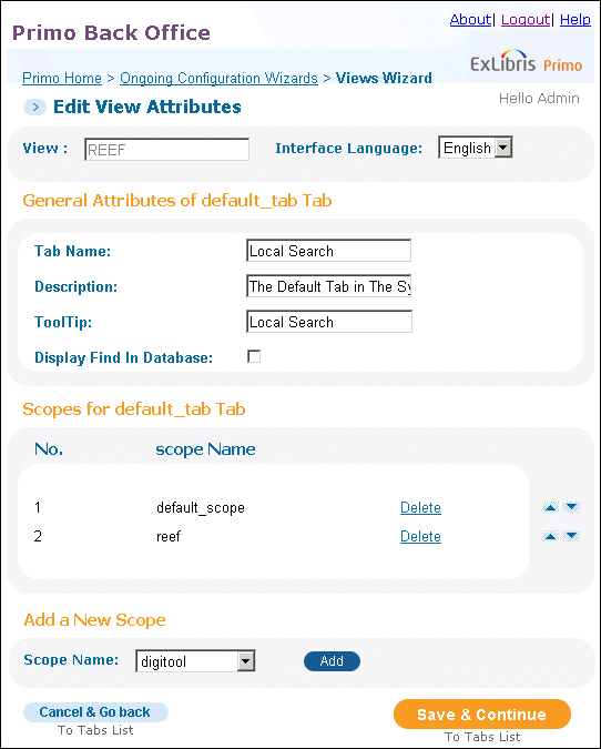 Edit View Attributes Page
 -
Edit the General Attributes for the tab (see General Tab Attributes Details for a list of fields).
General Tab Attributes Details Field name Description Tab NameThe name of the view's tab.DescriptionA description of the tab.ToolTipText used in the ToolTip tab in the Front End.Display Find in DatabaseSelect this check box to display the Find Database link for a search tab that includes only local search scopes.The Find Database link always displays for search tabs that include remote search scopes.
The tab's General Attribute details are updated and appear on the Tab List page (see Tabs Configuration Page). -
Click Save & Continue.The updated tabs appear in the Tabs List.After creating your tabs, you can:To configure your view's tiles, use the instructions in Tiles.
Delete a Tab
-
In the Tabs List of the Tabs Configuration page, click Delete next to the tab that you want to delete.A confirmation dialog box opens.
-
Click OK.The tab and the association to the tab's search scopes are deleted from the system, and the tab is removed from the Tab List.
Add a Scope to the Tab
-
On the Tabs Configuration page, click Edit next to the tab to which you want to add a search scope.The Edit View Attributes page opens (Edit View Attributes Page).
-
In the Add a New Scope area, select a search scope in the Scope Name drop-down list.
-
Click Add to add the search scope to the tab.The new search scope appears in the Search Scopes area.
-
On the Search Scopes List page, click Save & Continue to return to the Tabs Configuration page.
Delete the Tab's Scope
-
In the Tabs List, click Edit next to the tab whose search scope you want to delete.The Edit View Attributes page opens (see Edit View Attributes Page).
-
In the Scopes List, click Delete next to the search scope that you want to delete.A confirmation box opens.
-
Click OK.
-
Click Save & Continue to return to the Tabs Configuration page.The search scope is removed from the Search Scope list and the association between the tab and the search scope is deleted from the system.
Tiles
| Page | Tiles |
|---|---|
|
Home Page
|
Each of the pages can contain the following tiles, but are defined once under the Home Page configuration tile:
All of these tiles are required except for the Static HTML tile.
|
|
Full Display
|
The Full Display page can also contain the following tiles:
|
|
Brief Display
|
The Brief Display page can also contain the following tiles:
|
Edit a Tile
-
On the Tabs Configuration page, click Save & Continue.The Tiles Configuration page opens.
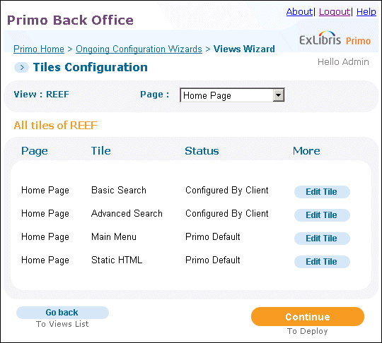 Tiles Configuration Page
 -
In the Page drop-down list, select the name of the page that contains the tile that you want to edit.The page's tiles appear in the All Tiles of area.
-
In the All Tiles of area, click Edit Tile next to the tile you want to edit.Depending on the tile you selected, the following page opens:
-
For the Basic Search tile, see Edit Basic Search Attributes Page
-
For the Advanced Search tile, Edit Advanced Search Attributes Page
-
For the Main Menu tile, Edit Main Menu Attributes Page
-
For the Static HTML tile, Edit HTML Attributes Page
-
For the Full Results tile, Edit Full Details Attributes Page
-
For the Send To tile, Edit Keeping This Item Attributes Page
-
For the Brief Results tile, Edit Brief Results Attributes Page
-
For the Refine My Results (Facets) tile, Edit Facets Attributes Page
-
For the Locations tile, Edit Locations Details Attributes Page
-
-
Click Save & Continue to return to the Tiles page.The tile details are updated and appear in the Tiles List page (see Tiles Configuration Page).If you want to edit another tile for the selected page, select the desired tile in the Tile drop-down. If the tile belongs to another page, select the page in the Page drop-down list and the tile in the Tile drop-down list. After selecting the desired page and tile, repeat Steps 3 through 5.To edit a tile that belongs to another view, select the desired view in the View drop-down list and repeat Steps 3 through 5.
Edit Basic Search Attributes Page
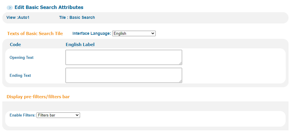
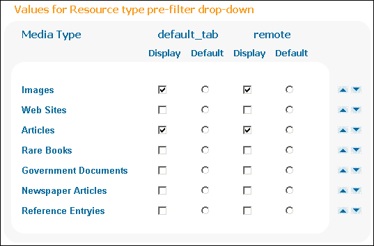
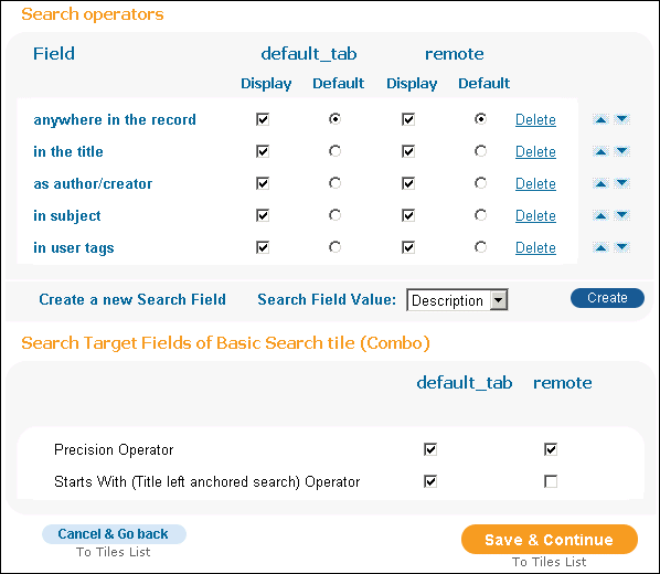
| Section | Field | Description |
|---|---|---|
|
Texts of Basic Search Tile |
Interface Language
|
The interface language of the tile.
|
|
Opening Text
|
The text displayed at the top of the tile.
|
|
|
Ending Text
|
The text displayed at the bottom of the tile.
|
|
|
Display pre-filters/filter bar |
Pre-filters |
When selected, the pre-filter parameters display in the new UI.
In addition, the following sections appear enable the configuration of each of the pre-filter drop-down selectors: |
|
Filters bar |
When selected, the Resource Type Filter Bar appears in the new UI.
In addition, the Values for Resource type filters bar section appears to enable the configuration of the filter bar. For information regarding the customization of resource type icons, see Customizing SVG Icons. |
|
|
Values for Resource type pre-filter drop-down (This section appears only for Pre-filter configuration.) |
Display
|
The media types displayed in the media type pre-filter in the search box. The facet_pfilter_values mapping table defines the supported media type selections, and the Basic Media Type code table defines the display labels, including All items.
|
|
Default
|
The media type that appears as the default in the media type pre-filter in the search box.
|
|
|
Values for Resource type filters bar (This section appears only for Resource Type Filter Bar configuration.) |
Display
|
The resource types displayed in the Resource Type Filter Bar. You can display a maximum of 10 resource types. If you display more than six resource types, the More option appears in the filter bar to enable the the selection of the bottom resource types (7-10).
The facet_pfilter_values mapping table defines the supported media type selections, and the Basic Media Type code table defines the display labels.
|
|
(This section appears only for Pre-filter configuration.) |
Display
|
The list of available default search fields that appear in the search field pre-filter in the search box. You can allow users to select from any indexed field, but the following fields are the most commonly used:
|
|
Default
|
The search field that is to be displayed as the default in the search field type pre-filter in the search box.
|
|
|
Search Target Fields of Basic Search tile (Combo) (This section appears only for Pre-filter configuration.) |
Precision Operator
|
When selected, the with my exact phrase option is offered in the basic search box. The following operators are supported:
|
|
Starts With (Title left anchored search) Operator
|
When selected, this indicates that the starts with option is offered in the basic search box.
This option allows users to perform left-anchored title searches only. |
Edit Advanced Search Attributes Page
Advanced searches using the NOT and OR operators are not supported in remote searches (MetaLib).
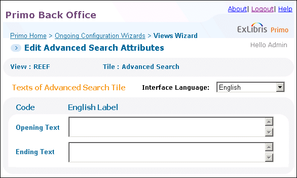
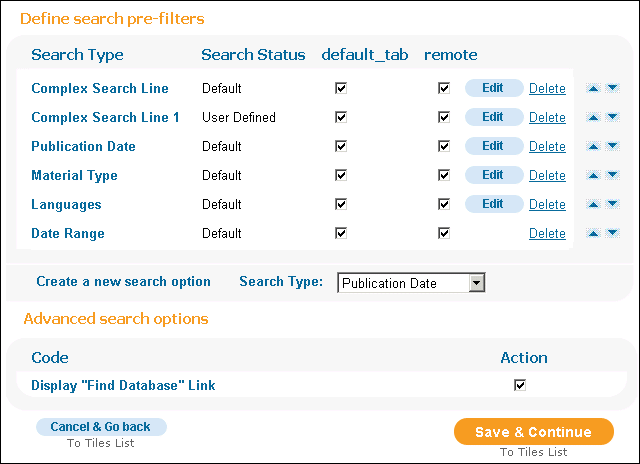
| Section | Field/Button | Description |
|---|---|---|
|
Texts of Advanced Search Tile |
Interface Language
|
The interface language of the tile.
|
|
Opening Text
|
The text displayed at the top of the tile.
|
|
|
Ending Text
|
The text displayed at the bottom of the tile.
|
|
|
Define search pre-filters |
Search Type
|
The search options available through the Advanced Search tile. Each of the options is displayed as an individual tab in the Advanced Search tile.
Both the Publication Date and Date Range options can be configured to filter by date, but providing both options may be confusing to end users. For more information on the Data Range option, see Configuring Date Ranges.
|
|
Search Status
|
Definitions of the search type. This can be the default definitions or user defined.
|
|
|
Tabs
|
A check box displays for each tab defined in the view. If you want to display the advanced search box for a tab by default, select the corresponding check box.
|
|
|
Edit button
|
Click the Edit button that displays next to a search type in the list to modify its settings. Each search type corresponds to a line in the Advanced Search box in the Front End. The following search types are valid:
|
|
|
Delete button
|
Click the Delete button that displays next to a search type to remove it from the Advanced Search box in the Front End.
|
|
|
Create a new search option
|
This field allows you to add search options to the Advanced Search box in the Front End. To add a search option, select a search option from the drop-down list and then click Create.
For more information on each type, refer to the Edit button above.
|
|
|
Advanced search options |
Display “Find Database” Link
|
This field indicates whether the Find Database links will display on the Advanced Search page. Select this field to display the link.
The Find Databases link always displays on the Front End for remote scopes, regardless of this setting.. |
Edit Main Menu Attributes Page
From this page, you can define the main menu links and language-specific labels for each link. For the new UI only, you can use the Main Menu URLS for the New UI mapping table to configure language-specific links. For information on accessing this page, see Views Wizard.
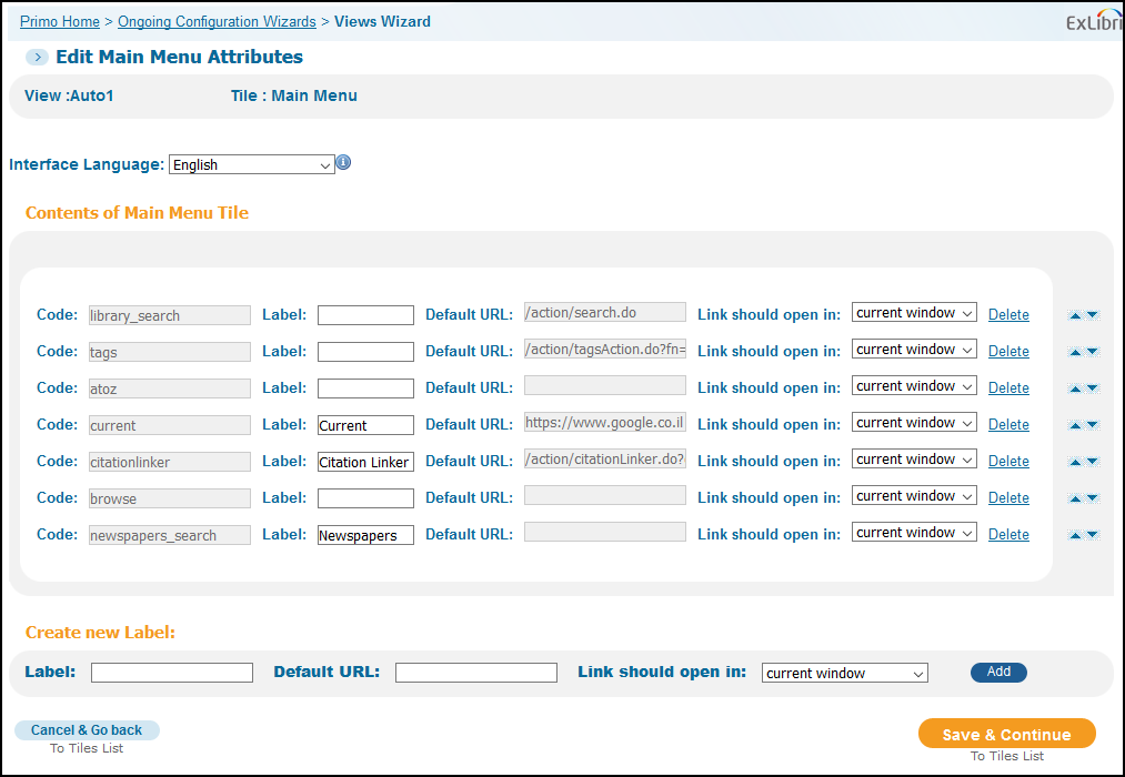
Edit the Main Menu Attributes details according to the following table:
| Section | Field | Description |
|---|---|---|
|
N/A |
Interface Language |
The interface language of the tile. Switching to another language allows you to create language-specific labels for the link. |
|
Contents of Main Menu Tile |
Code |
An internal identifier that associates each main menu link with a label defined in the View Labels code table. It is created for you during the creation of a link. |
|
Label |
The label that appears at the top of the header. You can create language-specific labels by selecting a specific language from the Interface Language drop-down field. |
|
|
Default URL |
The default URL for the English link and all other languages. For the new UI only, you can use the Main Menu URLS for the New UI mapping table to configure language-specific links. For the classic UI, you can create language-specific labels only. |
|
|
Link should open in |
Indicates whether the link should open in the current window or in a new window/tab. The default is current window.
|
|
|
Create new Label |
Label |
The label that appears for the link in the Main Menu. In addition, this value is used to create the link's code. |
|
Default URL |
The URL of the label. |
|
|
Link should open in |
Indicates whether the link should open in the current window or in a new window/tab. The default is current window. |
Edit HTML Attributes Page
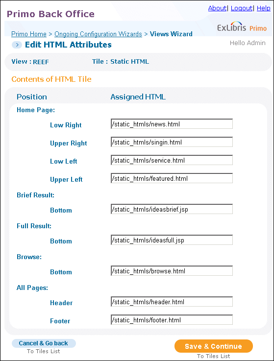
| Section | Field | Description |
|---|---|---|
|
Contents of HTML Tile (Classic UI only) |
Position
|
The various positions in the tile.
|
|
Assigned HTML
|
The HTML code that is to appear in the specific position.
|
Edit Full Details Attributes Page
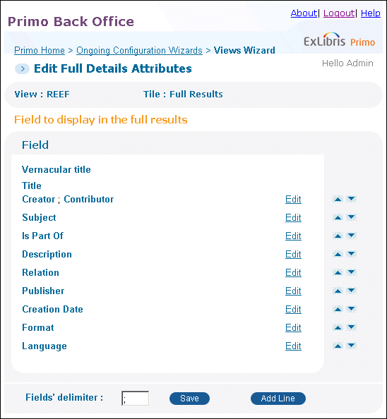
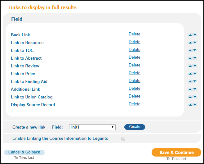
| Section | Field | Description |
|---|---|---|
|
Field to display in full results |
Field column
|
The list of fields that are displayed in the Full Display.
To reorder the fields, click the arrows next to the fields to move the fields up or down as needed.
The Snippet field allows you to display the text in the Search section from the PNX that includes the query terms, illustrating why the record was found.
The system automatically adds the vernacular title and title to the first two lines. |
|
Edit
|
This button opens a display line for editing. You can perform the following operations on a display line:
|
|
|
Add Line
|
This button opens a new display line to allow you to add a new field.
To add a new field, select the field type in the Field drop-down list and click Create. Otherwise, click Cancel to exit without making changes.
You can add a maximum of 50 display fields. |
|
|
Fields' Delimiter
|
This field defines the field separator, which is used to separate multiple fields per display line. To update the delimiter, fill in the field and click Save. The default value is a semicolon.
To display multiple fields per display line, refer to the description on the Edit button.
|
|
|
Links to display in full results |
Field column
|
The list of links that are displayed in the Full Display.
The display of the URI field is not supported, but it can be added as needed through customization by the customer. |
|
Delete
|
Deletes the link.
|
|
|
Create a link
|
Select the field type in the Field drop-down and click Create.
|
|
|
Enable Linking the Course Information to Leganto |
When this field is enabled, users can access their Leganto reading lists by selecting the Course Information link under the Details section of a record's full display in the new UI. To support this functionality, the <crsinfo> PNX field, which contains all course related information (including the course code), store the course code in subfield $$R to allow linking from the field. For example: <crsinfo>SOCPETS: Sociology of Pets; Sociology; Braun, Connie; $$RSOCPETS</crsinfo> For the classic UI, the display/crsinfo rule that includes the $$R subfield should not be included in your normalization rules. |
Edit Keeping This Item Attributes Page
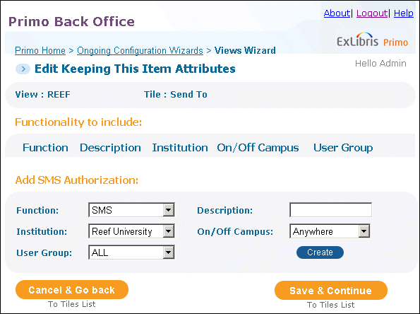
| Section | Field | Description |
|---|---|---|
|
Functionality to Include |
N/A
|
This section lists the SMS authorization items for the SMS option provided in the Actions drop-down list in the full and brief results. |
|
Add SMS Authorization |
Function
|
Indicates the function to configure. The only valid value is SMS.
|
|
Description
|
Contains the description of the function.
|
|
|
Institution
|
Indicates the institutions to which this function applies. To apply this function to all institutions, select All. For institution-level staff users, your institution will already be selected.
For installation-level users, you must select an institution before the associated values appear in the drop-down lists that display the Select Institution value. |
|
|
On/Off Campus
|
Indicates whether the user should be within the institution's IP range.
|
|
|
User Group
|
Specify Not Guest to enable SMS only for signed-in users.
|
|
|
Create button
|
Click this button to add the specified function to the Actions drop-down list.
|
Edit Brief Results Attributes Page
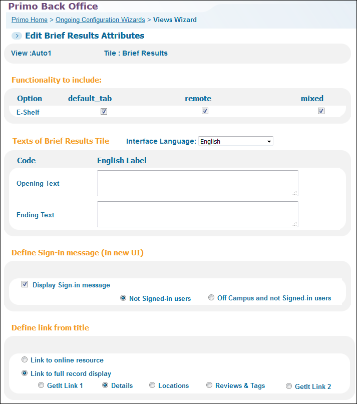
| Section | Field | Description |
|---|---|---|
|
Functionality to include |
E-Shelf
|
(Classic UI only) This field allows you to enable the add to e-Shelf option per tab in your view. To add this option to your view, select the relevant tabs.
|
|
Texts of Brief Results Tile |
Interface Language
|
The interface language of the tile.
|
|
Opening Text
|
The text displayed at the top of the tile.
|
|
|
Ending Text
|
The text displayed at the bottom of the tile.
|
|
|
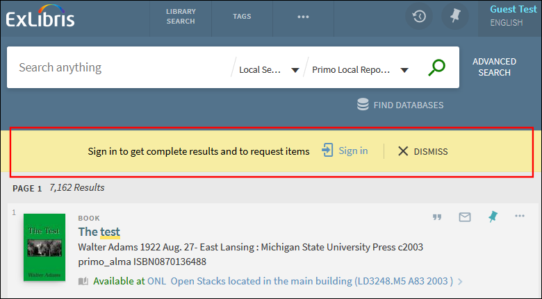
Define Sign-in message (in new UI) |
Display Sign-in message
|
(New UI only) Indicates whether to display the sign-in message on the Brief Results page. The following options are valid:
 Sign-In Message Enabled in Brief Results
|
|
Define link from title (Classic UI only) |
Link to online resource
|
Specify this option to allow users to display the online resource by clicking the title in the Brief Record display.
If a GetIt! 1 link is not configured to link directly to the online resource, the title cannot be clicked. By default, the online resources are configured, based on availability, to allow direct linking. To update these settings, refer to GetIt! Links. |
|
Link to full record display
|
Specify this option to allow users to display the full record by clicking the title in the results. Select one of the following tabs to display it initially:
The default is the Details tab.
|
|
|
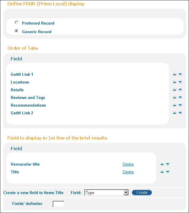
Define FRBR (Primo Local) display |
Preferred Record
|
This option displays the preferred record (based on ranking) for the FRBR group. This is the default display type.
|
|
Generic Record
|
This option displays a generic record for the FRBR group.
The generic record serves as a placeholder for the group and does not include the data and functionality that is relevant to a specific record (such as the availability status, tabs, and save to e-shelf). It only indicates that multiple versions of the title have been found. End users can click either the title or the View versions link to display the versions for the FRBR group. In addition, generic records display two rows in the brief results:
|
|
|
Order of Tabs |
Field |
This section enables you to order the tabs in the Brief Record display. Select the arrows next to each of the following tabs to move the tab up or down in the list:
If GetIt! Link 1 is a link to an online resource, it will always display in the first tab, regardless of these settings. |
|
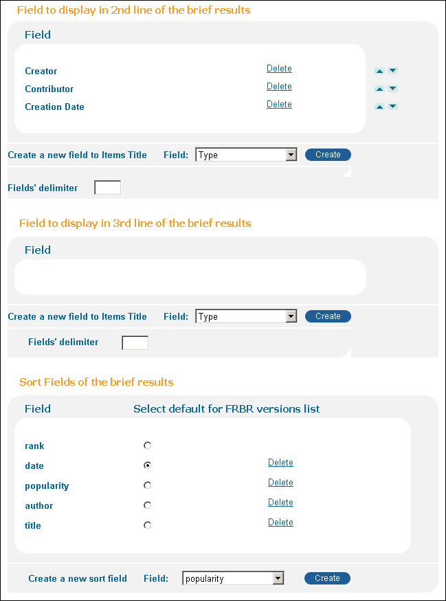
Fields to display in 1st line of the brief results |
Field
|
The list of fields that are displayed in the first line of the Brief Results.
By default, the system includes the Title and Vernacular title fields in the first line. |
|
Delete
|
Deletes the field.
|
|
|
Create a new field to Item's Title
|
Select the field type in the Field drop-down list and click Create.
|
|
|
Fields’ delimiter
|
Characters used to separate fields per line. If no delimiter is specified, the system defaults to a new line.
|
|
|
Fields to display in 2nd line of the brief results |
Field
|
The list of fields that are displayed in the second line of the Brief Results.
By default, the system includes the Creator, Contributor, and Creation Date fields in the second line.
|
|
Delete
|
Deletes the field.
|
|
|
Create a new field to Item's Title
|
Select the field type in the Field drop-down and click Create.
|
|
|
Fields’ delimiter
|
Characters used to separate fields per line. If no delimiter is specified, the system defaults to a space.
|
|
|
Fields to display in the 3rd line of the brief results |
Field
|
The list of fields that are displayed in the third line of the Brief Results.
The system always displays the information stored in the display/ispartof field in the third line of the Brief Results. If you do not want to display this information, omit the display/ispartof field in the normalization rules. |
|
Delete
|
Deletes the field.
|
|
|
Create a new field to Item's Title
|
Select the field type in the Field drop-down and click Create.
|
|
|
Fields’ delimiter
|
Characters used to separate fields per line. If no delimiter is specified, the system defaults to a space.
|
|
|
Sort Fields of the brief results
|
Create a new sort field
|
This section lists the fields that will appear in the Sort By drop-down list in the search results. For more information, see Sort Fields Config*.
Because the popularity sort applies to local records only, it is recommended to remove it for blended searches. The date2 field is a virtual field that allows you sort by date in ascending order. For more information on the sort fields, see the Sort Fields Config mapping table.
|
|
Select default for FRBR versions list
|
Select this radio button to specify the default sort used for the FRBR versions list in the Front End.
The FRBR versions list opens after clicking the View versions link in the record's brief display.
 View Versions Link
During an update pipe, the FRBR versions list will return no results until the hotswapping process has completed.
|
|
|
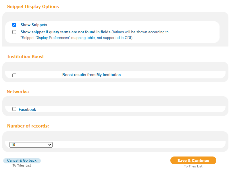
Snippet Display Options |
Show Snippets
|
Primo enables you to display snippets in search results retrieved from the CDI, local Primo collections, and external enrichments that are loaded locally (such as from Syndetics). Select this field to display snippets when the search term is found in the abstract, toc, or fulltext fields. For CDI records, the snippets will display only when the search term is found in the snippet.
|
|
Show snippet if query terms are not found in fields (Values will be shown according to "Snippet Display Preferences" mapping table; not supported in CDI) |
Select this field if you want to display snippets when the search term is not found in the abstract, toc, or fulltext fields. To select this field, you must also select the Show Snippets field.
If the search term is not found in the abstract, toc, or fulltext fields, the system displays the first 160 characters of the highest priority field specified in the Snippet Display Preferences mapping table.
For more information, see Snippet Display Preferences.
Regardless of this setting, the snippets will display only when the search term is found in the snippet for CDI records.
|
|
|
Institution Boost |
Boost results from my institution
|
Select this field if you want to boost the search results for records in your institution. To configure the boost level, see Results Boosting – Institution Boost. |
|
Network |
Facebook
|
(Classic UI only) Enables the Facebook Like button for local Primo and CDI records on the Brief Results page so that users can share content with their friends on Facebook.
The browser's language selection overrides Primo's display language for the Facebook Like button. |
|
Number of records |
(Classic UI only) Indicates the maximum number of records that will display in the search results unless overridden by the user’s preferences. The valid values are 10, 20, 30, and 50. The default value is 10.
This setting does not apply to the number of results returned from Alma’s A-Z list. |
Edit Facets Attributes Page
| Section | Field | Description |
|---|---|---|
|
Texts of Facets Tile |
Interface Language
|
The interface language.
|
|
Opening Text
|
The text displayed at the top of the tile.
|
|
|
Ending Text
|
The text displayed at the bottom of the tile.
|
|
|
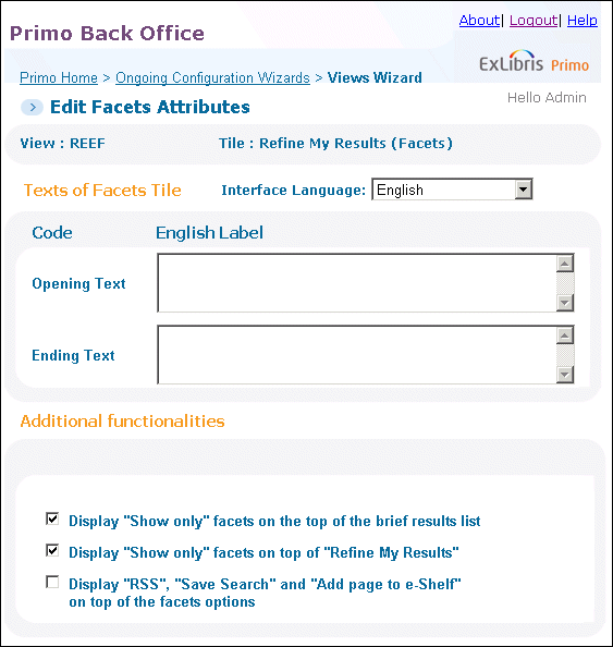
Additional functionality |
Display “Show Only” Facets on the top of the brief results list
|
(Classic UI only) Select this field if you want to display the Show Only section (which contains the top-level facets) above the list of the results on the Brief Results page.
|
|
Display “Show Only” Facets on the top of “Refine My Results”
|
Select this field if you want to display the Show Only section (which contains the top-level facets) above the Refine My Results section on the Brief Results page.
|
|
|
Display "RSS", "Save Search" and "Add page to e-Shelf" on top of the facets options
|
Indicates whether the rss, Save search, and Add page to e-Shelf links appear above or below the Facets section on the Brief Results page.
|
|
|
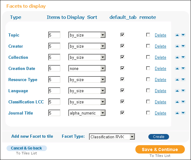
Facets to display |
Type
|
The type of facet to be displayed.
|
|
Items to Display
|
The maximum amount of items to be displayed for this facet.
Because the system creates five groups for the Creation Date facet, a value greater than 5 will only display five groups. For information on how facet groups are created for the Creation Date facet, see Facets Section in the Primo Technical Guide.
|
|
|
Sort
|
Indicates the order in which the facets are displayed.
|
|
|
Default tab
|
Indicates whether to add to the default tab.
|
|
|
Delete
|
Click this button to delete the facet.
|
Edit Locations Details Attributes Page
| Field | Description |
|---|---|
|
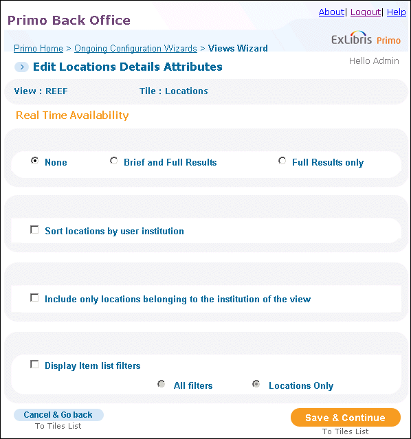
Real Time Availability
|
This field controls the display of real time availability information in this view. One of the following check boxes may be selected:
|
|
Sort locations by user institution
|
Select this option to sort the locations by the user’s institution.
|
|
Include only locations belonging to the institution of the view
|
Select this option to display only locations that match the institution of the view.
|
|
Display Item list filters
|
For sites using OPAC via Primo for Aleph, select this check box if you want to provide filter drop-down lists in the Locations tab on the Brief Results page.
This option is not valid for Voyager customers.
When this check box is selected, you can select one of the following filter options:
To change the text for the drop-down lists, label, and button, modify the following codes in the Location Tab code table:
|
Deploy View
-
On the Tiles Configuration page, click Save & Continue.The Deploy page opens.
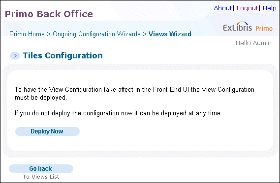 Deploy Page
 -
Click Deploy Now.A deploy job is added to the queue. If you want to monitor the deploy job, click the deploy job link (see ). For more information on monitoring jobs, see Deploy Monitoring.
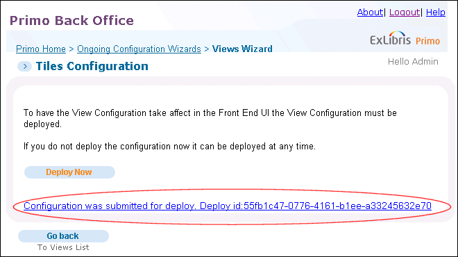 Deploy Job Link
 -
Click Go back to return to the Views List page:The Front End view has been created and deployed to the Front End.


