
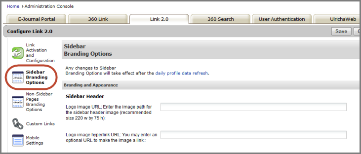
360 Link: Administration Console -- Sidebar Branding Options
- Product: 360 Link
My library uses 360 Link with Index-Enhanced Direct Linking (IEDL) and we have the Sidebar Helper Frame turned on, are there customization options for the sidebar?
The Sidebar Branding Options page in the administration console contains the available customization options.
Changes to the branding of your 360 Link will not be visible to patrons until the Daily Profile Data Refresh has completed; to see how your changes will look without having to wait, click Preview.
- See 360 Link: Previewing Changes You Make in the New Interface for additional information about previewing changes.
- For more information about the daily profile data refresh:
Branding and Appearance
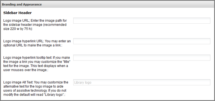
The first branding and appearance option for the Sidebar Helper frame is the logo that appears at the the top of the sidebar. Enter the logo image URL, Logo image hyperlink URL, and Logo image hyperlink tooltip text. The tooltip text is the text that displays when a user mouses over the image (assuming you have made the image a hyperlink by adding a URL to the Logo image hyperlink URL field).
The Logo image Alt Text is the alternative text for the Sidebar header logo. The text value can be read by screen readers. The default value is "library logo". Note that when a screen reader first focuses on the Sidebar Helper frame, the screen reader automatically sees a statement saying "This is the 360 Link Sidebar Helper frame - use this to find other links to this content or links to additional library resources." This is automatic behavior built into 360 Link.
In the Sidebar Header and Background section:
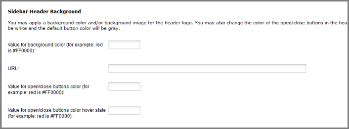
You can apply a background color (hex value) or image (an online image with a URL) to the header logo. The default setting is white if you do not enter a color or URL.
The last two settings above are to customize the look of the header buttons in the top right of the sidebar, used for collapsing or closing the sidebar:
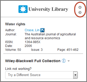
By default the buttons are colored gray (and they turn to black when you hover over them); you can use the two settings to provide color hex values of your choice.
For the two hyperlink color settings in the section labeled Other, see the Hyperlink Colors (Branding) section of the Activation and Configuration admin page.
Advanced Settings
Select the first setting in the Advanced Settings section, Automatically collapse sidebar after initial load, to minimize the sidebar after it is briefly displayed to the user. Sample display of a collapsed Sidebar Helper Frame displaying along the right side:

Collapsed sidebar image: Enter the image that you would like displayed along the left side of the page when the Sidebar Helper frame is minimized. Note the stated maximum dimensions for the Collapsed sidebar image are 30 pixel width by 450 pixel height. The default display of the collapsed sidebar does not contain an image, so by default a blank/white collapsed sidebar is displayed.
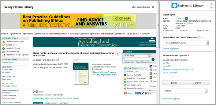
Display 'Additional Options' link in sidebar: Select this checkbox to display at the bottom of the Sidebar Helper frame an "Additional Options" link that takes the user to the full 360 Link results page. The sample sidebar at the top of this Support Center article includes the Additional Options link.
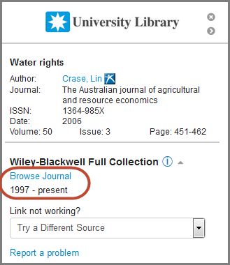
Expand additional resources information by default: Use this checkbox to display, by default, additional resource information such as a link to the journal and full text coverage dates. By leaving the checkbox on this admin page un-checked, a user needs to click the drop-down "information" icon in order to see the additional resource information:
Collapse custom links section by default: Selecting this checkbox will hide any custom links you have set up on the Sidebar Helper frame. The custom links section header such as "More full text options" (displayed in the Sidebar Helper frame screenshot at the top of this document) will display, and the user can view the custom links by clicking the drop-down arrow to the right of the header text.
Display "Open content in new tab" link: Select this checkbox to display at the bottom of the sidebar a link that opens the URL for the target content in a new tab. For users that are likely to further their research by searching within the target database, the new tab (which will not include the Sidebar Helper Frame) enables users to bookmark pages beyond the initial target content that was provided along with the Sidebar Helper Frame. This feature can also be used as an alternate way to view content that may not be displaying properly alongside the sidebar.
- To change the label for this link, use the Custom Text tool in the 360 Link tab of the administration console.
- Date Created: 12-Feb-2015
- Last Edited Date: 16-Jun-2015
- Old Article Number: 12196