
New Layout
Overview of the New Layout
Ex Libris is gradually introducing a set of new layout features in Alma record lists. These features aim to facilitate quicker access to common processes, enable focused filtering through multiple facet-value selection, and enable users to perform workflow tasks while keeping the task list visible.
The rollout process for the new layout of each type of task list is scheduled to take place over at least three quarterly releases. During this time period, users will be able to choose whether to work with the old layout or the new layout; see Opting In or Out of a New Feature.
For full details on the Alma user interface, see The Alma User Interface.
For details on the basic and advanced search, see Searching in Alma.
Navigation Bar
Simplified Menu Mode
Selecting the Use Simplified Menu Mode toggle button in the navigation panel presents a streamlined menu containing only the most widely and commonly used menu entries, selected based on statistical analysis. Menu entries marked by a user for favorites also appear in the simplified view.

Once in the simplified mode, you can select View Full Menu to temporarily return to the full menu view.

Closing and then opening the menu brings you back to the simplified view. When you log out and back in, Alma remembers your choice for the Use Simplified Menu Mode toggle button.
In the simplified view, searching in the menu looks for all the options in the full menu, not only the simplified ones displayed.
The simplified view has no impact on the display of the Recent Pages in the homepage dashboard.

Task List
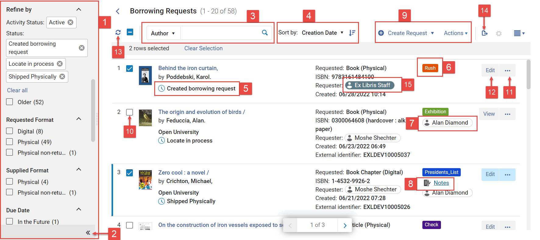
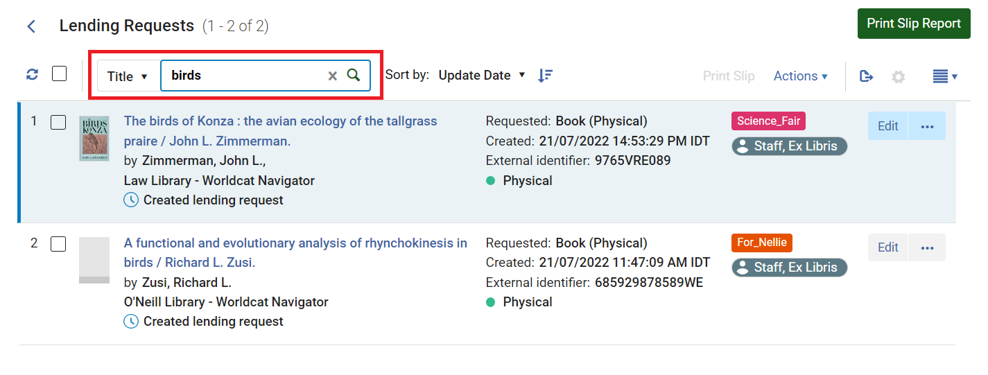
When you first open a task-management page, such as the Borrowing Requests page, it opens a task list in the right panel, with a Facets panel to its left. You can use the Facets filtering system and the sort feature, as well as other options that are specific to certain types of tasks, to help you find the tasks you need to work with.
For a video showing the task list see here.
-
Facets panel
-
Collapse button
-
Secondary-search controls (Resource Sharing record lists only)
-
Sort controls
-
Current status
-
Label (see Managing Labels)
-
Assignee (select to see user information)
-
Notes link (for Resource Sharing record lists, only displayed when notes exist and are active; see The Alma User Interface)
-
Actions menu
-
Task checkbox (the number of selected checkboxes across all the pages appears above the list. On some pages, such as PO Lines and search results for All Titles, selecting a checkbox/es causes other options to appear (see Managing Search Queries and Sets).
-
More actions button (row actions)
-
Main action
-
Refresh
-
Export
-
Requester (select to see user information)
Facets and Filters
Facets
The Facets panel enables you to filter the task list so that you only see tasks that meet selected conditions. The facets are divided into categories, such as Status and Creation Date. In the New Layout, you can select multiple values in each category, enabling you to filter the task list so that it only shows the exact collection of tasks you need to see.
The currently selected facets appear at the top of the Facets panel, under Active Facets.
In some cases, a particular facet value is already selected when you first open a task list. For example, when you open the resource-sharing Borrowing Requests task list, Activity Status "Active" is already selected. You can clear the selection if you wish, as explained below.
For customizing facets see Customizing the Display of Facets.
Expanding and Collapsing the Facets Panel
-
Select the arrows at the bottom of the facets area to collapse/expand the facets panel.
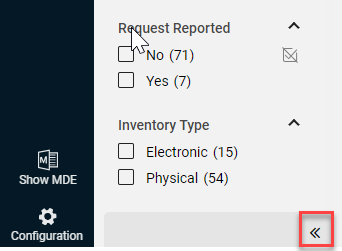
In smaller screens, the Facets panel is automatically collapsed, and when you expand it, it overlaps the task list.
-
A dot on the collapsed facets bar indicates active facets, and the number of active facets appears.

-
If you hover over the collapsed facets bar, a tooltip displays the selected facets.

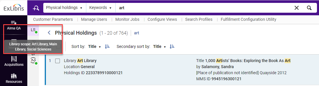
The tooltip also displays the location for library scope (LS) where relevant for example in search results for Physical holdings. A dot on the library scope indicates that libraries were selected (the default is all libraries).
-
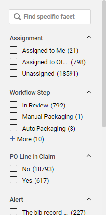
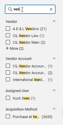
When many facets appear in the Facets panel, it may be difficult to scroll through the list in order to locate the facet you require. In this case you can filter the facets to locate the facet you need (see Filtering the Facets List).
Facet sections are sorted alphabetically which enables organizing the information more efficiently. Individual Facet sections can be customized to be displayed in any order suitable for users. For more information on customizing Facets, see Customizing the Display of Facets.
Resizing the Facets Panel
You can resize the Facets panel by dragging the resize icon.
You can also resize the facets panel with the keyboard by using the Tab button to reach the resize icon and then using the ← (left) and → (right) arrow keys.
Filtering the Facets List
- At the top of the list of facets, in the Find specific facet field, type a sequence of characters that appears in the name of the facet you are looking for. As you type, the list of facets is filtered so that only those containing the sequence you type are displayed.
Using Facets to Filter the Task List
-
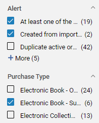
In the Facet panel, select the value/s you want to include in the task list.
-
Select Apply. The task list is filtered by all of the currently selected facets and the selected facets are displayed in the Active Facets section.

-
If you select multiple values in a single category, the logical relationship is OR. In other words, tasks with any of the selected values in the category are included.

-
If you select values in multiple categories, the logical relationship is AND. In other words, tasks with one or more of the selected values in each category are included.
Excluding Facets from the Results
- To exclude a facet from the results, select the Exclude icon to the right of the facet value and then Apply.
Removing Facets from the List
- In the upper part of the Facets panel, select the x beside each facet value you want to remove. To remove all the selected facet values, select Remove all.

- The Reload facets button appears. You can select it to restore the facet values.

Saving Facets
-
In the Active Facets list, select the Save icon.
 Save facet selection
 -
Alma saves the values in the facets list. The next time you enter the page, the results appear according to the saved facet values.
When saving facets in persistent searches, any future repository searches you run will use those saved facets.
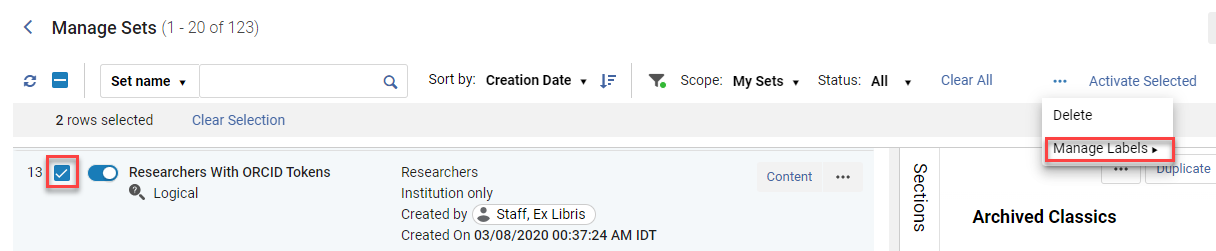
Saving Multiple Combinations of Facets
On the Manage Sets and the resource sharing task list pages, you can save multiple combinations of facets under different names. The saved facets are available in the Saved drop-down list.

-
To save a facet under a new name after making updates, select the Save as New icon.
 Save as New icon
 -
To delete a facet, select the Delete icon.
 Delete facet icon
 -
To set a facet as the default when entering the Manage Sets page, select the Default icon.
 Set as default
You can also set a facet as the default when saving as a new facet.
 Save as Default
Filters
When a non-default filter is selected, a green dot appears next to the filter icon to indicate that the results displayed on the page are not the default ones (for example My Sets instead of All sets).
In responsive mode, only the filter icon displays and selecting that icon displays the filter options.
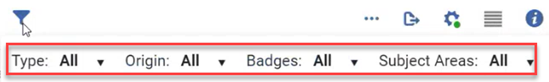
The Clear All button displays next to the filter, enabling the user to clear the filter values and reset them to their defaults.

If only the default options are selected for the filters, then the Clear All button does not display.
Secondary Search
Some pages include a secondary search that enables you to search the current list for records that meet certain criteria.
 to filter the list.
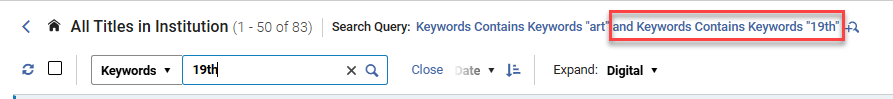
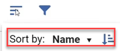
Sorting the Task List
You can sort the task list by various criteria.
-
Under Sort by, select the desired sort criterion. The list is sorted.
-
Select
 .
.
In responsive mode, the sort options appear under the sort icon.
Information in the Task List
For each task in the task list, Alma displays basic information about the task, as well as its current status. If the task list is wide enough, icons showing labels that are attached to the task (see Managing Labels) and its current assignee, also appear, as well as a link to attached notes. If the list is not wide enough to display these objects, selecting a task in the list opens the Details pane, where this information also appears.
For customizing the records display see Customizing the Display of Records.
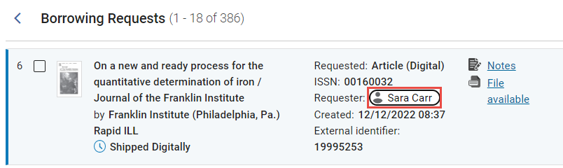
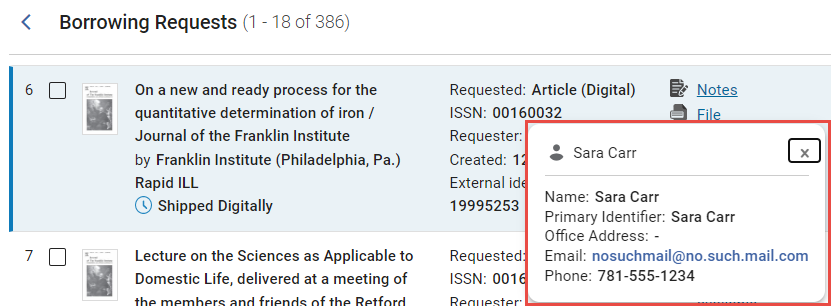
Opening a User-Information Pop-Up
You can see additional details about a user (assignee, requester, etc.) whose name appears in the task list (or the Details pane; see New Layout 2022 below).
-
Select the name of the user. A pop-up opens and displays additional information about the user.
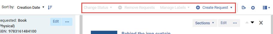
Actions Menu
The Actions menu allows you to perform actions on one or more selected tasks (changing status, removing tasks, etc.) or actions that are not related to any specific task in the task list (e.g., creating a new task).
You can select tasks on different pages in the task list, and perform the action you select on all of them.
-
In the task list, select the checkbox beside each task on which you want to perform the required action. The options that can be performed on the selected tasks become available in the Actions menu.
-
In the Actions menu, select the action to perform.
Depending on how wide the task list is, the Actions menu may be expanded so that each of the options it contains appears separately above the task list, or collapsed so that some or all of the options are only available in the Actions dropdown menu.

To customize the actions menu see Customizing the Display of the Actions Menu.
Managing Labels in Alma
On some pages in Alma, you can use labels as reusable identifiers that can be attached to records as required. Labels are automatically color-coded in order to highlight them.
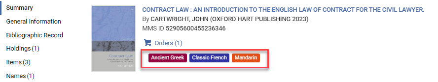
You can use labels for various purposes, including highlighting important features of particular records and grouping records to make it easier to find them later on. For example, you could attach an "Exhibition" label to all the books requested from other libraries in your network for a particular exhibition planned at your library. You can choose existing labels in your system or create new ones on the fly, as required. Any new labels you create are saved in the system and available for reuse. Each type of task (for example, sets, PO lines, etc.) has its own list of saved labels. Note that labels for records on the All Titles search are not saved in analytics.
You can manage labels through the Actions menu or through the Details pane, as described below.
Managing Labels Through the Actions Menu
From the Actions menu, you can add labels to a single or multiple records in the task list.
-
In the task list, select the checkbox beside each task to which you want to add labels, and then select Manage Labels from the Actions menu. The label manager opens.
 If your selections include tasks that already have some of the labels, they will not be attached a second time.
 -
Select Add or the edit icon.
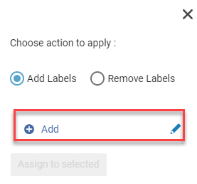
-
Enter the new label and select Save (
 ). Make sure to mark the checkbox next to the new label.
-
Select Save and then Apply.

The label is attached to the selected tasks. If it was a new label, it is also saved in the system. -
If the labels you added do not appear in the selected tasks, refresh the task list.
-
In the task list, select the checkbox beside each task from which you want to remove labels.
If your selections include tasks that do not have some of the labels you choose to remove, the labels will still be removed from the selected tasks that do have them.
-
In the Actions menu, select Manage Labels. The label manager opens.
-
Select Remove Labels.
-
Select the Labels field. A list of existing labels opens.
-
Select the labels you want to remove from the currently selected tasks.
-
Click outside the label area, or select Apply. The labels are removed from the selected tasks.
-
If the labels you removed still appear in the selected tasks, refresh the task list.
If, after you remove a label from one or more tasks, the label is no longer attached to any tasks, the label is deleted from the list of saved labels.
Managing Labels in the Details Pane
Any labels that are already attached to the selected task are displayed in the Details pane, in the General Information section at the top of the pane. You can also attach additional labels to a task and remove labels from a task in this pane.
Labels can also be managed for multiple tasks at once from the Actions menu; see Managing Labels Through the Actions Menu, above.
-
In the Details pane, in the top section, select Add Labels (if no labels were added previously).

If labels already exist select the label area.

-
Add the new label/s, making sure to mark the checkbox next to the new label, and then select the Save (
) icon.
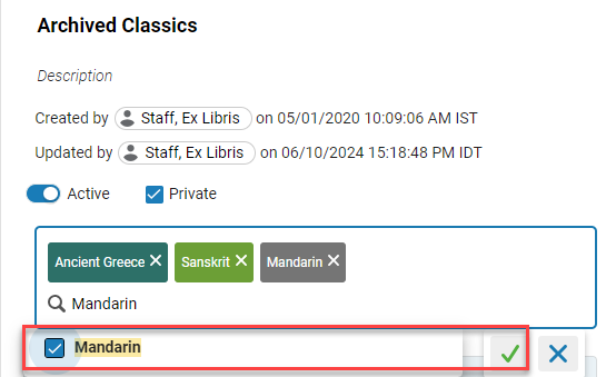
To attach an existing label, select it from the list. You can select multiple labels. To create a new label, type its text.
If the labels you added do not appear in the selected tasks, refresh the task list.
-
In the Details pane, in the top section, select the label area.
-
Do one of the following:
-
Select the x on a label you want to remove. The label is removed from the label area, and a list of the labels currently attached to the task appears.
-
Select the label area again. A list of the labels currently attached to the task appears.
-
-
In the list of the labels currently attached to the task, clear the checkboxes beside each of the labels you want to remove from the task.
-
Click outside the label area, and then select the Save button (
 ). The labels are removed from the task.
 -
If the labels you removed still appear in the task's row in the task list, refresh the task list.
If, after you remove a label from a tasks, the label is no longer attached to any tasks, the label is deleted from the list of saved labels. (You may have to refresh the task list to see the change.)
Labels in the Facets List
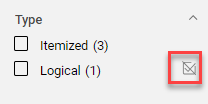
On some pages in Alma, labels are included as a category in the Facets panel.
Performing Actions on Individual Tasks
Depending on the type of task and its current status, various actions can be performed on individual tasks that appear in the task list, such as assigning it to a staff member, updating its status, sending messages to people interested in the task (patrons, vendors, staff members), and viewing and editing its details. The More actions button ( ) gives you access to the available row actions for each task, given its current status. The Main action of the list of available row actions may appear as a separate button beside the More actions button (). For example, if Edit is the main action for a task, given its current status, there may be a separate Edit button beside the More actions button (see Task List above). To customize the actions menu see Customizing the Display of the Actions Menu.
Refreshing the Task List
In some cases, the results of actions that are performed in the task list are not visible until the display is refreshed.
-
Above the task list, select Refresh (
 ).
).
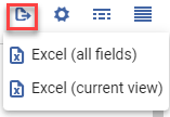
Exporting to Excel
You can export a maximum of 1000,000 lines at one time. If the task list is longer than this, only the first 1000,000 tasks are exported. For additional information about exporting to Excel, see Export to Excel.
-
Select Export. Note that on some pages you can choose to export the current view. The all fields option ignores any customization of the display that was done (see Customizing the Display).
Opening List Records
You can open records in lists by selecting the title row area.

Views
The New Layout supports three views:
-
Split view: In Split view, an additional Details pane (see Working in the Details Pane) is added to the right panel, alongside the task list. This pane provides fast access to more information about the currently selected task and to many workflow and editing options.
-
Full Page view: In Full Page view, either the task list or the Details pane is displayed in the entire right panel. You can switch between them as necessary.
-
List view: In List view, the task list is displayed in the entire right panel, and the Details pane is hidden.
Split view is only available if the window is wide enough to provide a useful display area. In narrow windows, such as those that are opened on relatively small computer screens, Full Page view is activated automatically.
For customizing the display of fields and columns see Customizing the Display of Records.
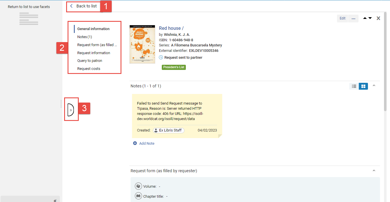
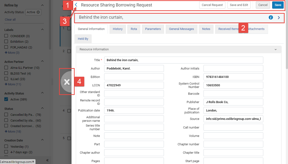
Split View
In Split view, a Details pane is added to the right panel alongside the task list, and the most significant information about the currently selected task is displayed there. Some of the task's fields can be edited in this pane, notes and labels (see Managing Labels) can be attached to the task directly from this pane, and other handling and editing options can be accessed from a dropdown menu. Because the task list remains open beside the Details pane, you do not lose sight of the task list while you are working on the selected task. The Split view option can be turned on or off, as desired.
-
When Split view is turned on (see below), in a task list, select a task. The Details pane opens and displays further information about the selected task.

- Details pane
- Customize button
- There are 2 alternating icons: Switch to list view
 and switch to split screen view
  .
. - Drag to resize
- Open full page view
- Close Details pane
Resizing the Panes
You can change the proportions of the task list and the Details pane by dragging the border between the two panes to the right or left. If you leave the page after you adjust the arrangement of the panes, the system saves the arrangement and implements it the next time you open the same page.
-
Align your mouse cursor with the border between the two panes. The cursor changes into a resize icon (
 ).
). -
Drag right or left to resize the panes as required.
-
You can also resize the panel with the keyboard by using the Tab key to reach the resize icon and then using the ← (left) and → (right) arrow keys.
Closing the Details Pane
When the Details pane is open, you can close it, so that you only see the task list.
-
Select Close (x - #6 in the illustration above).
Turning the Split Screen Option On or Off
You can turn the Split view option on or off. When it is turned on, selecting a task in the task list opens the Details pane alongside the task list, as described above. When it is turned off, selecting a task in the task list opens the Details pane in Full Page view, as described below.
-
Select the Split screen button (#3 in the illustration above).
Full Page View
In Full Page view, either the task list or the Details pane is displayed in the entire right panel.
-
On the border between the two panes, select the Open Full Page view (
 ) button. The Details pane fills the entire right panel.
-
Back to list
-
Sections menu
-
Return to split view
-
Select an item in the task list.
-
Select Back to list.
-
Select Return to split view (
 ).
).
Table View
On some pages, you can select the Table View icon to move from the regular record view to table view.


Selecting the title or (New for May 2026) the view icon in table view opens the split view.

For customizing the display of tables, see Customizing Table View.
Working in the Details Pane
The Details pane displays information about the currently selected task, and provides a number of convenient features for editing and processing the task.
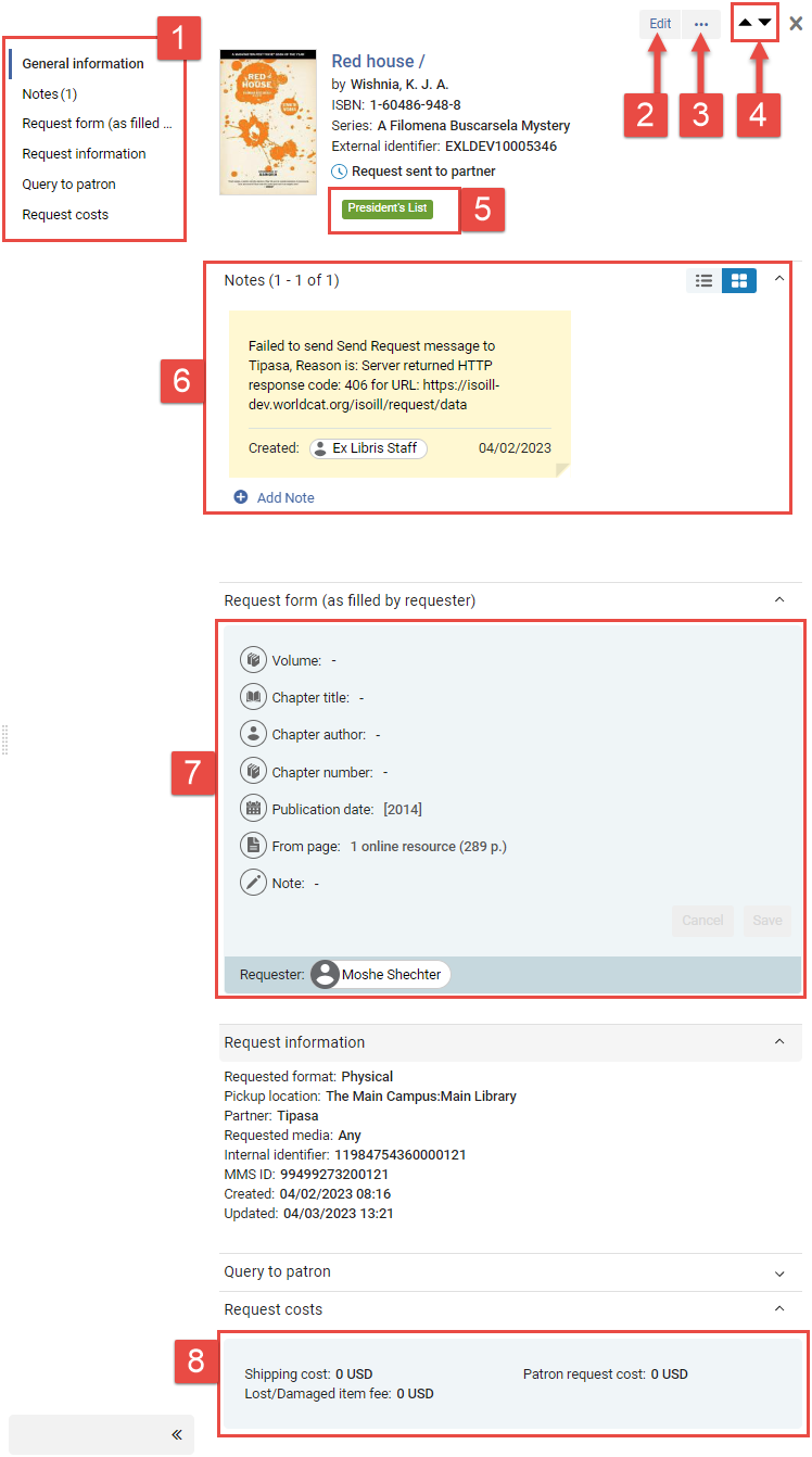
1. Sections menu
2. Main action
3. More actions button
4. Navigation arrows
5. Label (see Managing Labels)
6. Notes section (see Managing Notes in the Details Pane)
7 & 8. Editable sections (see Editable Sections in the Details Pane)
Navigating Within the Details Pane
The Details pane is divided into sections. The first section provides basic information about the selected task. Additional sections display further information, provide fields in which you can edit some of the task's information, and enable you to add notes and labels (see Managing Labels) to the record. The sections available in the Details pane vary depending on the type of record.
Navigating Between Sections
You can navigate from section to section either by scrolling or by selecting a section from the Sections menu.
Navigating Between Tasks
You can navigate from task to task either by selecting one of the navigation arrows to go up or down in the task list, or by selecting a different task in the task list.
Expanding and Collapsing the Sections Menu
The Sections menu can remain open while you are working in the Details pane, or it can be collapsed to allow more space for the other components displayed in the window.
-
At the bottom of the menu, select Collapse (
 ).
).
-
At the bottom of the collapsed menu, select Expand (
 ).
).
In smaller screens, the Sections menu is automatically collapsed, and when you expand it, it overlaps the rest of the Details pane.
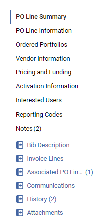
Counters in the Sections Menu
For some options in the Sections menu, counters indicating how many items exist in the section appear in parentheses after the name of the section. For example, a Notes section that contains two notes would appear as Notes (2), while a Notes section that does not contain any notes would appear without a counter in parentheses, simply as Notes.
Additional Links in the Sections Menu
In some types of tasks, additional links appear in the Sections menu. These links open additional information about the task in a sliding panel, rather than in the Details pane itself, and are identified by link icons ( ). Like the Sections options in the menu, these links may have counters in parentheses indicating how many objects in that category are defined for the task.
Required-Information Indication
A red asterisk (*) marks sections that contain fields that must be filled in in order for the workflow to proceed.
Editable Sections in the Details Pane
Some fields of a selected task can be edited directly in the Details pane. Sections that contain editable fields are shaded light blue. Required fields are marked with a red asterisk (*).
In some types of record lists, such as PO line task lists, you cannot edit the fields of a record unless you are in Edit mode. In these cases, an Edit button ( ) appears in the record list, and another Edit button (
 ) appears at the top of the Details pane when it is opened. In other types of lists, such as Resource Sharing record lists, sections can be edited individually, and without first entering Edit mode.
To enter Edit mode, it may be necessary for the task to be assigned to you.
In the task you want to edit, select the Edit button. The task is opened for editing in the Details pane, and Save and Cancel buttons are added at the top of the pane.
- Select anywhere in the shaded region containing the field. All of the editable fields in the region become available for editing. If you did not previously enter Edit mode, Save and Cancel buttons are added to the region.
- Select fields and edit their contents as required.
Editing a field
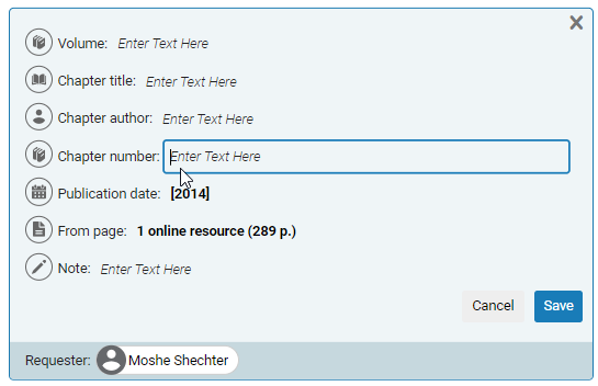
- Select Save. The changes you made are saved in the task.
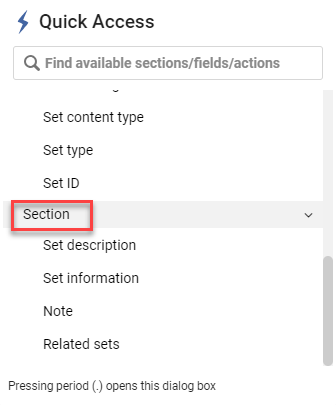
Quick Access Module
The Quick Access module gives you quicker access to specific actions, fields or sections on some pages in Alma such as Manage Sets, PO Lines, etc.

-
Use the keyboard shortcut (period '.') or select the Quick Access link at the bottom of the Sections slide-out pane.
-
The Quick Access module appears with links to specific actions, fields and sections.
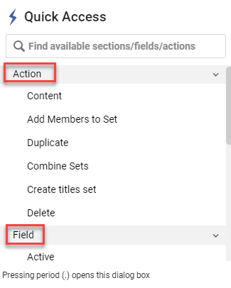
-
The values that appear under Action, Field and Section differ, depending on the task that is currently selected in the task list.
-
Select a specific action, field or section.
-
Action - Activates the specific action as if you had selected it for the current task in the details pane.
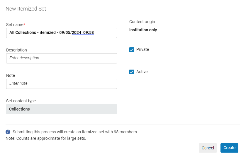
For example in the Manage Sets page if you select Itemize under Action, the New Itemized Set page appears, as if you had selected Itemize from the row actions menu.
-
Field - Takes you directly to the specific field.
For example in the Manage Sets page if you select Created by under Field, the focus moves to the Created by field.

-
Section - Takes you directly to the specific section.
For example in the Manage Sets page if you select Set information under Section, the focus moves to the Set information section.

-
-
If items were previously selected from the Quick Access module, these sticky selections (indicated with a
 icon) are displayed above the Action section.
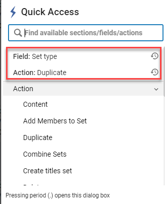
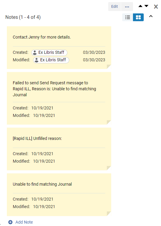
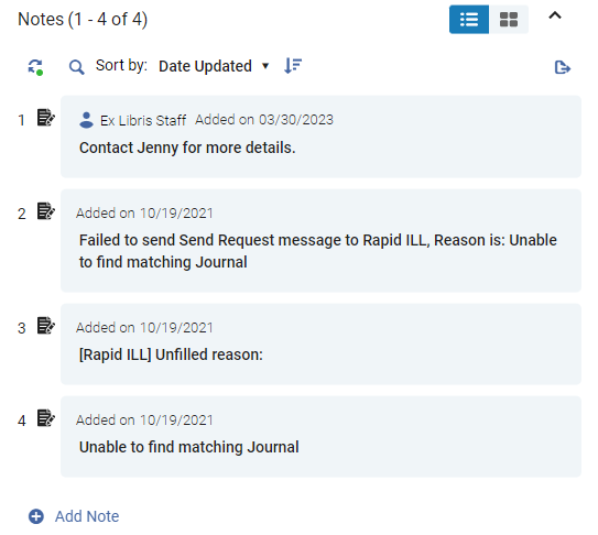
Managing Notes in the Details Pane
Any notes that are already attached to the selected task are displayed in the Details pane, in the Notes section. You can also add, edit, and delete notes in this pane.
For information about active and inactive notes in Resource Sharing record lists, see The Alma User Interface.
Two views of the Notes section are available, Notes layout mode and List layout mode. List layout mode supports searching within and sorting of the existing notes, but Notes layout mode does not. To switch between the modes, select an option at the top of the section ( ).
).
- In the Notes section, select Add Note. A new blank note is added to the section.
- In the blank note, select the Enter Text Here message.
- Enter the note text.
- Do one of the following:
- In Notes layout, select any spot outside of the note.
- In List layout, in the note, select Save.
The note is saved and attached to the item.
-
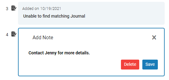
Select the text area of the note and then modify the note as required.
-
Do one of the following:
-
In Notes layout, select any spot outside of the note.
-
In List layout, in the note, select Save.
The changes are saved.
-
In List layout:
-
Select the note.
-
Select the Delete button.
-
Confirm the deletion. The note is deleted.
In Notes layout:
-
Place your mouse on the note. A Remove button (
 ) appears in the upper-right corner of the note.
 -
Select the Remove button (
). -
Confirm the deletion. The note is deleted.
-
At the top of the notes, under Sort by, select the option by which to sort the notes. The list is sorted.
-
Select the Sort icon (
).
-
At the top of the notes, select the Search icon (
 ). The search options and search text fields open.
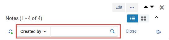
-
Select the search option, and enter the text to search for in the notes.
-
Select the Search icon (
). The list of notes is filtered so that only those that match the search criteria are displayed.
More Actions and Main Action Buttons
The More actions ( ) and Main action (e.g., Edit) buttons (see Performing Actions on Individual Tasks above), are both available in the Details pane when it is open. If the Details pane is wide enough, some or all of the options in the More actions menu appear as separate buttons at the top of the pane, alongside the Main action button.
If the task list is wide enough, these options are also available in the task list. Otherwise, when the Details pane is open, they only appear there.
Sliding Panel
When you select certain options in the New Layout record lists, the result is displayed in a sliding panel that is superimposed on the task list. For example, in the Resource Sharing > Borrowing Requests page, selecting Edit in a task opens the full request form in a sliding panel in which it can be edited. Note that when the sliding panel is open, the persistent menu icons disappear.
-
Page header - Contains the page title and various action buttons (see Alma User Interface). Select Save to close the sliding panel and save the changes or Cancel to close without saving. Select Save and Edit to save the changes and keep the sliding panel open.
-
Task header - Contains the task title and buttons you can select to see more information about the task.
-
Back - Close the sliding panel without saving.
-
Close - Close without saving.
-
On some pages, the "View in full page" icon appears, enabling you to view the page in full-screen mode and resize the panel by dragging it.
A warning displays to save any changes when moving to the full page view.
The "View in full page" functionality is not available for "pickup" sliding panels such as Add Collection from the All Titles search results.
Customizing the Display in Alma
Accessing the Customization Menu
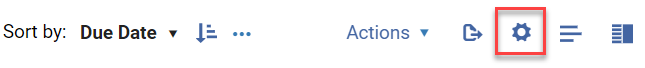
The customization menu is accessed from the gear icon at the top of the page.
For some pages, admin users will see an option to customize the display at the institution level. This will set institutional defaults, eliminating the need for individual users to configure their display to best fit their library’s preferences.
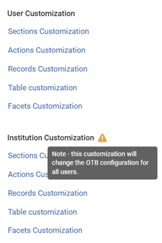
When any of the customization settings are customized, a dot appears on the Customize sections icon -  ..
..
Customizing the Display of Sections
You can customize the sections display by selecting Sections Customization from the Customization menu (see Accessing the Customization Menu).
You can enable/disable sections, except for those that remain displayed by default (such as Set description in the example below).
You can move sections with the Move ( ) icon.
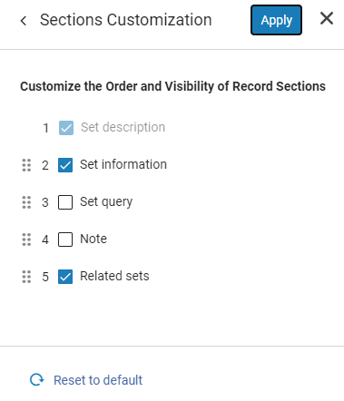
Select Apply to implement the changes or Reset to default to restore the defaults.
Customizing the Display of the Actions List
You can customize the display of the actions list by selecting Actions Customization from the Customization menu (see Accessing the Customization Menu).
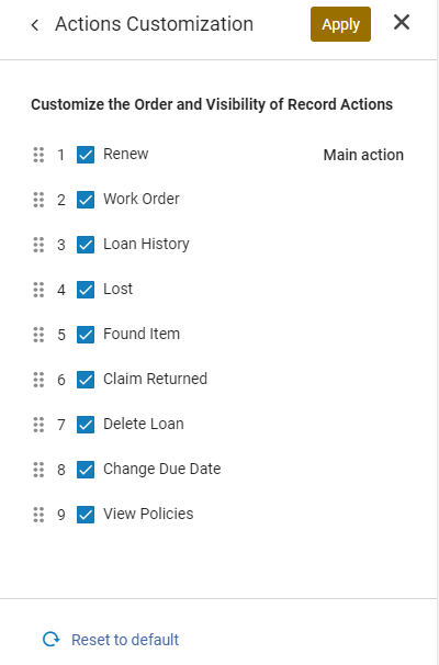
You can show actions to the user or hide them by checking/unchecking the icon to the left of the action.

Note that hidden actions will not be displayed in the Quick Access menu.
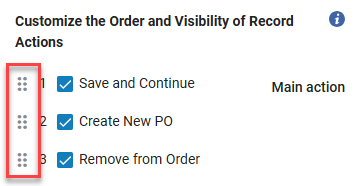
You can move actions by dragging the Move icon.
Select Apply to implement the changes or Reset to default to restore the defaults.
The first item in the list is the Main action. It is this action that appears as a separate button beside the More actions button, when the action is available for the task. (If it is not, the next action in the list that is available for the task serves as the Main action.)
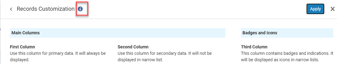
Customizing the Display of Records
You can customize the display of fields by selecting Record Customization from the Customization menu (see Accessing the Customization Menu).
You can enable/disable fields for display, except for those that remain displayed by default (such as Title in the first column in the example below).
You can move fields with the Move ( ) icon.

Select Apply to implement the changes or Reset to default to restore the defaults.
Customizing the Table Display
You can customize the table display by selecting Table Customization from the Customization menu (see Accessing the Customization Menu).
You can enable/disable table columns for display. You can move table columns with the Move () icon.
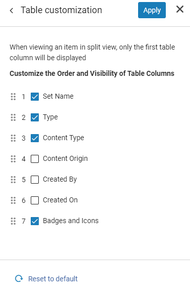
Select Apply to implement the changes or Reset to default to restore the defaults.
Customizing the Display of Facets
You can customize the facets display by selecting Facets Customization from the Customization menu (see Accessing the Customization Menu).
You can enable and disable facets for display. You can move facets with the Move () icon.
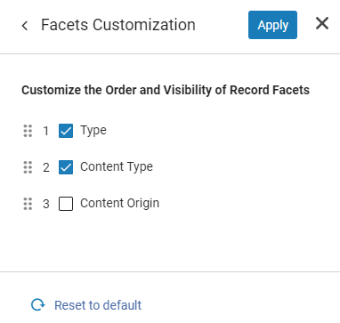
Select Apply to implement the changes or Reset to default to restore the defaults.
Video Showing How to Customize the Display
You can view a short video showing how the customization impacts what you see by selecting the (i) icon at the top of the page.
Responsive Mode
The Responsive Screen Mode option enables you to view content in low resolution screens and disable split screen mode. You can access this from the UI Preferences section of the User Menu (see Alma User Interface).