The App Manager UI
Logging In and Out of the App Manager UI
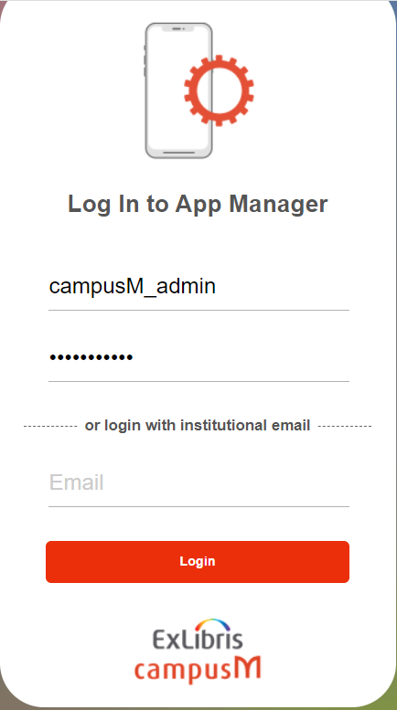
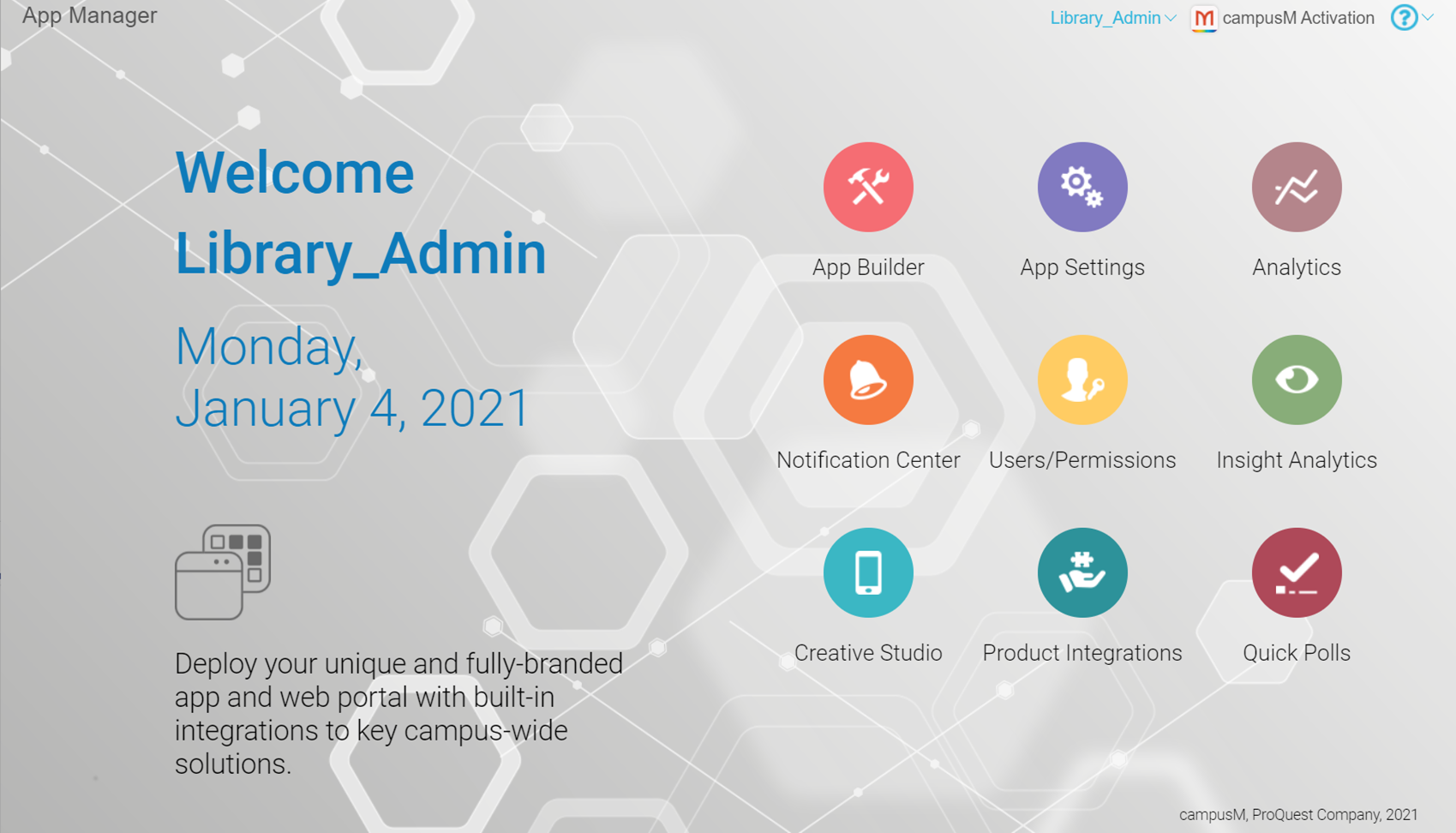
Changing Your Password

Institutional SSO Login for App Manager
IDP is used to authenticate the user and then the user is authorized within the App Manager. Therefore, user access and their permissions are still managed within the Users/Permissions area of the App Manager.
Once configured, to add a user to the App Manager, navigate to Users/Permissions > Users and create a new user with an Auth Type of External and with the email address as used by the IDP for authentication. You can then configure their access control.
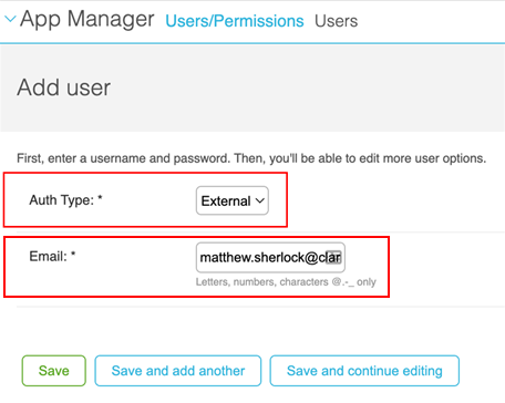
When a new user logs in to the App Manager, they must use the login with institutional email option. This redirects them to the IDP for authentication, and if their email address matches an authorized user, they can access the App Manager.
Configuring SSO for app manager requires a support ticket request. Once the ticket is submitted, support can use an (usually existing) Integration Profile to configure authentication against the institutional IDP.
Logging Out of the App Manager
Switching App Environments
Working with Lists
- A count of the total number of records appears at the bottom of the list.
- Search: For some lists, you can enter part of a record name in the search box at the top of the list and select Search to filter the list.
When noted, you can also filter the list by selecting a record type on the right side of the list.
- View/Edit: Select a record in the list to view and/or edit it.
- Add: When available, you can add a new record by selecting Add xxx. In some cases, only certain basic fields are available when adding a record. In these cases, after editing the record, you may want to edit the record to configure any additional fields.
- Save: When adding or editing a record, an asterisk * before a field indicates a mandatory field. Several types of save buttons may be available. Select any one of the buttons to save your changes (note that you cannot enter Ctrl + S to save). After saving your changes, the next page that appears depends on the button that you selected:
- Save – Display the list of records.
- Save and add another – Display the add record page.
- Save and continue editing – Display the edit page for the record.
After saving changes, if the changes affect the app in a visible way, the end-user sees the changes if they log out and in to the app or switch profiles. You can force these changes to appear immediately to the end-user by publishing the app. See Publishing Apps.To exit a record without saving your changes, simply navigate to any other page in the App Manager. - Delete: To delete a single record, select Delete from within the record, and select Yes, I'm sure in the confirmation dialog box. To NOT confirm a deletion, select anywhere in the breadcrumbs trail to navigate away from the page.
To delete multiple records, select the records in the list of records, select Delete selected xxx from the Action menu, and select Yes, I'm sure in the confirmation dialog box. Note that this is not possible for some lists of records, for example, profiles.
- View History: Select History within a record to view the change history for that record. The change history includes a timestamp for each change, the ID of the user that made the change, and the action that occurred. It is not possible to roll back changes. The change history is for auditing purposes.
Working with the Text Editor
| Icon | Function | Description | ||||||||||||||||||||
|---|---|---|---|---|---|---|---|---|---|---|---|---|---|---|---|---|---|---|---|---|---|---|
| Maximize | View fullscreen with the toolbar attached to the main toolbars. You must exit this mode to save the record or modify any other fields. | |||||||||||||||||||||
| View Source | Edit the HTML source of the text. You must exit this mode to save the page. | |||||||||||||||||||||
| Numbered or Bulleted List | Create a numbered or bullet list. | |||||||||||||||||||||
| Link/Unlink | Insert or remove a hyperlink at the cursor. Select Link to display a dialog box to select the link type. The dialog box contains multiple tabs, depending on what you select for Link Type.
On the Link Info tab, select one of the following for Link Type:
|
|||||||||||||||||||||
| Image | Insert an image. You must first upload the image to the Asset Manager; see Uploading Files.
After inserting the link to the image, to edit the image, select the image, and select the Image again.
To delete the image, select the image, and press the Delete key.
When uploading or editing the image, the following options are available:
Select OK to add the image or select Cancel to return to the text editor without adding the image.
|
|||||||||||||||||||||
| Insert Horizontal Line | Add a horizontal line. | |||||||||||||||||||||
| Insert Special Character | Insert a special character. Select a special character from the pane to insert it into the text area. | |||||||||||||||||||||
| Format Text | Format selected text in bold, italics, or underlined. | |||||||||||||||||||||
| Style Text | Apply style types to the selected text. | |||||||||||||||||||||
| Format Paragraph | Format paragraph. | |||||||||||||||||||||
| Text Color | Apply color to selected text. | |||||||||||||||||||||
| Hide/Display Toolbar | Hide/display the toolbar. The toolbar is redisplayed if you re-access the page. |
Working with the App Builder
- The Device Display Pane presents a simulation of how the app would appear for a specific device. orientation, profile, and list of app roles. Select the refresh button
 on the lower right corner of this pane to refresh the view. You can drag and drop services in this pane to change the location in the app for the end-user.
 - Use the Device Selection Menu and orientation toggle button to view the app as it would appear on various devices and orientations. For more information, see Viewing Service Positions by Device Type and Orientation. The height and width (in pixels) of the current display size appear beside the orientation toggle button.
- Use the Profile and Role Selection Menus to view the app as it would appear to end-users who have enabled various profiles and/or app roles.
- Use the Configuration Tabs to configure the look and feel of specific services, as well as the app roles that can view each service. In addition, you can configure the default look and feel for all services for each profile, as well as the default look and feel for all profiles (for the entire app). Any service property not defined for a specific service inherits the property value from the profile default. Any service property not defined for a service, or a profile inherits its value from the app default.
- When working on a specific service, an additional configuration tab for that service appears in the Configuration Tabs. The service is highlighted in the Device Display Pane and all other services are blurred.
- After making any changes in the App Builder, select Save & Publish at the bottom of the Configuration Tabs, and again in the confirmation dialog box, to publish your changes. These changes are immediately available to end-users, even if the end-users are already logged into the app. To discard all changes, navigate to some other area of the App Manager. Select Leave in the confirmation dialog box to confirm losing your changes.
Working with Static Content and the Content Menu

- Menu nodes – Contain sub-nodes that are either other menu nodes or section nodes.
- Section nodes – Either contain contents or act as redirects to other services.
- Menu Options – Static content services that appear in the main area of the app. These nodes are created, deleted, and customized in the App Builder. You cannot add or delete static content services from this menu. See Creating Services and Deleting Services.
Top-level nodes in the Menu Options area are menu nodes. If there are no sub-nodes, the static content service behaves exactly like a basic service: if a redirect is configured for the service, tapping the static content service tile opens the target link. The same thing happens if there is a single sub-node that is a redirect.Otherwise, if there is a single sub-node with static content, the app displays the content. If there is more than one sub-node, the app displays a menu with the sub-nodes as menu options. When the end-user selects a menu option, the app opens the sub-node (either another menu, the content of the node, or the end-user is redirected).
- About – Static content that appears when the end-user selects About (or the device-specific equivalent option) in the app. These nodes are used when configuring a profile.
Top-level nodes in the About area are either menu nodes or section nodes. The About menu option functions as a menu node (that cannot be deleted).
- Intro to App – Static content used in other areas of the app, such as a splash screen. These nodes are used when configuring a profile.
Top-level nodes in the Intro to App Section area are iPad Intro, iPhone Intro, and Android Intro. These nodes cannot be deleted.
- Select a menu node and select Create Node. A pane to create a new node appears.
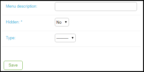 Create New Node
 - In Menu description, enter a name for the new node.
- In Type, select Menu or Section. If you select Menu, select Save to save the node and finish the process.
- In Section Type, select page to add static contents or redirect to create a redirect. Additional fields display depending on your selection.
- If you are creating a redirect, enter the redirect URL in URL and select Save to save the node and finish the process. See Working with App URLs.
Otherwise, enter the static content in the Content field. This field is a simple WYSIWYG HTML editor, enabling you to easily add bold, italics, links, four levels of headings, images, bulleted and numbered lists, and block quotes. Select the second-to-last (second from the right) icon to view/edit the HTML source. The source editor has several features, including automatically adding closing tags when you enter open tags and marking errors in the HTML code with red Xs on the left of the line numbers. Select the right-most icon to edit in full screen.
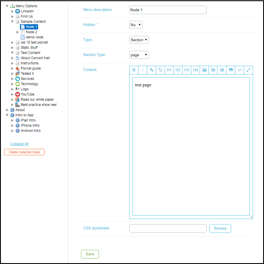 Content Menu - Edit Static Content
 - In CSS stylesheet, select Browse to attach a local CSS style sheet that you have previously uploaded to the Asset Manager; see Uploading Files. The local CSS style sheet overrides any settings in the global CSS style sheet (see Configuring the Global CSS Style Sheet), which Library Mobile also applies to your contents.
- When you are done, select Save.
Nested Smart Tiles
With a Nested Smart Tile, users can add multiple buttons within a single tile. This feature allows for a nested menu option appearance, presented in a carousel format.

Nested Smart Tile
By grouping items together, users can minimize the real estate occupied on the homescreen, providing a clutter-free user interface.
- Add a new menu option to the home screen in app Builder in the usual way and select Smart Tile from the tile type.
- Select Nested Smart Tile from the smart tile type and provide a name. This will be the Title shown on the nested smart tile when deployed.
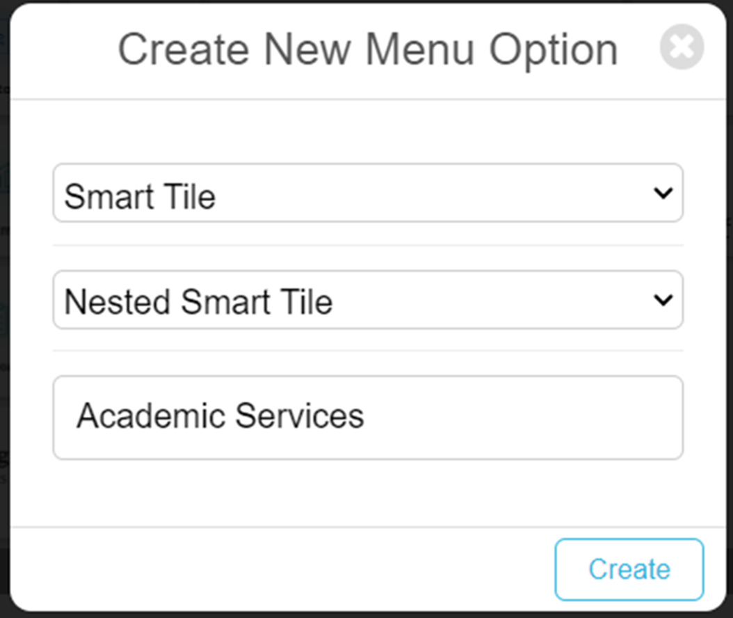
- Configure the menu option through the config panels, adding an Action URL (the action undertaken on selection), the Label and the image to associate with the nested tile.
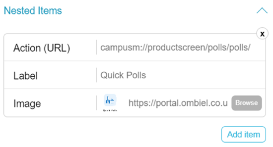
- You can add a number of these nested items by selecting the Add Item button. After 4 items, the tile will turn into a carousel, allowing end users to browse the content by selecting the left and right arrows on the tile.
- Save and publish.
Options in the UI
See the following sections for information about the top options.
App Builder
App Settings
The options on this page are:
- App Settings
- General Settings – See Configuring App Name and Icons.
- Email Templates – See Configuring App Emails.
- Web App Icons – See Configuring App Name and Icons.
- Biometric Identification – See Configuring Biometric Identification.
- iOS Splash Pages
- iPhone Splash Pages – See Configuring App Information Screens.
- iPad Splash Pages – See Configuring App Information Screens.
- User Management
- User Roles — See Enabling/Disabling App Roles for End-Users.
- Registered Users — See Managing Users.
- News/Events/Comms
- Home Page Banners – See Configuring Default Banner Service Images.
- Maps/Locations
- Campus Maps – See Adding Maps.
- Location Categories – See Adding Map Location Categories.
- Positions – See Adding Map Locations.
- Position Actions – See Adding Actions at Map Locations.
- Publishing
- Publish Content – See Publishing the App.
- Feedback
- Problem Page Categories – See Configuring Problem Feedback Categories.
- Problem App Categories – See Configuring Problem Feedback Categories.
- Contact Email Addresses – See Configuring Email Addresses to Receive Feedback.
- Feedback – See Viewing Feedback.
- Problems – See Viewing Feedback.
- Ideas – See Viewing Feedback.
- Sharing
- Twitter Settings – See Configuring Twitter Sharing.
- Email Settings – See Configuring Email Sharing.
For more information, watch Library Mobile Introduction. (4:34 min)
Analytics
See Analytics.
Notification Center
The options on this page are:
- Notification Actions
- Send Individual Notification – See Sending Notifications to End-Users.
- Send Group Notification – See Sending Notifications to End-Users.
- Manage Notification Groups – See Configuring Notification Groups.
- other actions on this page – See Viewing Sent Notifications and Resending Notifications.
User/Permissions
- Users/Permissions
- Users – See Managing Users.
- Groups – See Managing User Groups.
Asset Manager
See Uploading Files.
Insight Analytics
See Monitoring App Usage.
Creative Studio
Product Integrations
See Product Integrations.
Help and Support Menu
- Help for this page – display online help documentation for the page you are viewing. (Only available for select pages).
- Browse Online Help – display App Manager documentation
- Raise a Ticket – open a Salesforce Support Ticket
- Release Schedule – display the monthly release schedule
- The current release notes

