
The Research Hub Interface
The following sections present elements that appear or remain consistent in the UI for all users throughout the Esploro research hub. For information about searching in the research hub, see Searching in the Esploro Research Hub.
Watch the Navigation video (2:13).
The Esploro Homepage
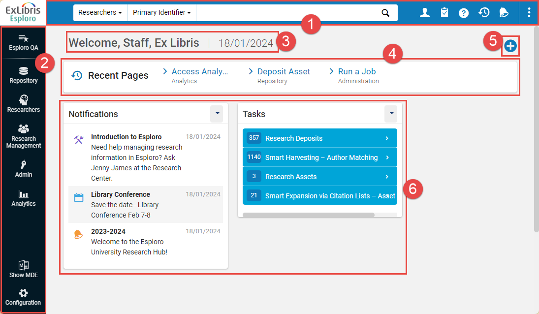
- Persistent Menu – For information, see The Persistent Menu, below.
- Navigation bar - For more information, see The Navigation Bar, below.
- Welcome greeting – Greeting with your user name and the current date.
- Recent Pages widget – Displays the pages you have most recently visited. Select to go directly to one of the pages. For more information see here.
- Manage Widgets button - Select this button to choose the widgets you want to include in your Esploro homepage; see Working with Widgets in Esploro Research Hub.
The homepage may additionally contain other components, such as:
- Widgets – (# 6 in the illustration above) Small panes of information or actions that are relevant to your user role and Esploro's current status. Some widgets contain links that you can select to view more information. Esploro has a set of predefined widgets, such as a widget showing information about tasks that may be awaiting your attention, and a widget showing the status of scheduled jobs. The Recent Pages widget is always displayed in the homepage. You can choose which other widgets to display. For additional information, see Working with Widgets in Esploro Research Hub.
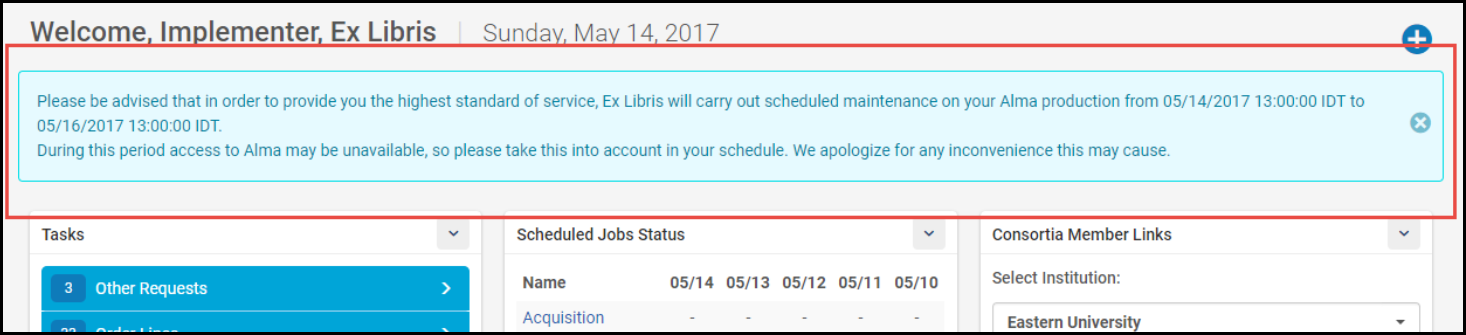
- Maintenance Message – A message about upcoming maintenance may appear under the persistent menu. Select X to dismiss the message.
The Navigation Bar
The main menu used to navigate in Esploro. Throughout this document, any reference to this menu uses a path of menu and sub-menu elements as follows: main section > sub-section > specific option, for example Repository > Asset Deposits > Deposit Asset. If the resulting page is also a menu of options, these options may appear in the documentation as additional elements to the path.
The Navigation bar can be collapsed to provide more room on the page while still remaining visible. It can be expanded again at any moment.
| Expanded State | Collapsed State | How to |
|---|---|---|
 |
 |
To collapse the Main Menu Navigation panel:
|
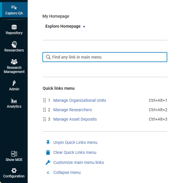
From the Navigation Bar you can easily search for a specific menu option and set the menu options that you use frequently as Quick Links, so that the Esploro interface is personalized to your workflow and you don't have to go through the sub-menus every time.
- Repository - Managing research assets
- Researchers - Managing researcher records
- Research Management - Managing research activities, grants projects, and organizational units
- Admin - Administration activities, including managing users and jobs.
- Analytics - Creating, running, and viewing reports about Esploro usage. Some pre-packaged reports are available from this menu.
Select on the Navigation Menu and select an option from the My Homepage drop-down list. The options displayed here are configured on the Analytics Object List. For more information, see Displaying Report Preview.
- Select the
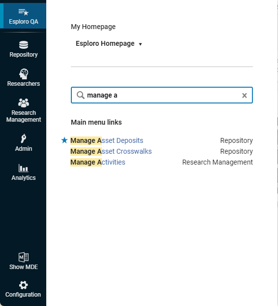
on the Navigation Menu or type Alt-Ctrl-F. Alternately, at the bottom of any menu area, select the search link.
 Search Panel
 - Enter your search term. Matching options in the Navigation Bar, as well as in the Configuration Menu, appear. Select the relevant option.
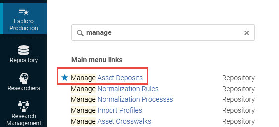
 Matching Search Options
Creating Quick Links
There are two methods to create Quick Links that you can use, depending on where in the Esploro menu you are.
Depending on whether you in the navigation panel or the sub-menu, do the following to create a quick link:
|
From the Navigation Panel |
From the sub-menu |
|---|---|
|
|
Once created, you can do the following with the Quick Links:
- To view your Quick Links, click
to open the Quick Links panel, and select your link.
- Use the hotkey automatically designated to each Link to open the tools quicker.
- Select Pin Quick Links menu to pin all the Quick Links to you page, as additional menu below the Persistent search box, always available on all pages. To remove this menu, click Unpin Quick Links menu.
The Persistent Menu

- Logo – The logo of your consortia or institution. Select the logo on any page to return to the Esploro homepage.
- Persistent Search Box – For more information, see Searching in Esploro.
- Main Menu Icons – Icons include (from left to right):
Icon Description 
User menu – Your user name and photo (when available) appears as a link. Select the link to open the user menu. The options in this menu are as follows: - In some institutions, the first item in the menu is a language selector that you can use to change the language used in the UI. To change your language, select a new language from the drop-down list. The user interface changes to the selected language. Currencies and numbers in the UI and exported Excel files change to match the standard defined by the language (with commas, periods, and spaces in the appropriate locations). See Configuring Institution Languages.
- Change Password – Change your password. This option only appears for internally managed users (see Account Type). To change your password, enter your existing password and your new password twice and select Save. Your new password is saved.
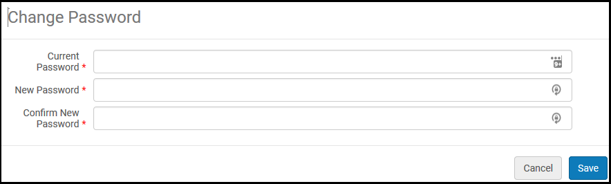 Change Password Dialog BoxDepending on your institution’s setup, you may be required to use passwords of a certain length, to include certain characters in your password, or to change your password at certain times.
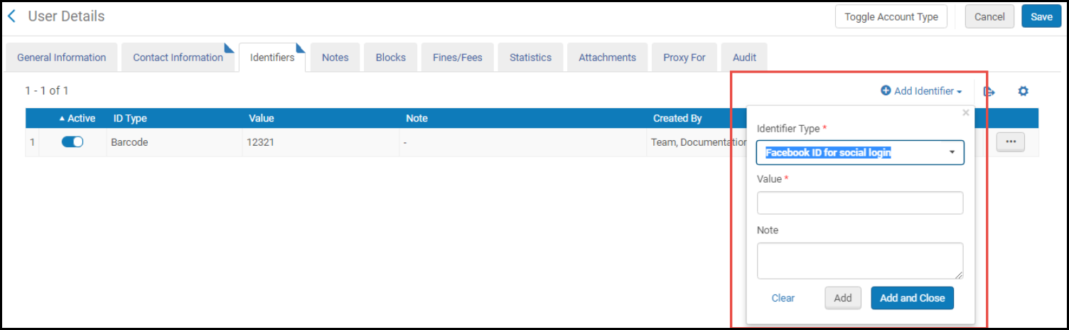
 - User Details – Display details about your user on the User Details page. For more information, see Editing Users.
- Detach from social account – If your user account has been associated with a social account and you want to disassociate the two, select this option to do so. This appears only if the user account is associated with a social account.
- UI preferences (on all pages other than the homepage) – This submenu enables you to select the font size of the UI and whether the pages are presented with gutters (default) or full width. Select the font size (Display Density) and Page Layout to suit you. Your selection is saved between sessions. Click the Shortcut Customizations link to view the global Esploro keyboard shortcuts and disable some of them, if needed. See Global Esploro Hot Keys.
- Sign Out – Log out. See Logging Into and Out of the User Interface.

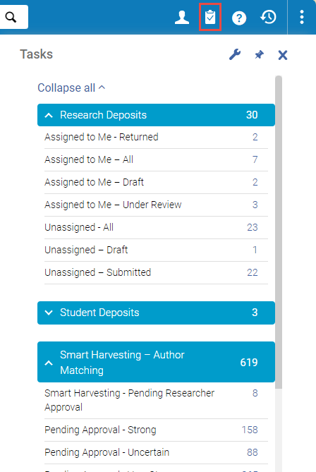
Tasks panel - A breakdown of tasks currently open in Esploro that may require your attention, grouped by task type. Each type can be collapsed to just show the number of open tasks of that type, or expanded to show a breakdown of that type into subtypes, such as Assigned to Me and Unassigned. Select the line of a subtype to open the page in which it is managed.
- The Tasks panel is also available as a widget on the homepage. For more information, see Working with Widgets in Esploro Research Hub.
- See also Assigned to Me, Unassigned, Assigned to Others Tabs, below; Author Matching Approval Task List.
 Tasks Panel
Help link – A menu of help options. Select one of: - Browse Online Help – Open the Online Help.
- Help For This Page – Open the Online Help page that is relevant to the current UI page that you are on.
- What’s New Videos – View a page with links to the most recent video tutorials.
- Esploro Release Schedule – Display a pop-up with the last several, and next several, sandbox, production release, and release update dates.
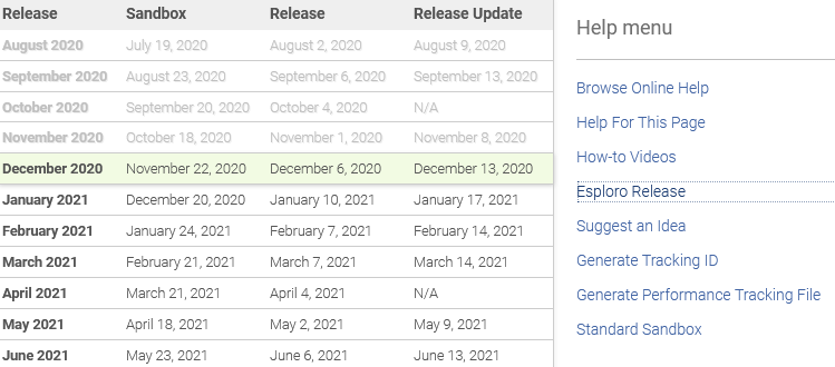 Release Dates Pop-up
The current release version and build number appear at the bottom of the Help menu. For premium sandbox customers, when working in the sandbox, the build information indicates the date that this build was cloned from production. An asterisk in the Release Update column indicates the date of the next scheduled refresh.
- Suggest an Idea – Suggest an idea to Ex Libris. Select to open the Ex Libris Idea Exchange page in a new window.
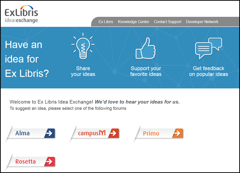 Ex Libris Idea ExchangeYour administrator may have removed this link. See Configuring Other Settings.
 - Generate Tracking ID – Generate a tracking ID for your Salesforce case to assist Ex Libris in debugging a problem. Use this when an error occurs but the error message does not contain a tracking ID. You should generate the ID as soon as possible after the error.
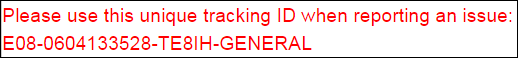 Generate Tracking IDThe tracking ID is not enough to resolve your issue. You must still provide as many details of the problem as possible, such as the steps in the workflow that led to the error, which entities were involved (user identifier, item barcode, and so forth.), and any other information that might be relevant.Watch the Tracking ID Generator video
 - Generate Performance Tracking File – Generate a performance tracking file if Esploro displays performance issues, such as long search times. Open a support issue and attach the file to the issue. The information in the file can help the support team resolve the issue.
Generate the tracking file immediately after experiencing the performance issue, before doing any other action.
- Instance Location - Displays the location of the data center for this instance.
- Premium Sandbox – Connect to your Alma premium sandbox, if you have one. For detailed information on sandbox environments, see Alma Sandbox Environments. If the Institution has at least one SAML\CAS profile, hover over the link to open a sub-menu with links to Premium Sandbox using different profiles. If the institution has no SAML\CAS profiles, then there is a single link to log in to the Premium Sandbox.
- Standard Sandbox – Connect to your Alma standard sandbox, if you have one. For detailed information on sandbox environments, see Alma Sandbox Environments.
- The date of the last indexing appears, which could be either the status of the last semi-annual indexing or the status of any indexing process initiated by the system or by customer support. The semi-annual reindexing is full reindexing of the Esploro repository, done twice a year (generally in July and December; for a more detailed explanation see here). While semi-annual indexing runs, it appears under Running Jobs tab (Admin > Monitor Jobs) with the following details: Job category ''SP', Creator 'System'. If you want to run a full reindexing at other points in time, contact Ex Libris Support. If you are a Depositing Administrator, General System Administrator, or Repository Administrator, the date that appears here is a link. Select the link to view the indexing job report.
- A link to the most recent Esploro release notes.
- In your sandbox environment, the date of the last clone from production.
- The date of the last CZ update that was implemented in your system. For details, see Synchronize Changes from CZ.
Recent Entities pane - allows you to view and access your recent activity, including the Recent Entities list that lists all the entities you have added, updated, and deleted within the last 7 days. You can scroll through the list and select an entity to resume your work, or you can view the entity in view-only mode. The Recent Entities list is a helpful way to find the records you have recently accessed, even if you do not remember their names. It also allows you to easily view your recent changes to your records. At any moment you can open and close the Recent Entities list, and then resume your ongoing work without interrupting its context.
For more details, see Recent Entities List.

Notifications panel - select to open the Real-Time Notifications panel - a list of notifications about completed manually run jobs. For additional information, see Real-Time Notifications Panel, below.
Real-Time Notifications Panel
Notifications about manually run jobs that have completed can be viewed and managed in the Real-Time Notifications panel. To open the panel, in the Persistent Menu, select Notifications ( ). The notifications are arranged in the panel by creation time, with the most recent at the top. The system checks for newly completed jobs every few minutes, and if new ones are found, a counter is displayed on the icon:
  . Notifications are automatically deleted after a month has passed. You can remove them earlier by dismissing them. A dismissed notification is deleted immediately and cannot be restored. The settings control both the display of notifications in the Real-Time Notifications panel and email and pop-up notifications.
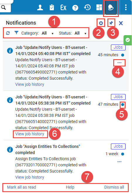
- Refresh button and filters.
- Select to open the settings for the real-time notifications feature; see Real-Time Notification Settings, below.
- Select the pin icon (
.png?revision=1) ) to keep the panel open on the Esploro screen.
) to keep the panel open on the Esploro screen. - More actions button - select to open the More Actions menu for a notification.
- New (unread) notification indicator.
- Select to open the job in the Monitor Jobs page, in the History tab.
- Global options for the Real-Time Notifications panel.
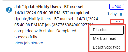
More Actions Menu
The More Actions menu of each notification contains the following options:
- Dismiss – Permanently delete the notification.
- Mark as read/unread – Remove/return the unread indicator (#5 in the illustration above).
- Deactivate type - Turn off real-time notifications for manual jobs. (For information about turning them back on, see Real-Time Notifications Settings, below.)
Real-Time Notification Settings
You can customize your real-time notification settings by choosing whether to receive notifications about completed manual jobs at all, and, if so, whether to receive emails and/or see pop-ups when these jobs complete. By default, email notifications are not activated, but pop-up notifications are activated.
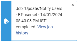
When pop-up notifications are activated, whenever a manually run job completes, a pop-up message appears in the Esploro hub browser-tab, informing you that the job has ended, and including a View job history link to open the job in the Monitor Jobs page, in the History tab. The pop-up appears regardless of which Esploro page is open at the time. If no Esploro tabs are visible at the time, the pop-up appears in the next Esploro tab you select.
- At the top of the Real-Time Notifications panel, select Configuration (
 - #5 in the illustration above). The Customize your notifications pane opens.
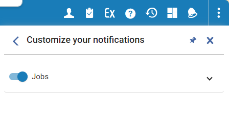
- To turn manual-job notifications on or off, select the switch beside Jobs.
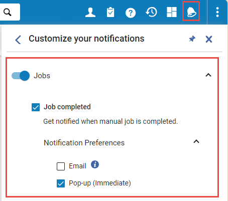
To configure the notification settings, select elsewhere in the Jobs row. The row expands to display the settings. - If you want to receive any notifications, select Job completed. When this option is selected, notifications are added to the Real-Time Notification panel whenever manually run jobs are completed. In addition, when this option is selected, you have the option of also receiving email and/or pop-up notifications, as explained in the next step.
- To turn email and pop-up notifications about manually run jobs on or off, select Notification Preferences, and then select the options you want to turn on.
Page Header and Summary Panel
- A back icon
 , if this page was opened from a list or as part of a larger procedure.
 - The page title.
- Any relevant actions (as buttons) to perform page-level actions on the page.
- The default action (typically Save) is highlighted in blue.
- If there are too many actions to display, additional actions are available in the or ... menu to the right of the displayed actions.
Configuring Esploro
- Select the
 icon. The following changes take place:
- The Esploro Main Menu changes to the Esploro Configuration Menu. To distinguish it from the Esploro menu, the bar color changes to the default primary color in the user interface, and its icons feature a cog wheel to distinguish them from the regular Esploro icons.
- The persistent search bar disappears, and the dropdown of units to configure appears instead.
- Instead of the main Esploro window, a dedicated screen opens.
- In the top dropdown, select the unit to configure.
- Select the functional area to configure, such as Researchers, and find the specific configuration tool you need.
- To close Esploro Configuration and to return to the task you left in Esploro, select the
icon.
Global Esploro Hot Keys
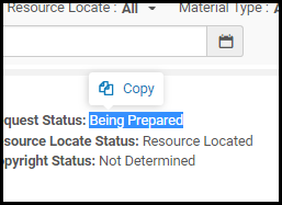
Copy Option When Selecting Text
Icons
Info Icon
 icon on some pages in Esploro. When you select the Info icon, a pop-up appears with information about the item on the page: created by, last updated by user/job, and (where applicable) modified by information.
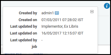
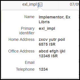
User Information Icon
 beside a user name on various pages and pop-up windows, such as the User Details page.
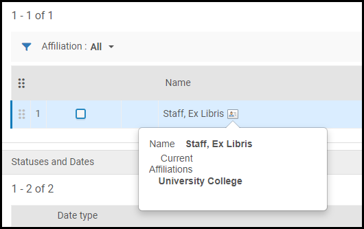
Researcher Information Icon
The researcher information icon is similar to the User Information Icon, but contains the researcher's affiliations. For general information on working with researchers see here.
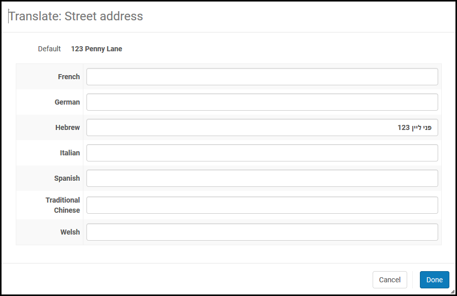
Translate Information Icon
 . For example:
Messages
Esploro returns messages on many pages based on your actions or missing or required information. Messages appear in a notification bar on the side of the page. The notification bar displays message types of Information, Error, and Success, each with different icons and colors. In confirmation dialog boxes and other smaller panes, the messages appear on the page (not floating). If you ignore a message but continue to work on the page, the message is minimized to its icon and remains on the page.
- Success – An action you performed succeeded. In the case of a long action that initiates a job, success only means that the job was submitted successfully, not that the results of the job were successful. After successfully submitting a job, you can select the job number in the message to open the Manage Jobs page (see Viewing Running Jobs).
Select X to remove the message or > to minimize the message. When enabled by Ex Libris, you can select Collapse by default to make all success messages on this page appear initially collapsed.
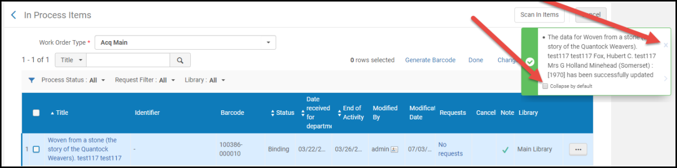 Success Message
 - Error – Your action could not be performed, or it failed. The message indicates the reason for failure, when available (see also Generate Tracking ID in The Persistent Menu). Select > to minimize the message.
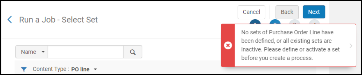 Error Message
 - Information – An indication of a normal event about which you should take notice. Select X to remove the message.
 Information Message
Adding Text and HTML Code in Text Fields


- <a>
- <abbr>
- <acronym>
- <address>
- <area>
- <article>
- <aside>
- <audio>
- <b>
- <bdi>
- <bdo>
- <big>
- <blockquote>
- <br>
- <caption>
- <center>
- <cite>
- <code>
- <col>
- <colgroup>
- <dd>
- <del>
- <details>
- <dfn>
- <dialog>
- <dir>
- <div>
- <dl>
- <dt>
- <em>
- <figcaption>
- <figure>
- <font>
- <footer>
- <h1>
- <h2>
- <h3>
- <h4>
- <h5>
- <h6>
- <header>
- <hgroup>
- <hr>
- <i>
- <img>
- <ins>
- <kbd>
- <label>
- <li>
- <main>
- <map>
- <mark>
- <menu>
- <nav>
- <ol>
- <p>
- <picture>
- <pre>
- <q>
- <rp>
- <rt>
- <ruby>
- <s>
- <samp>
- <section>
- <small>
- <source>
- <span>
- <strike>
- <strong>
- <sub>
- <summary>
- <sup>
- <table>
- <tbody>
- <td>
- <tfoot>
- <th>
- <thead>
- <time>
- <tr>
- <track>
- <tt>
- <u>
- <ul>
- <var>
- <video>
- <wbr>
Adding Information in Multiple Languages
You can add information to the title, description, and keywords in multiple languages for the following areas:
- Deposits/Assets
- Projects
- Activities
- Resources
This feature works on multilingual environments only. For configuring multilingual environments, see here.
For a video showing how to add fields in additional languages to projects and activities, see here.
For a video showing how to add abstracts and keywords in multiple languages, see here.
-
Select the plus icon at the top of the section.
- Select the language from the searchable drop down list.
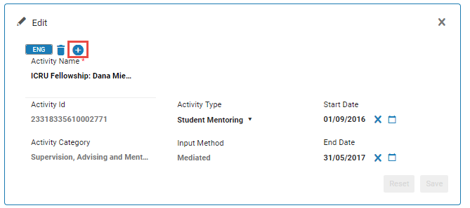 Add Language for Editing Information
 - Update the information in the new language.
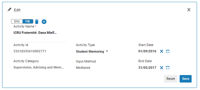 Updated Information
Note that if you delete a language, information that was added in that language will also be deleted.
Tabs
"Has Content" Indication
 indicates that the tab has a table or list with user-configured or system-generated content.
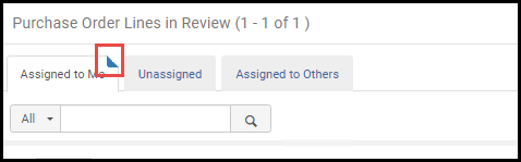
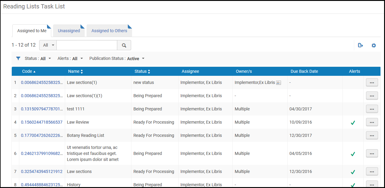
Assigned to Me, Unassigned, Assigned to Others Tabs
- Assigned to Me - These items are assigned to you. This tab provides the most options, typically including the option to unassign the item or assign the item to another operator.
- Unassigned - These items are not assigned to any operator. You may be able to perform most actions on this page, but not as many as you can perform on the Assigned to Me tab. If you have the relevant permissions, this tab also allows you to unassign the item or assign the item to yourself or to another operator.
- Assigned to Others - These items are assigned to another operator. This tab provides the fewest actions to perform. If you have the relevant permissions, this tab allows you to unassign the item or assign the item to yourself or to another operator.
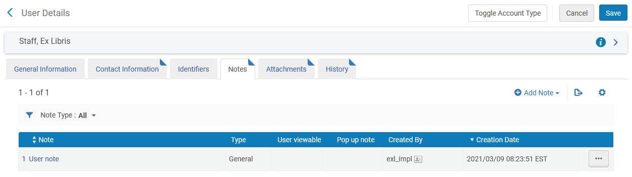
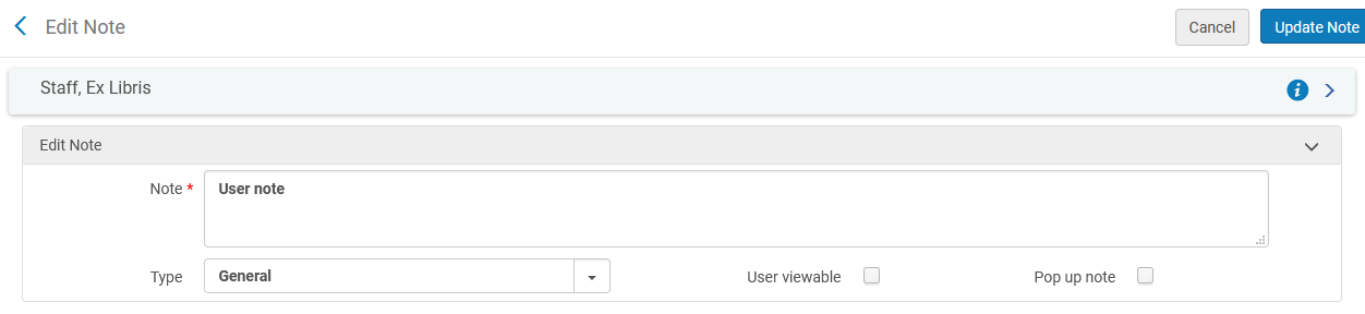
Notes Tab
Attachments Tab

- To add an attachment, select Add Attachment. Browse for a file, add a URL and/or note, if required, and select Add Attachment.
- To edit an attachment, select Edit in the row actions menu.
- To delete an attachment, select Delete in the row actions menu and select Confirm in the confirmation dialog box.
- To download a file, select Download in the row actions menu, browse to the download folder, and select OK.
The maximum attachment size is 25 MB.
History Tab

- The History tab of the Monitoring Jobs page has a different functionality. For more information, see Viewing Running Jobs.
- The Operator column appears only for managers and administrators. See Configuring Users' Ability to View Operator Details.
Drop-Down and Quick Pick Lists
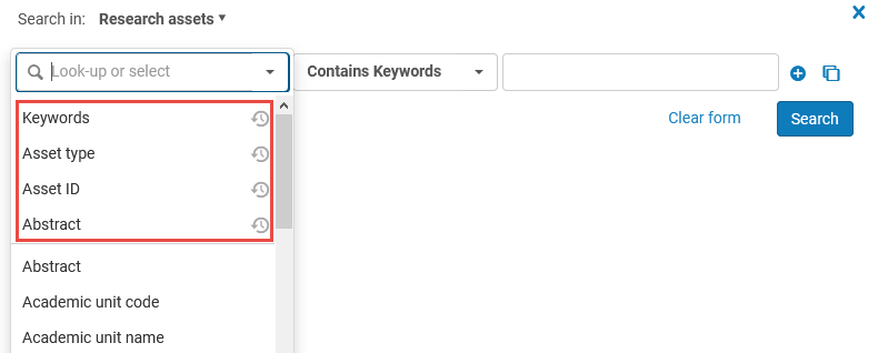
 in the field.
 in the selection field to select any recently selected item.
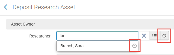
Lists and Tables in Esploro
Common Table/List Types
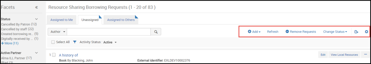
Record Lists
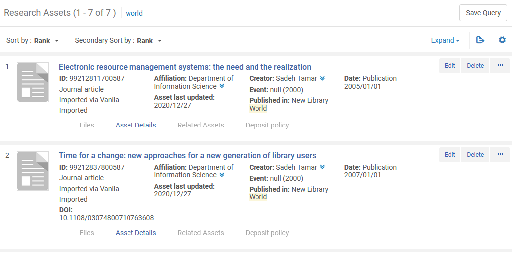
- Where relevant, Assigned to You, Unassigned, and Assigned to Others tabs. See Assigned to Me, Unassigned, Assigned to Others Tabs.
- A table actions list, if any. See List, Table, and Row Actions.
- The second to last link
 is an option to export the displayed elements in the table to Excel (see Export to Excel).
 - The last link
 enables you to customize how the results appear in the list; see below.
- The second to last link
- Pagination options, when required (see Pagination)
- Facets for filtering the items on the list (see Facets, Filters, and Secondary Search)
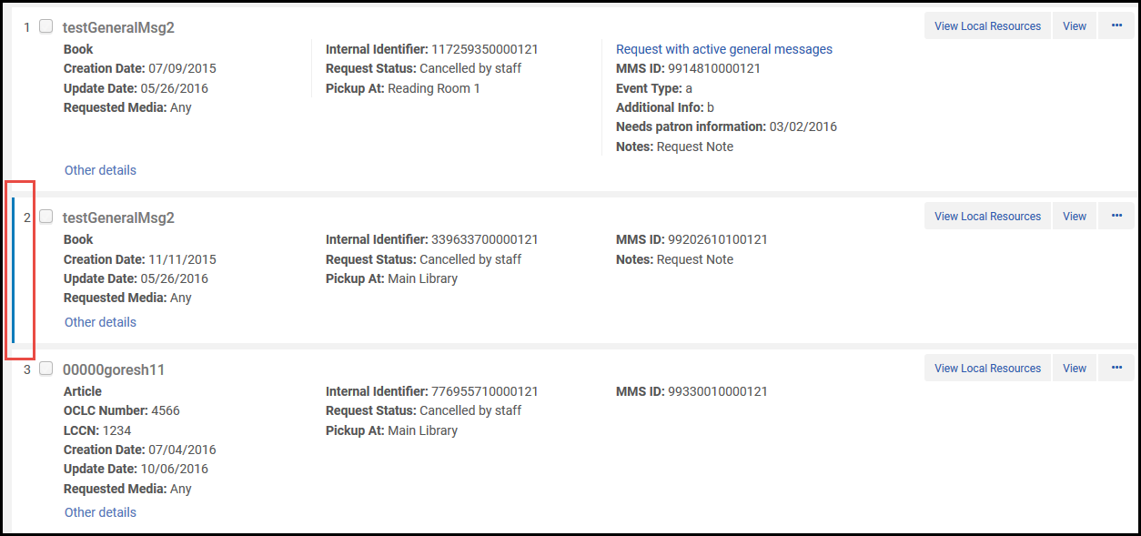
- Its number in the list
- A check box, if there is a page-level action that can be performed on multiple items in the list
- The item's name, typically linked to a page where you can view more information about the item
- Various other information fields about the item
- A row actions list that enables you to perform actions on the item. See List, Table, and Row Actions
- If you are returning to this page after having viewed or edited an item in the list, that item is highlighted (see Last Item Edited Indicator).
- On some pages, additional information appears in tabs at the bottom of each list item. For example:
- Inventory in search results (see Viewing Inventory/Other Details) and citation details in reading lists (see Managing Citations) may appear. Select one of the tabs to expand or collapse this information. If an Expand table action is present, you can use it to pre-select that all tabs, or all tabs of a certain type, are expanded by default.
- Electronic collection and portfolio details may be expanded for a particular title in the Community tab with icons indicating activation and/or availability. See the icon tooltips for additional information.
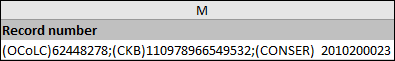
Record List Fields with Multiple Values
 ). Select the multiple values icon to display all the values for the field. In the case of the Record number field, the multiple 035 $a values appear listed in the same order as presented in the MD Editor.
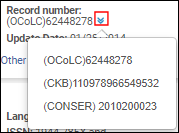
Record List from Single Record Search
Configure Record List Appearance
in the table actions list to open a configuration pane.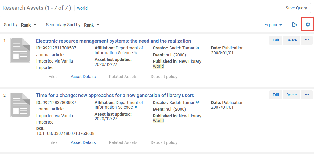
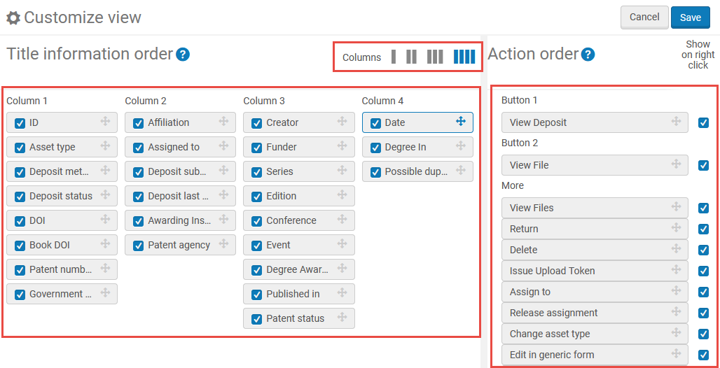
- For an entry in the list, if the entry does not contain a value for a field, the field does not appear.
- Currently, when configuring the available row actions on a page, the list of row actions displays all actions that can be performed on the kinds of entries that populate the list, even if these actions do not appear on the page. Regardless of the row actions that you select to appear while configuring, if the action is not relevant for the page or the entry, it does not appear in the row actions.
 . When you select the icon again, the Restore list defaults option appears. Select to restore the fields and actions to their out-of-the-box settings.
List Tables
- When presenting a list of tasks, the table usually contains Assigned to You, Unassigned, and Assigned to Others tabs. See Assigned to Me, Unassigned, Assigned to Others Tabs.
- A table actions list, if any. See List, Table, and Row Actions.
- The second to last link is an option to export the displayed elements in the table to Excel (see Export to Excel).
- The last link enables you to customize the columns that appear. Select or unselect columns to appear in the table, and then select Done. For more information, see Working with Table Columns.
- The second to last link
- In some cases, you may have options to sort the list. You may be able to move an item down or up the list by selecting the up or down arrows in the Move Up and Move Down columns. Or you may be able to drag and drop items by selecting and dragging the drag and drop icon
 . The selected row is highlighted, and, as you drag the row up and down the table, a blank bar appears below or above other rows, indicating to where the selected item will be dropped.
 - Pagination options, when required (see Pagination)
- Facets for filtering the items on the list (see Facets, Filters, and Secondary Search)
- Its number in the list
- Various information fields about the item
- A row actions list that enables you to perform actions on the item. See List, Table, and Row Actions.
- If you are returning to this page after having viewed or edited an item in the list, that item is highlighted (see Last Item Edited Indicator).
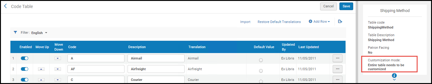
Code Tables
- The page title Code Table
- A summary header with basic information about the table
- A table actions list, if any. See List, Table, and Row Actions.
- The first option enables you to import information to the table (see Importing Code Table Information).
- Another option enables translation for multi-language institutions (see Code Table Label Translation).
- Add Row enables you to add a new row, when available (see Adding Lines to Tables).
- The last link is an option to export the displayed elements in the table to Excel (see Export to Excel).
- The option to Cancel your changes or Save / Customize to save your changes
- Its number in the list
- The option to enable/disable the element by toggling a slider; a blue slider
 indicates that the element is enabled; a gray slider
  indicates that the element is disabled. These sliders are not functional on all code tables. If the slider colors are muted (
 /
/  ), you must first enable the line using the Customize row action before you can change their values.
 - The options to move an item down or up the list by selecting the up or down arrows in the Move Up and Move Down columns
- The code and description of the item. These can often be changed, either directly or after selecting Customize in the item's row actions list. Select Save after making any changes to the table.
- The option to select one of the items as the default value. Only one value can be selected. For some tables, this value may be disabled or may have no relevance.
- The user who last changed the element and the date of the last change
- A row actions list, typically containing at least the option Customize if you have not yet customized the list, or Restore if you have. Select Restore resets the row to its original value. After selecting a row action, select Save at the top of the page to save your changes. When available, select Delete to remove the row.
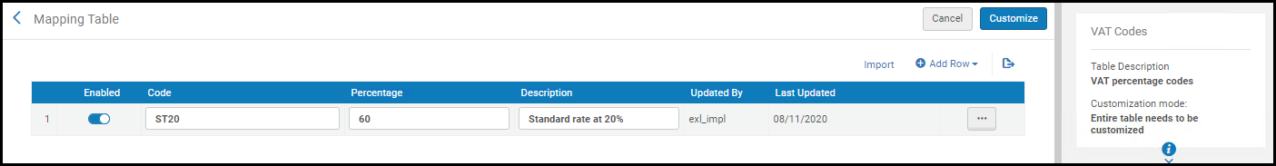
Mapping Tables
- The page title Mapping Table
- A summary header with basic information about the table
- A table actions list, if any. See List, Table, and Row Actions.
- Add Row enables you to add a new row, when available (see Adding Lines to Tables).
- The last link is an option to export the displayed elements in the table to Excel (see Export to Excel).
- The option to Cancel your changes or Save to save your changes
- Its number in the list
- The option to enable/disable the element by toggling a slider; a blue slider indicates that the element is enabled; a gray slider indicates that the element is disabled. These sliders are not functional on all mapping tables. If the slider colors are muted ( / ), you must first enable the line using the Customize row action before you can change their values.
- The key (code) and other information for the item. These values, other than the key, can often be changed, either directly or after selecting Customize in the item's row actions list. Select Save after making any changes to the table.
- The user who last changed the element and the date of the last change
- A row actions list, typically containing at least the option Customize if you have not yet customized the list, or Restore if you have. Select Restore resets the row to its original value. After selecting a row action, select Save at the top of the page to save your changes. When available, select Delete to remove the row.
List, Table, and Row Actions
 , with options to export all or some of the list to a Microsoft Excel file. See Export to Excel. Another common table action above a table is Add Row; see Adding Lines to Table. Code tables allow you to add lines in bulk; see Importing Code Table Information.
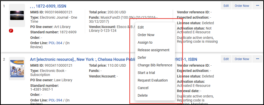
Adding Lines to Tables
Importing Code and Mapping Table Information

- The Excel sheet must be named CodeTable
- The columns must be named Code and Description (case-sensitive) to match to the target, so after exporting a code table, rename the columns to these values.
- The Excel sheet must be in a specific structure. It is recommended that you export the existing table to get the existing values and the structure (if relevant), make your changes, and then import the changes back to Esploro, as described below.
- Export the file using Export > Excel (see Export to Excel).
- Open the Excel file and rename the Excel sheet CodeTable.
- Make your changes and save the file. Note that there should be no duplicate lines in the Excel file.
- Select Import on the relevant page. The Import Tables page appears.
- Select Browse to locate your file.
- Select Import to upload the file. The contents of the file appear on the page.
- Review your changes and select Import to import the changes to Esploro.
- The process as is for code tables, but without the need to change or rename the file.
The structure of the Excel file includes the actual codes that are imported back into Esploro, in addition to columns of descriptions that help you make sense of the data, but are not imported. The description values can be duplicated. In addition, the Excel file includes additional sheets, which are also not imported back into Esploro, that provide you with full lists of codes and values that can be inserted into the Esploro dropdowns - you can use these sheets when adding new rows to the Excel file, instead of referring to Esploro for these code/value combinations.
There cannot be duplicate lines in the codes that are imported back into Esploro.
Export to Excel
and selecting Excel. When exporting a table with hidden columns, you can choose to export only the visible columns or all of the columns, including the hidden ones.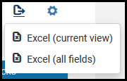
Table and Row Level Customization Mode
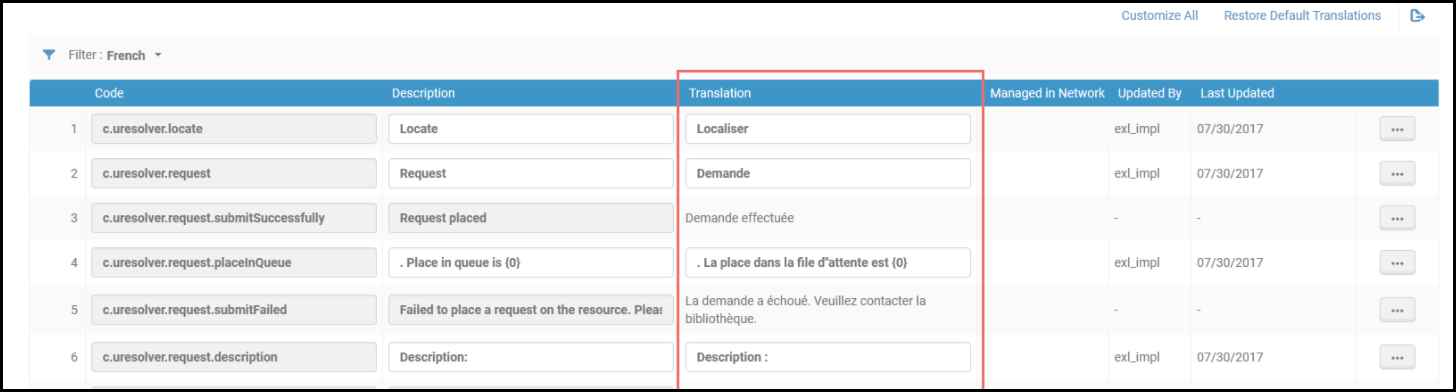
Code Table Label Translation
- Change the language filter to a language other than English.
- Edit the text in the Translation column.
- Select Save.
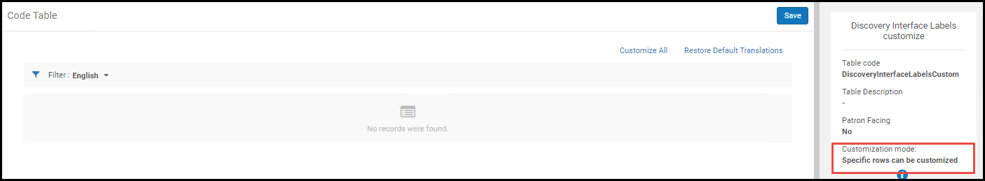
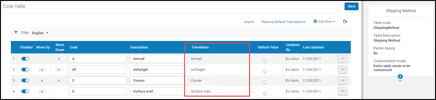 Table Level Customization
- Change the language filter to a language other than English.
- Select Customize in the row actions list to customize a row, or select Customize All in the table actions list to make all of the rows of the table available for customizing.
- Edit the text in the Translation column.
- Select Save.
 Row Level Customization
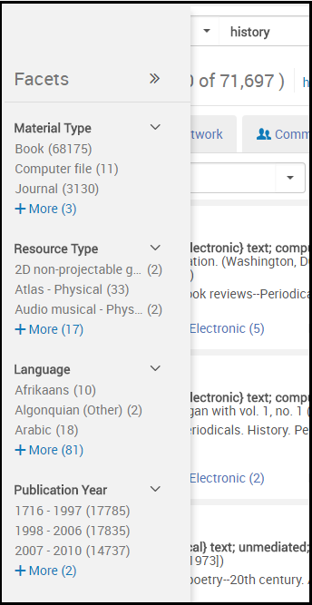
Facets, Filters, and Secondary Search
Facets and Filters
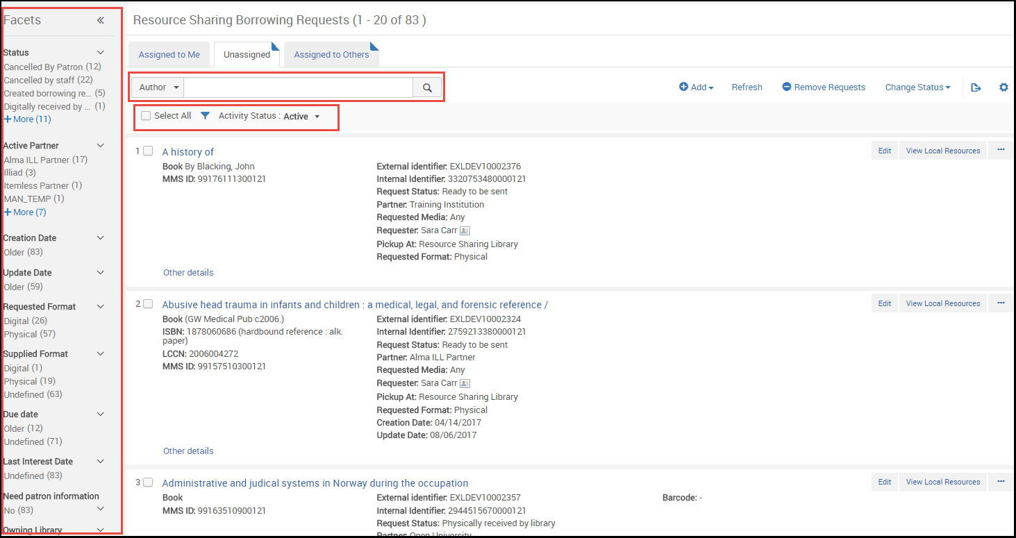
The Facets panel bar can be collapsed to provide more room on the page while still remaining visible. It can be expanded again at any moment.
| Collapsed State | Viewing Facets in Collapsed State | To Restore |
|---|---|---|
|
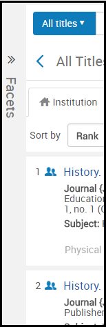
Minimize the Facets pane by selecting << beside the word Facets. The panel collapses into a small stripe on the left of the screen.
|
You can view the facets by hovering your mouse over the Facets stripe.
|
Select >> to restore the Facets pane. |
Secondary Search
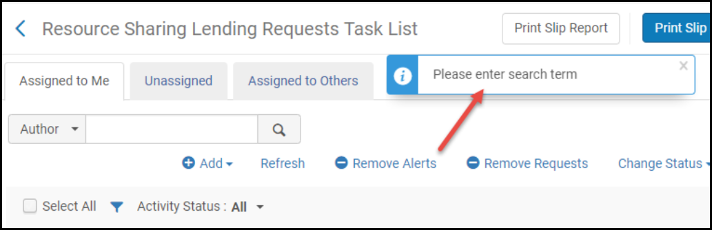
 to filter the list. Note that this search is a "contains" search (except for a code search of the resource sharing partner list, which is a "starts with" search).
Pagination

- Select one of the arrows < or > (or press Alt-, or Alt-.) to display the previous or next page.
- Select a page number to display that page.
- Enter a page number in the small text box and select Go to display that page.
- You can select the number of lines per page. On some pages, the range is between 10 and 50. On other pages it is between 20 and 100.
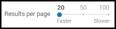 Results Per Page Tool
- Esploro does not preserve selections that you make as you navigate from page to page (exception: Esploro remembers your selection for results per page). All actions on the page apply only to the visible selections you make on that page.
- If the bottom pagination is not visible, a small floating version of the pagination element appears at the bottom of the page. To navigate to a specific page when the floating pagination is visible, select the page number, enter a new page number, and press Enter.
Last Item Edited Indicator
Working with Table Columns
- For columns that have up/down triangles, you can sort the rows in the table by that column by selecting the column heading. Select the column heading again to toggle between ascending and descending order.
Sorting a table changes the order of the lines in the table, and your selected sort is retained when you leave and return to the page. However, the sort has no effect on how items in the table appear in other areas of Esploro. For example, if you sort users in descending alphabetical order (Z to A) on the Find and Manage Users page, the relevant list of users still appears in ascending alphabetical order (A to Z) when selecting to assign a task to a user.
- Select between two column headings to change the width of table columns.
- Select and drag a column heading left or right to change the order of table columns.
- Hide and display columns by selecting
 in the table actions list. To configure record list columns, see Record Lists.
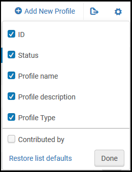 Hide/Display Columns Pane
- Clear the check box of a column and select Done to hide the column.
- Select the check box of a hidden column and select Done to have it appear.
- Select Restore list defaults to restore all columns to their original settings.
If you have previously customized the columns on this page, the icon has a small green dot in the lower right corner. When you select the icon, the option to Restore list defaults appears. Select to restore the columns to their out-of-the box settings. - Select the row list action View Hidden to display a pop-up of any hidden fields for that row. For example:
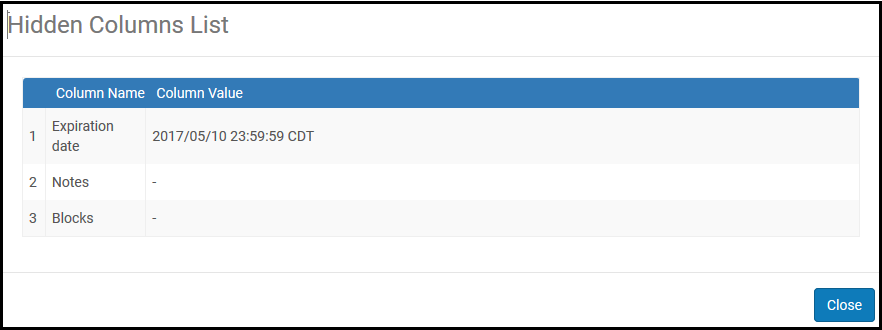
Hidden Columns List